What I did
- UX & Business Research
- UX Initial Flow
- Build POC Using UI Kit
- Linked the Prototype
Delivered in Apr 2022
Task Description
A fleet management company wants to create a web application to manage shipments across its vehicles, Each vehicle will contain a GPS device that will send the location, The admin will assign a shipment task for the vehicle.
Shipment details:
- Shipment name.
- Shipment status (Todo – In progress – paused – finished)
- Start point coordinates and address.
- Endpoint coordinates and address.
- Expected time.
- Start Date Time.
- End Date Time.
- Distance.
- Driver name and phone number.
Vehicle details:
- Plate number.
- Model.
- Color.
- Current status (moving – paused – inactive).
The Task
Create high-fidelity wireframes and user interfaces with prototype for:
Vehicles page:
- View all Vehicles.
- Add, edit and delete Vehicles.
- Filter vehicles by status.
Vehicle Details page:
- View vehicle details.
- View today’s vehicle shipments.
- View vehicle live location, tracking, and history.
- View vehicle status history (date – status type).
Shipments page:
- View all shipments.
- Filter shipments by (date & time – vehicle – shipment status)
- Add, edit and delete the shipment.
Task Delivered Screens
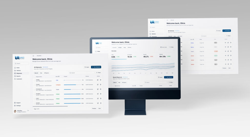
#I shared all the screens with the HR and Design Manager of Unifi, but not in the specific order presented. Along with a Figma file, I provided them with a video detailing my design process, and each image includes an accompanying description for better understanding. By watching the shared video, you can gain insight into the function of each screen.
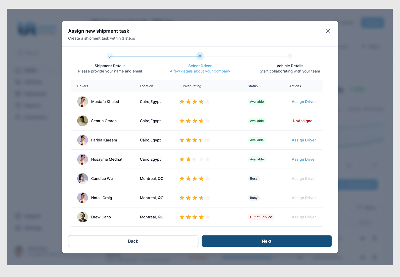
Assign new shipment task - Select Driver - with un assign – Fleet Management System
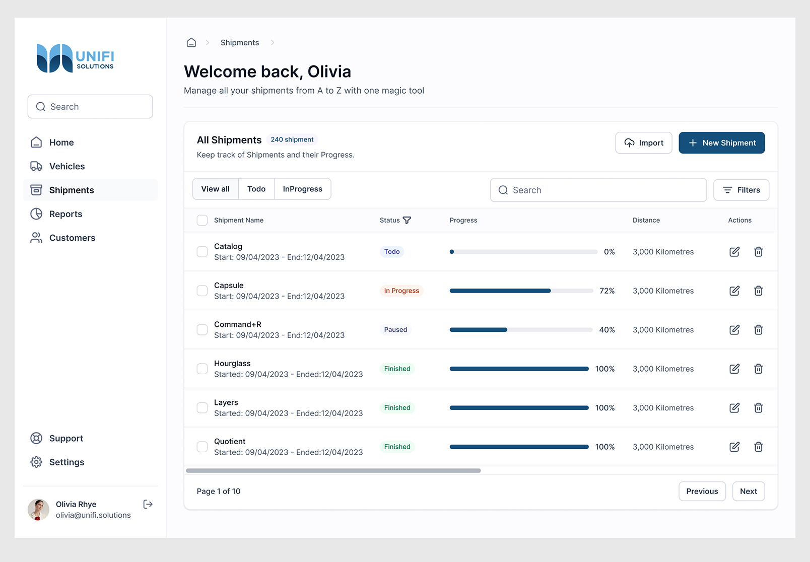
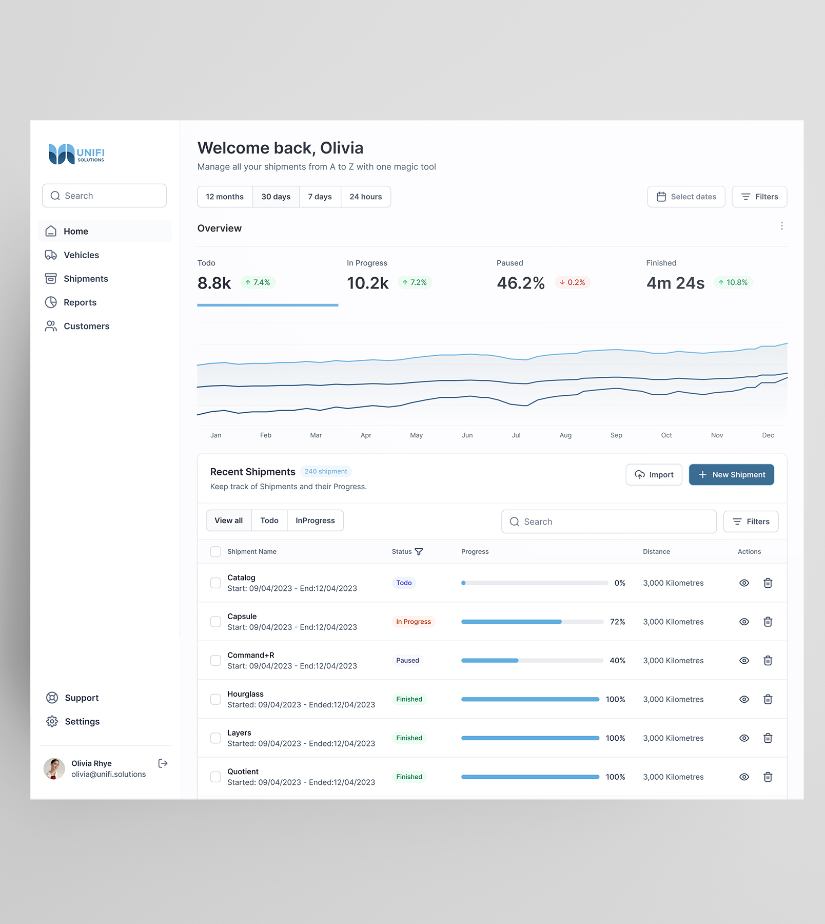
All Shipments Listing – Fleet Management System
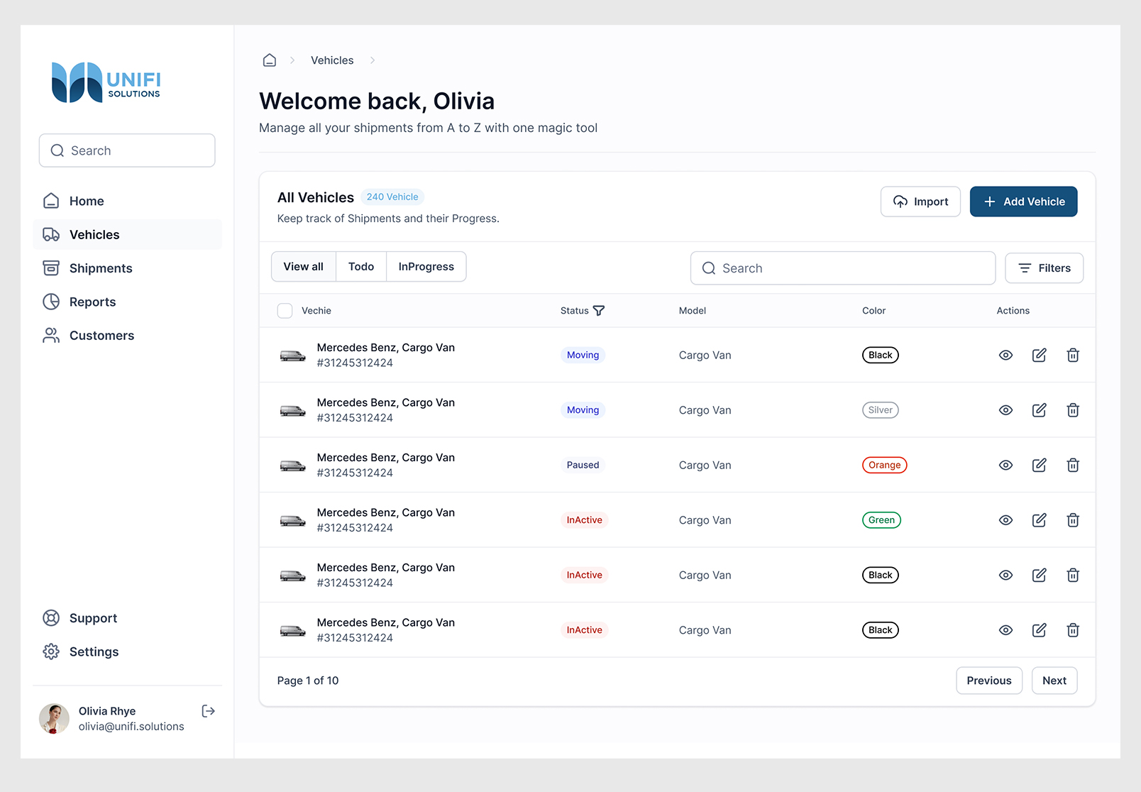
Vehicles Listing – Fleet Management System
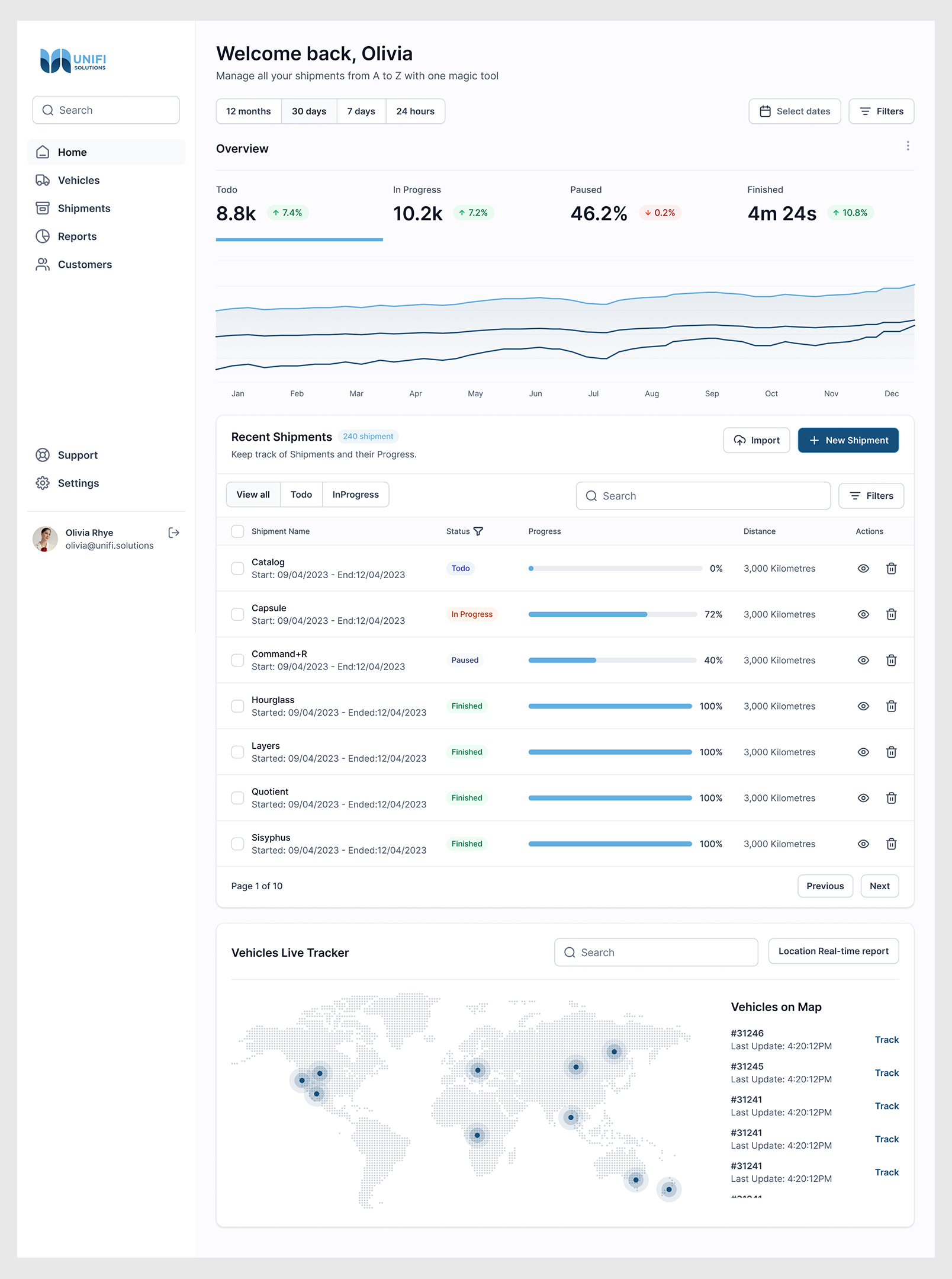
Home Screen – Fleet Management System
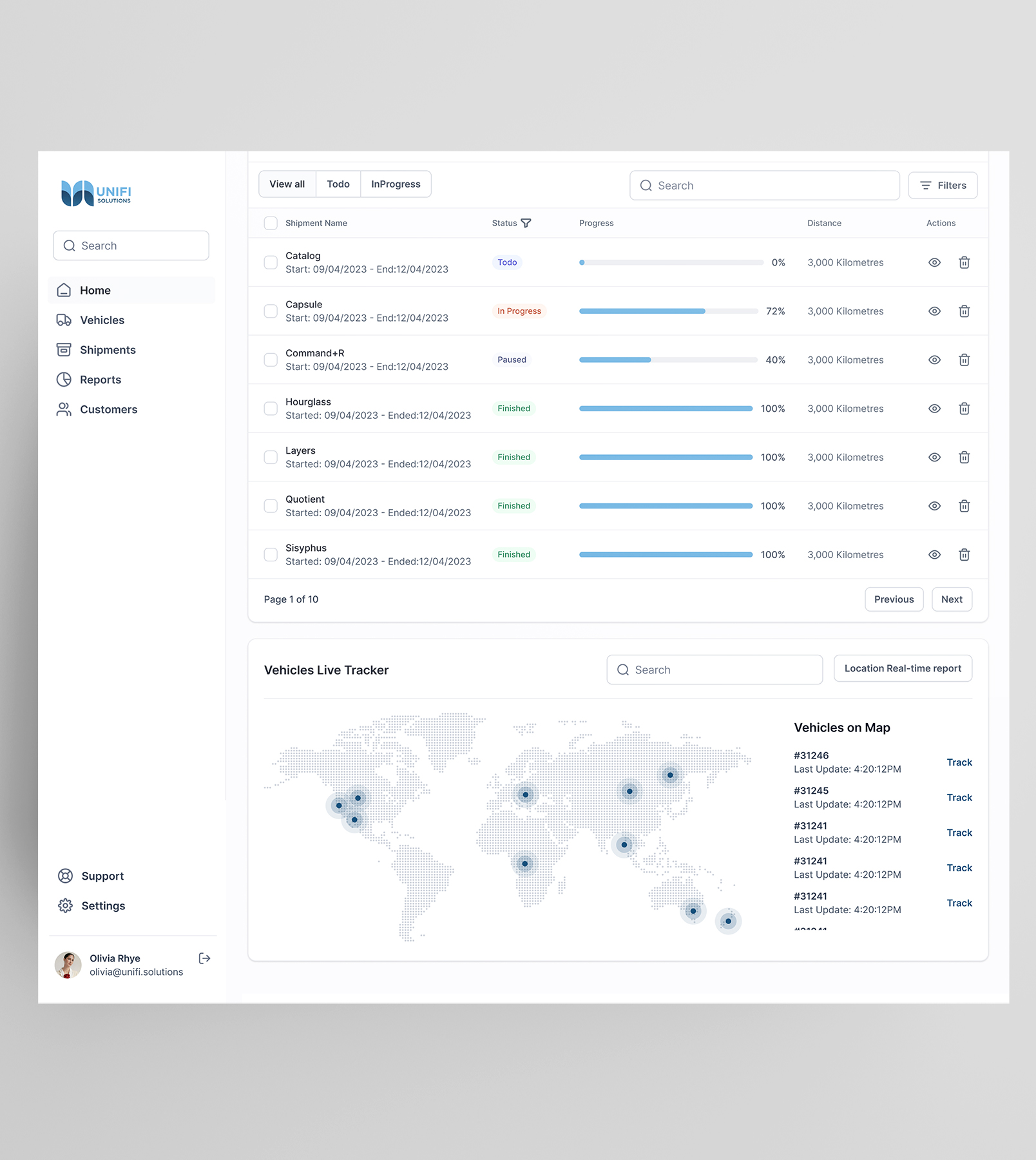
Home with card of Vehicles Live Tracker – Fleet Management System
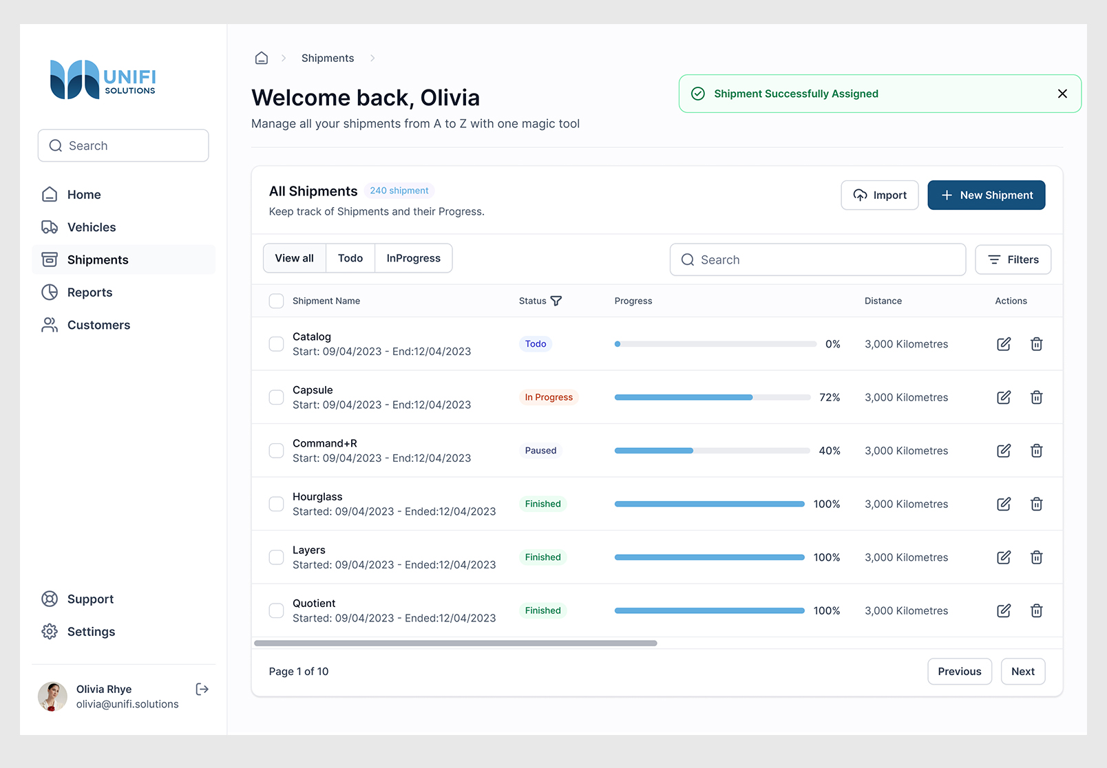
Shipment Successfully Assigned Message – Fleet Management System
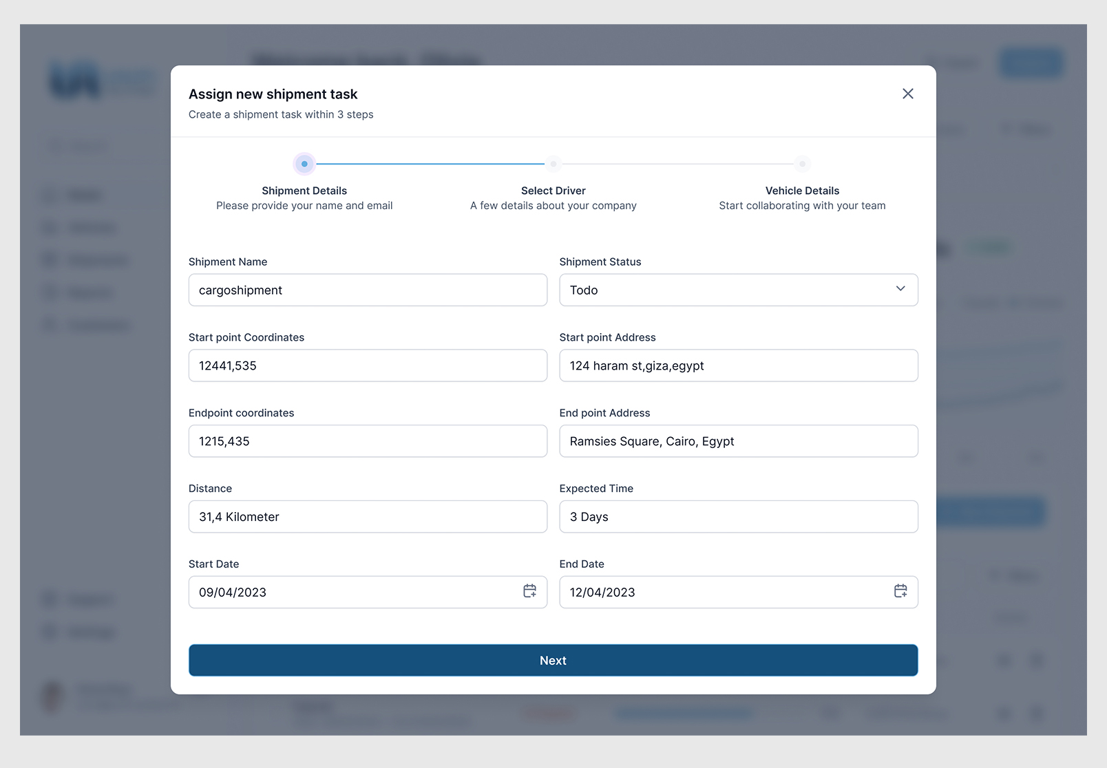
Assign new shipment task - Shipment Details – Fleet Management System
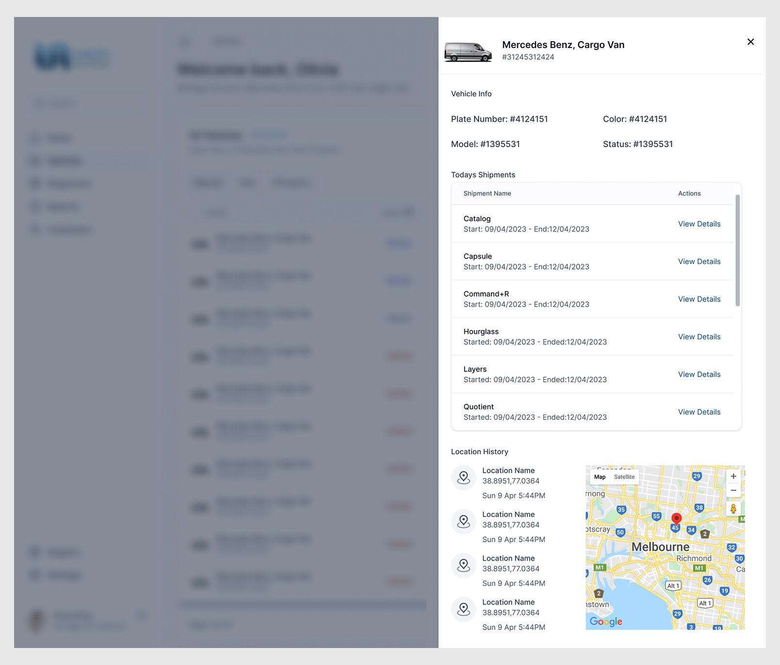
Vehicles Listing details – Fleet Management System
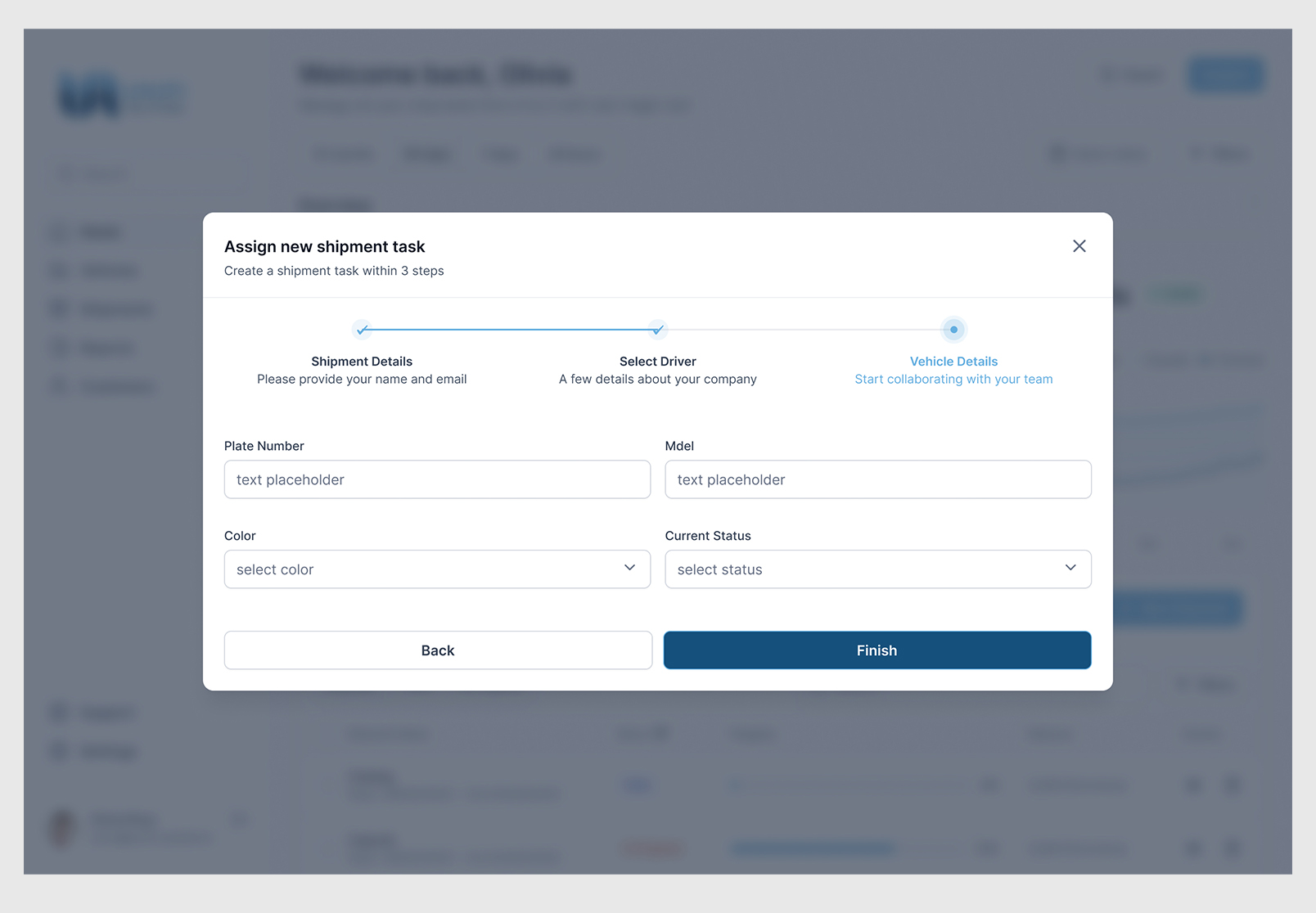
Assign new shipment task - Vehicle details – Fleet Management System
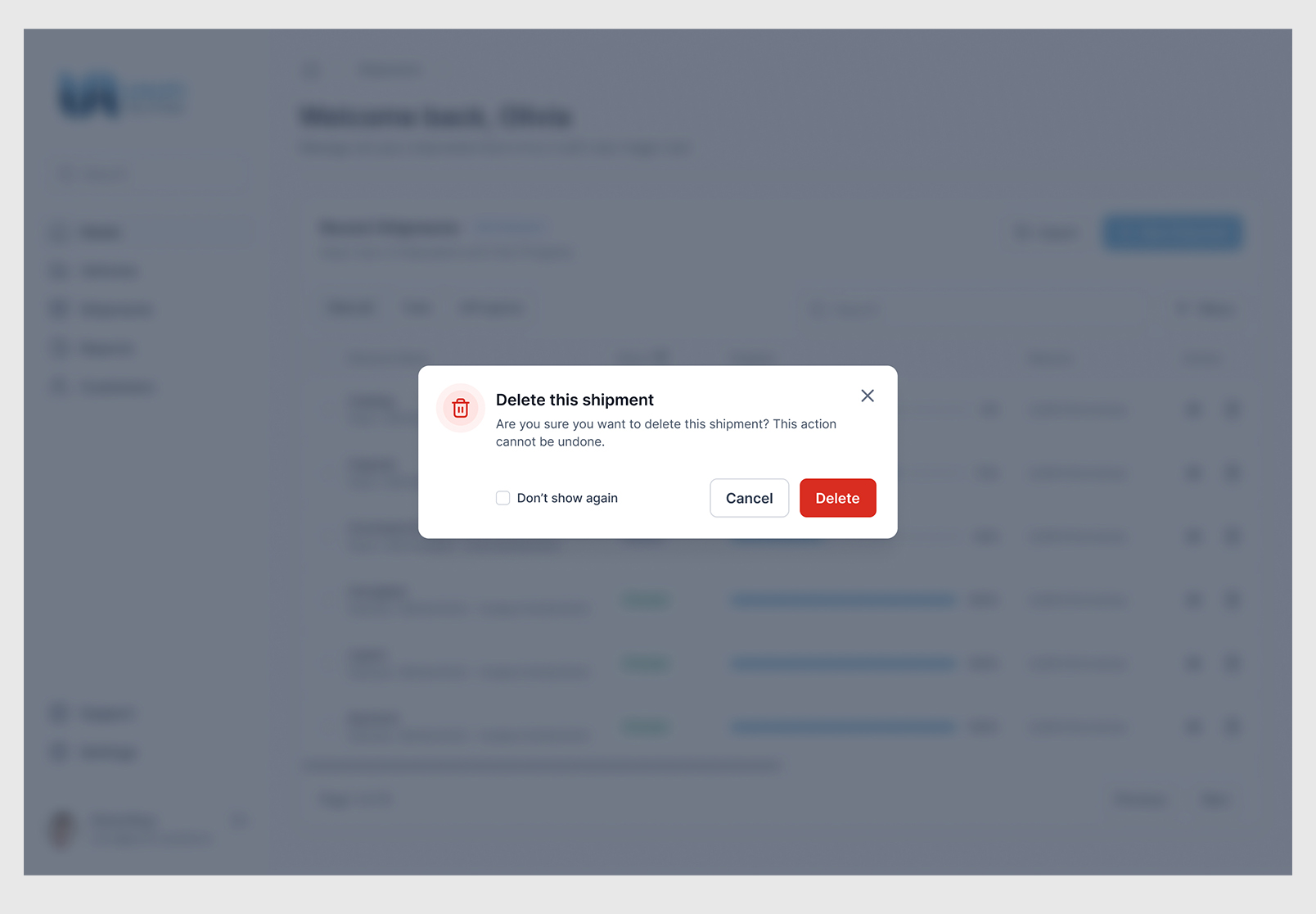
Confirm Delete shipment – Fleet Management System
The Process Behind those screens
Firstly for the research phase
Due to the limited time available in comparison to the number of requested items, I opted to use boosters. Initially, during the research phase, I utilized ChatGPT to identify the leading web application solutions for fleet management. To achieve this, I asked ChatGPT a question on UI design for fleet management apps, and it recommended several websites:
- Fleetio: Fleetio is a cloud-based fleet management platform that provides tools for tracking and managing vehicles, equipment, and drivers. Their UI design is clean and intuitive, with a focus on usability and ease of navigation.
- Fleet Complete: Fleet Complete is another popular fleet management app that offers real-time GPS tracking, driver safety monitoring, and vehicle diagnostics. Their UI design is modern and visually appealing, with a customizable dashboard that allows users to quickly access the information they need.
- Verizon Connect: Verizon Connect offers a suite of fleet management tools, including GPS tracking, route optimization, and maintenance scheduling. Their UI design is simple and user-friendly, with a color scheme that is easy on the eyes and intuitive navigation menus.
- Fleetmatics Reveal: Fleetmatics Reveal is a comprehensive fleet management solution that includes GPS tracking, fuel monitoring, and driver behavior analysis. Their UI design is sleek and modern, with an emphasis on real-time data visualization and customizable reporting.
- Omnitracs: Omnitracs is a fleet management app that provides tools for managing safety, compliance, and fuel efficiency. Their UI design is highly customizable, with a range of widgets and dashboards that can be tailored to the specific needs of different users.
Overall, the key to a great fleet management app UI design is to prioritize usability, ease of navigation, and real-time data visualization. By drawing inspiration from some of the top apps in this space, you can create a UI design that meets the needs of your users and helps them make better decisions about their fleet management strategies. ~ ChatGPT
Then
Upon briefly exploring and examining the shared demos and screenshots of the identified solutions on their websites, I proceeded to the next stage of comparing the requirements outlined by Unifi with the visual representations.
Secondly:
To consolidate all the requirements into a single location, I created an initial flowchart on paper.
Thirdly:
In my quest to find a suitable UI kit that met my requirements for design assets and charts needed to convey my ideas and concepts for the dashboards, I drew from my visual experience and analyzed the competitors’ solutions. Eventually, I narrowed down to the top two UI kits that matched my needs.
- Untitled UI
- Figit
and I choose Untitled UI
FYI:
Figma UI kits are pre-designed user interface (UI) component libraries that designers can use as a starting point for their design projects. These kits contain a variety of pre-made UI elements such as buttons, forms, icons, navigation menus, and other common interface components that can be easily customized and adapted to fit a specific project’s needs.
Figma UI kits are designed to save designers time by providing pre-built, reusable UI components that can be quickly added to a design project. They can help ensure consistency and efficiency throughout the design process, particularly for teams working on collaborative projects.
Figma UI kits come in different styles and themes, such as material design, iOS, Android, and more, so designers can choose the right kit for their project. Many Figma UI kits are also free to use and can be found online from various resources, while others may be premium or require a subscription.
Overall, Figma UI kits are a valuable resource for designers looking to streamline their workflow, improve consistency, and accelerate their design process.
Finally:
Using the UI kit, I effortlessly created the aforementioned screens by dragging and dropping components. I also customized the main theme styles and colors to align with UNIFI’s branding guidelines. That’s all there is to it. Additionally, you may review the supplementary deliverables and Figma file below.
Delievrables
I fulfilled the requested requirements by delivering a Figma file comprising all the screens and a prototype. However, I decided to complement the file with a video recording using Loom software. The purpose of the video was to present my design ideas and concepts in a more engaging manner, with particular emphasis on the design process and user experience.
Other Assets
In case you require them for your future projects or if you plan on using the same tools as me more extensively, these are the additional design assets that I utilized.
