The Story
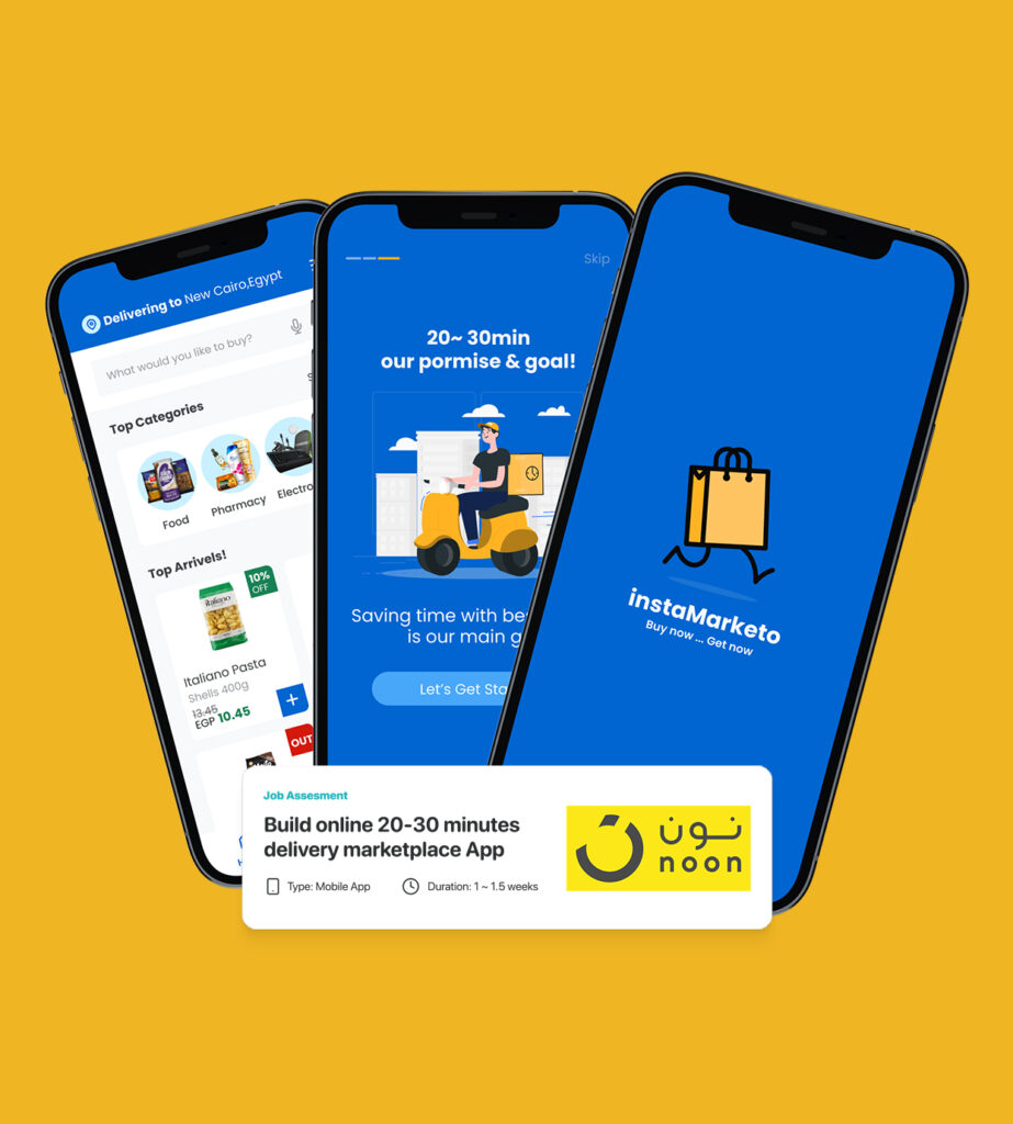
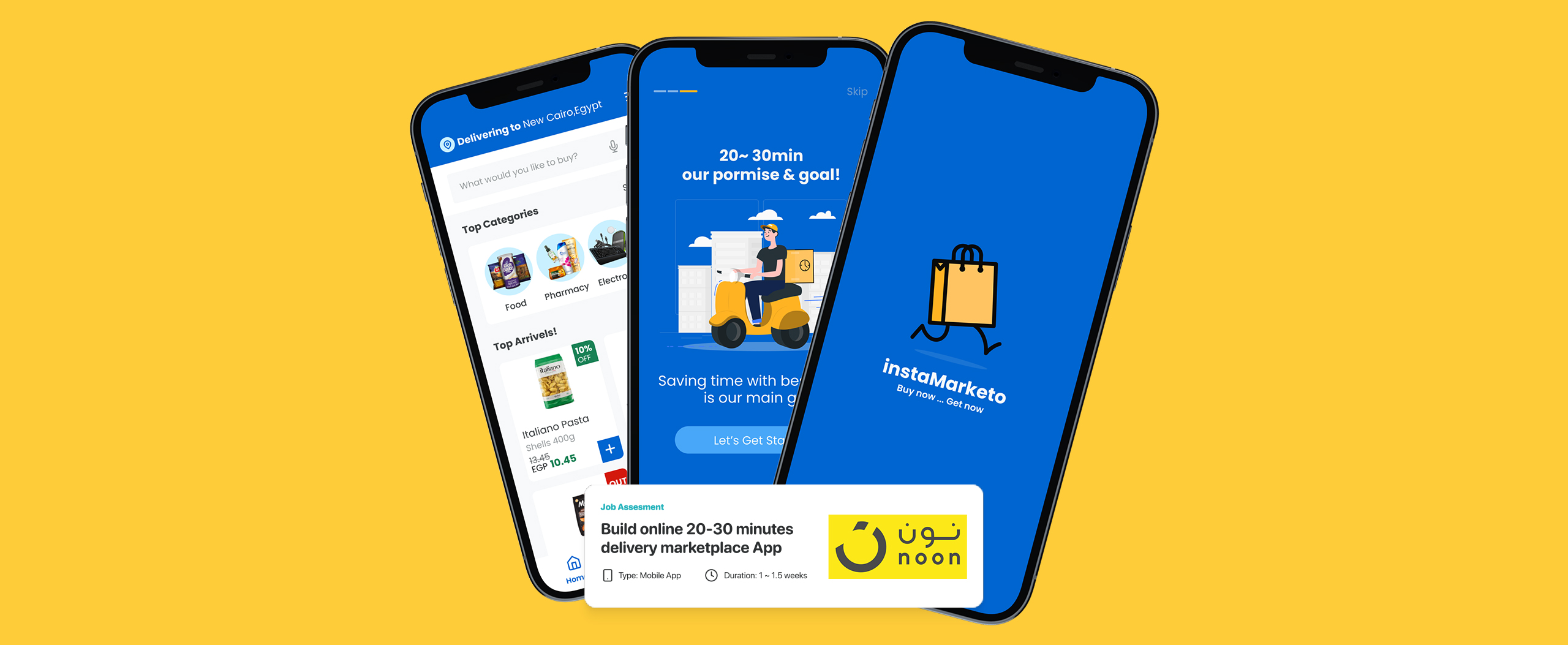
This Design case study started as part of the hiring process for the Senior Product Designer position at Noon online marketplace, I was given this task after successfully passing the initial screening process and a mobile interview with HR representative, Aya Ali, who sent me the task via email.
Noon Task Brief - Design case study
A new online marketplace wants to build an app that can deliver any item (Grocery, Electronics, Accessories) within just 20-30 minutes once the user places the order.
Requested Deliverables
- Design an app checkout experience with the above feature(s)
- Conduct a research which validates your decisions
- Benchmark visual inspirations and great visual aesthetics
- A component driven design system (Optional, but good to have)
- A prototype to demonstrate the process flow
Analyzing the brief & requirements
- Idea: Online marketplace deliver orders within 30min.
- Scope: Research to Prototype.
- Device: Mobile App.
Grocery app design - Project High Goals
- Build full app experience based on well market & competitors research.
- Build design system based on benchmark visual inspirations.
- Build prototype to demonstrate the process flow.
My Role
- Build app information architecture (App map, user scenarios, stories, and flows).
- Setting design direction and build design system.
- Implemented UI Design and prototype.
Let's Understand the Business first
Understanding Business is the best way to build a product business understanding is crucial for a UI/UX Designer working on an online marketplace app that promises to deliver any item within 20-30 minutes. Understanding the business objectives and target audience helps a UI/UX Designer to create a grocery app design based on user-centered design that supports the business goals and delivers a competitive edge. This can lead to the creation of an efficient design that streamlines the app’s operations, reduces errors, and increases productivity, ultimately enhancing customer satisfaction.
Understanding Business Process
- Fist step to understand Business is to listen well for the stakeholders and the business owners because he is the most on on the table understood the needs
- Start your own business and market research as you are the owner and try to do your best to get closer to the user problems and user needs as much as you can, and in this type of task it’s all about secondary research especially if it’s a generic field like E-commerce ~ Never reinvent the wheel!, and here are the top resources I used to understand the problem:
- Save Time & Money with the Advantages of Online Grocery Shopping ~ Article from: foodtown.com Read it.
- How Would Grocery Delivery Apps Benefit Your Business? ~ Article from: kyanon.digital Read it.
- THE ONLINE GROCERY REPORT market stats, trends and companies to know ~ Article from: businessinsider.com Read it.
- Consumers forgoing online grocery are motivated by price, report finds ~ Article from: grocerydive.com Read it.
- Types of grocery Go-to Strategies For Six Types of Grocery Apps ~ Article from: rubygarage.org Read it.
- National Grocers Association Previews Consumer Survey Results ~ Article from: nationalgrocers.org – Read it.
- Food shopping user research to user personas ~ Article from: medium.com Read it.
- QuickShop e-groceries — a UX case study ~ Article from: uxdesign.cc Read it.
- Grocery App: Case Study Of The Online Grocery Shopping ~ Article from: uxplanet.org – Read it.
the app discovery process,Where I search for the top competitors mentioned by stakeholders and group them together. I then analyze each app to identify common and unique features.
Grocery App Business Strategy board summary
The business strategy board helps UI/UX designers understand the company’s goals, target audience, and market trends, enabling them to create user experiences that align with the company’s objectives. By prioritizing features and functionality, designers can make informed design decisions that impact the company’s success.
Obstacle problem
- Today’s busy modern life customers doesn’t have time for shopping.
- Variation of product is untrusted as the offline experience force users to visit many supermarkets for getting all their.
- User stroll heavy weight grocery carts and stand in a long line for the billing process.
- Shoppers always get upset when finding their needed products are all sold-out at the store.
- Many customer have a problem of buying all their needs one time as the cash is run out of them.
- Local market delivery isn’t accurate on the delivery time.
Objectives
- Convenient experience and customer time saving.
- Free groceries shopping anywhere and any place.
- Checkout completed easily with just a few clicks.
- Enhance your customers’ pleasant and smooth grocery shopping experience with book that product in advance or set notifications up when it comes back in stock.
- Enhance the recurring order items by a scheduled Orders plan.
- Secure Payments Options with deals of instalment third party.
- Browse on Your Time get order on the deticted time
Customer segment
- stay-at-home mum.
- single-man
- Working family member have no time for shopping
- the elderly people who can’t go market or carry bags
Measurement of success
- Conversion rate
- Customer lifetime value
- Customer Engagement
- Customer Retention
Direct and indirect competitors Apps general discovery
After understanding our business scope let’s discover what others do it’s not a competitor analysis more than a (Competitors ideas and features discovery)
World Wide
General discovery spotlight
Following a comprehensive analysis of other similar apps, I began listing the common features shared across all the competitors. This helped me to validate the existing features in our app and identify any missing major features. In such cases, I would consult with the product manager or business owner to understand the business case for not including the feature. This process of listing the top common features across all apps in the market helped us to select the appropriate features and streamline our product flow.
Main Features
- User Profiles
- Quick Shopping List
- Co-creating and Sharing Options
- Advanced Search
- Multi Payment Options
- Price comparison
- QR Scan for fast search
- Shipping options
- Order summary
- Returns and checking the return status
- Checking the shipping status
- Flash sales and discounts
- Barcode scanning
- AI Voice Assistant
- Smart Suggestions
- Recommended Products
- Chat Support
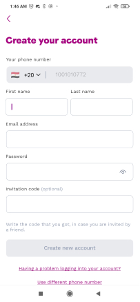
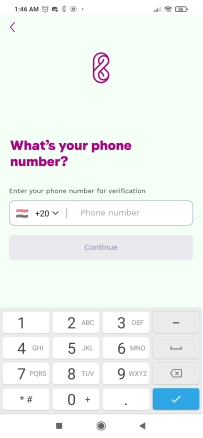
- Easy login & registration
- Easy login & registration
- Easy login & registration
- Product gallery
- Shopping cart
- Checking item availability in specific locations
- Item availability reminder
- Personalized product recommendations & item feeds
- Membership options
- Loyalty programs
- Coupon codes
- Allow reviews of your app
In Detailed discovery
During this phase, my approach is to revisit the apps we previously listed, but this time I conduct a thorough analysis of our direct competitors. This involves examining both the user experience and user interface of each app that falls under the umbrella of direct competitors, who target the same segment as us, whether it’s in Egypt, the MENA region, or globally, like:
In Egypt:
MENA Region:
- NowNow is your all-in-one delivery app that delivers everyday-essentials to your doorstep within minutes. From grocery shopping to pharmacy delivery.
World Wide:
- Beelivery Groceries to your door in as little as 15 minutes.
- Grocemania Order from any local grocery shop get order in minutes!
- Gorillas Groceries at retail prices, delivered in 10 minutes.
- Weezy local UK groceries to your doorstep in a jiffy.
- Gopuff Daily essentials delivered in minutes.
- Getir From snacks to beverages to your door in minutes.
- Zapp your favorite drinks, snacks and grocery essentials in 20 mins.
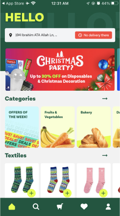
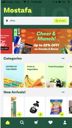
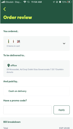
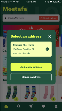
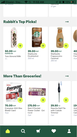
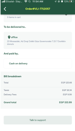
During my analysis of the competitors’ in-app details, I take a thorough approach by installing each app and placing real orders (if the app supports my country), capturing screenshots throughout the entire process for detailed study. I then analyze each competitor from three key perspectives: Design, User Experience, and Checkout Flow. This allows me to identify what makes their design exceptional, what enhances the overall user experience, and how the flow of the checkout process is optimized, starting from the product addition stage at a high level.
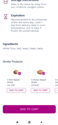
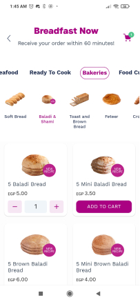
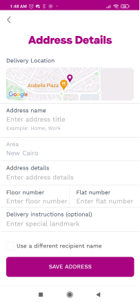
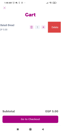
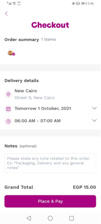
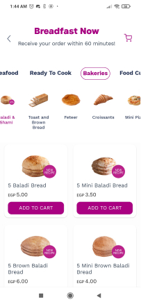
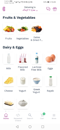
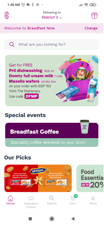
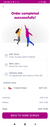
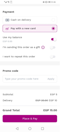
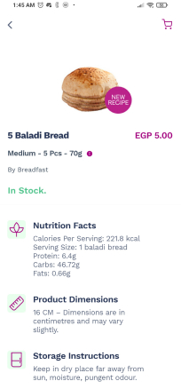
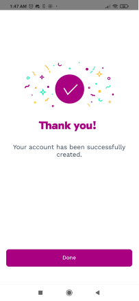
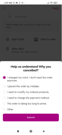
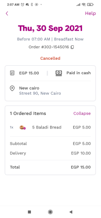
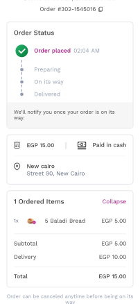
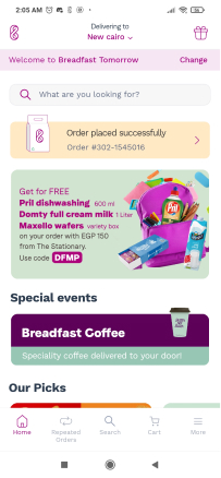
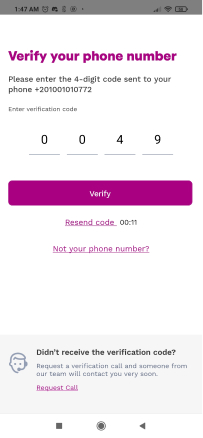
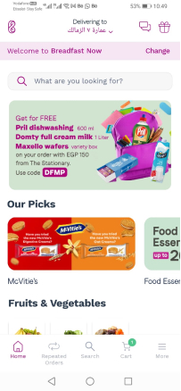
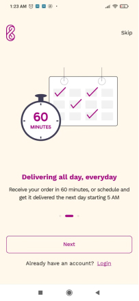
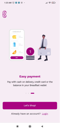
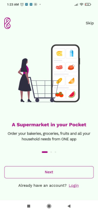
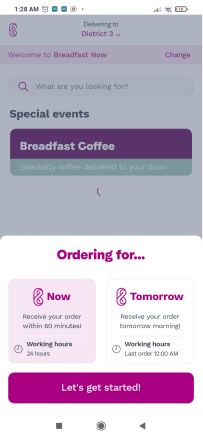
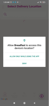
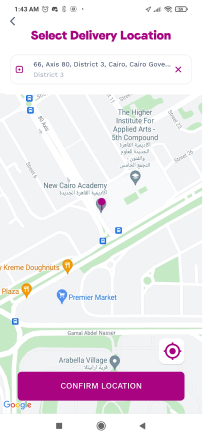
1- Breadfast
What’s Great about design.
- Simple & Clear
- Product is the main
- Consistency of brand color usage
What’s great about experience
- Customizing experince by selcting Now or tomorrow from beginig.
- Product Details and description listing
- Order repeating experince
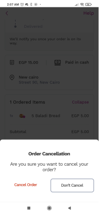
Checkout experience flow (starting from adding product – very high level)
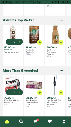
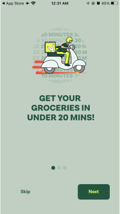
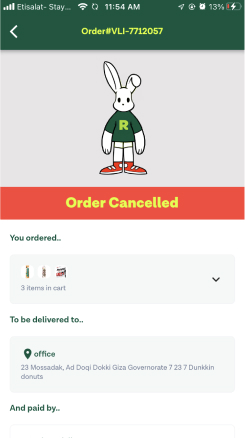
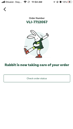
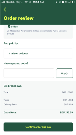
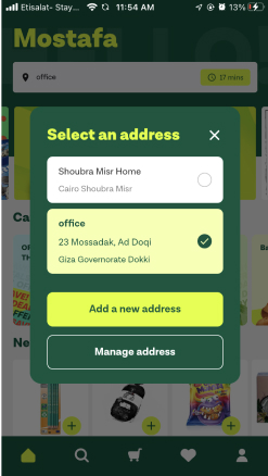
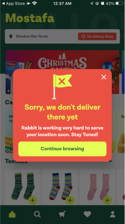
2- Rabbit
What’s Great about design.
- Animation and characters usage
- Terminology and personal spech
- Products categorization style
What’s great about experience
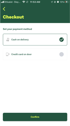
- Credit card on door!.
- User always aware about the dlivery time.
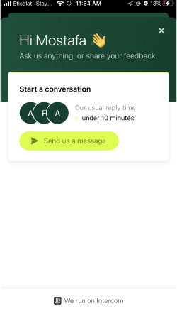
- Support is superly accesable and the one click checkout experince
Checkout experience flow (starting from adding product – very high level)
Time to build our own Grocery Mobile APP
After this research about what’s our competitors do it’s time to collect all together then start building and building here not just a design it’s a wide range of deliverables including:
- User Personas, Joureny,Stories, Scenarios & expectations.
- App information architecte ,site maps, user flows.
- Design direction, design system, ui design & prototype.
User Persona ~ for whome we are building this high level view
let’s organize the shelf
After studying competitors features and our users needs which gathered from secondary research and customer discovery let’s sort the main features
Account
- Login
- signup
- User profile
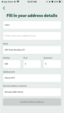
- Setting location
- Orders History
- Change Language
- Co-creating and Sharing Options
Discover & Search
- Product gallery
- Detailed product descriptions
- Recommended Products
- Product scores and reviews
- Price comparison
- Product filtering and sorting
- QR Scan for fast search
- AI Voice Assistant
- Product Alternatives
- Item availability reminder
- Repeat order
Buy & Checkout
- Add product to cart
- Quick Shopping List
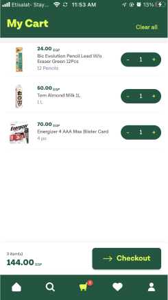
- Shopping cart
- Shipping options
- Order summary
- Membership options
- Multi Payment Options
- Loyalty programs
- Flash sales and discounts
- Coupon codes
- Order as a gift
Order Track
- Order Summary
- Clear Order tracking
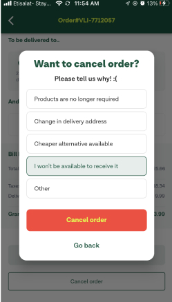
- Cancel order
- Add to order
- Contact Delivery
- Contact Support
The story behind each feature
Using user stories is a beneficial approach as it allows all team members to understand the situation and user perspective. While it’s typically a task for the product manager, as a product designer, I enjoy being involved in the process from the outset.
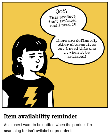
Item availability reminder
As a user i want to be notifed when the product i’m searching for isn’t avilabel or preorder it.
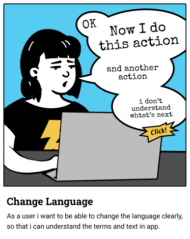
Item availability reminder
As a user i want to be notifed when the product i’m searching for isn’t avilabel or preorder it.
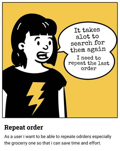
Repeat order
As a user i want to be able to repeate odrders especially the grocerry one so that i can save time and effort.
Loyalty programs
As a daily user i need a loyalti program including cashbacks and coupons so that i can save more money.
This Stories is briefly a preview for the full User Story Backlog check this notion file
App direct main user story and scenarios (Just a sample for scenarios is represented)
Main User Story:
As a user i want to able to buy all my need especially the groceries and fresh
products as fast as i can.
- Scenario 1: After signup user will check the available products search for what i need and checkout.
- Scenario 2: Open app and repeat my last order with adding some customizations on the order it self
and select a diffrent location for delivery.
1st Scenario Journey map
Simple preview for the user flow digram for the grocery app user flows
Other flows?
To expedite the process, I shared the main user flow for ideal scenarios. However, it’s essential to create and evaluate the flow for alternate scenarios with the Tech/Business team before moving forward with the sketching and design phase.
Time to Start designing
Upon completing the research phase, my responsibilities in this task extend from the branding phase to the prototype phase. Therefore, I need to:
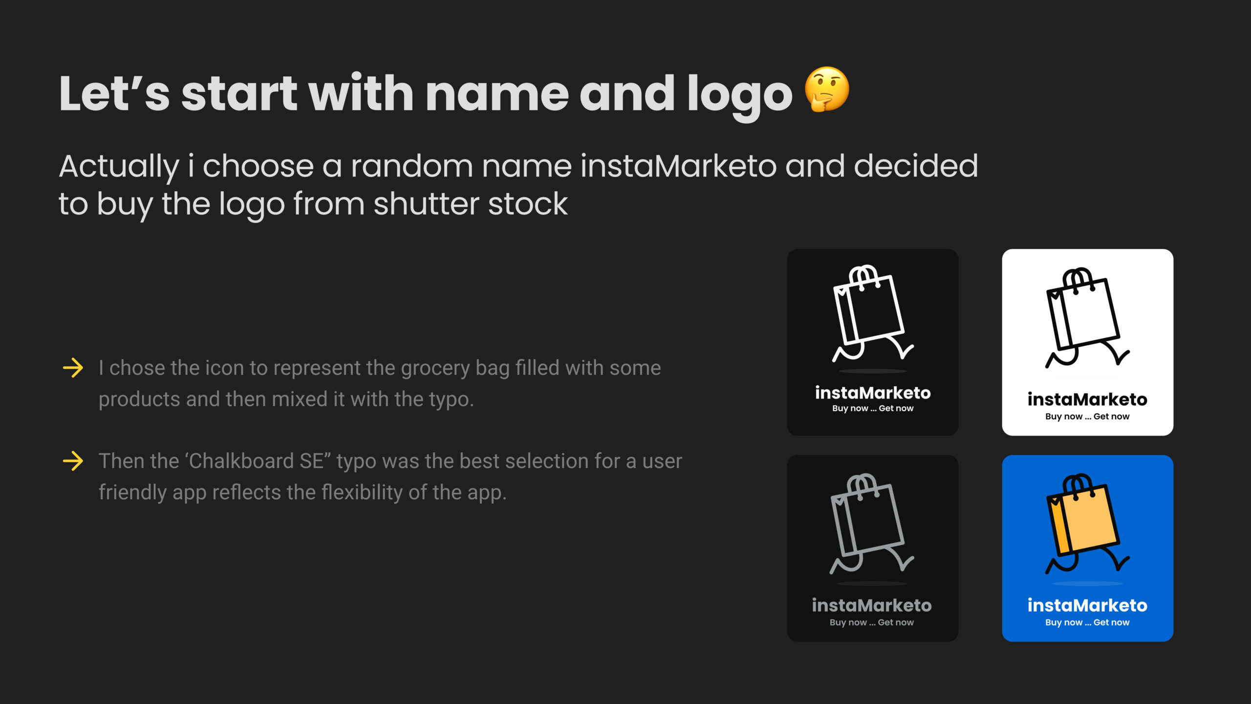
- Find name, create logo and set the design direction
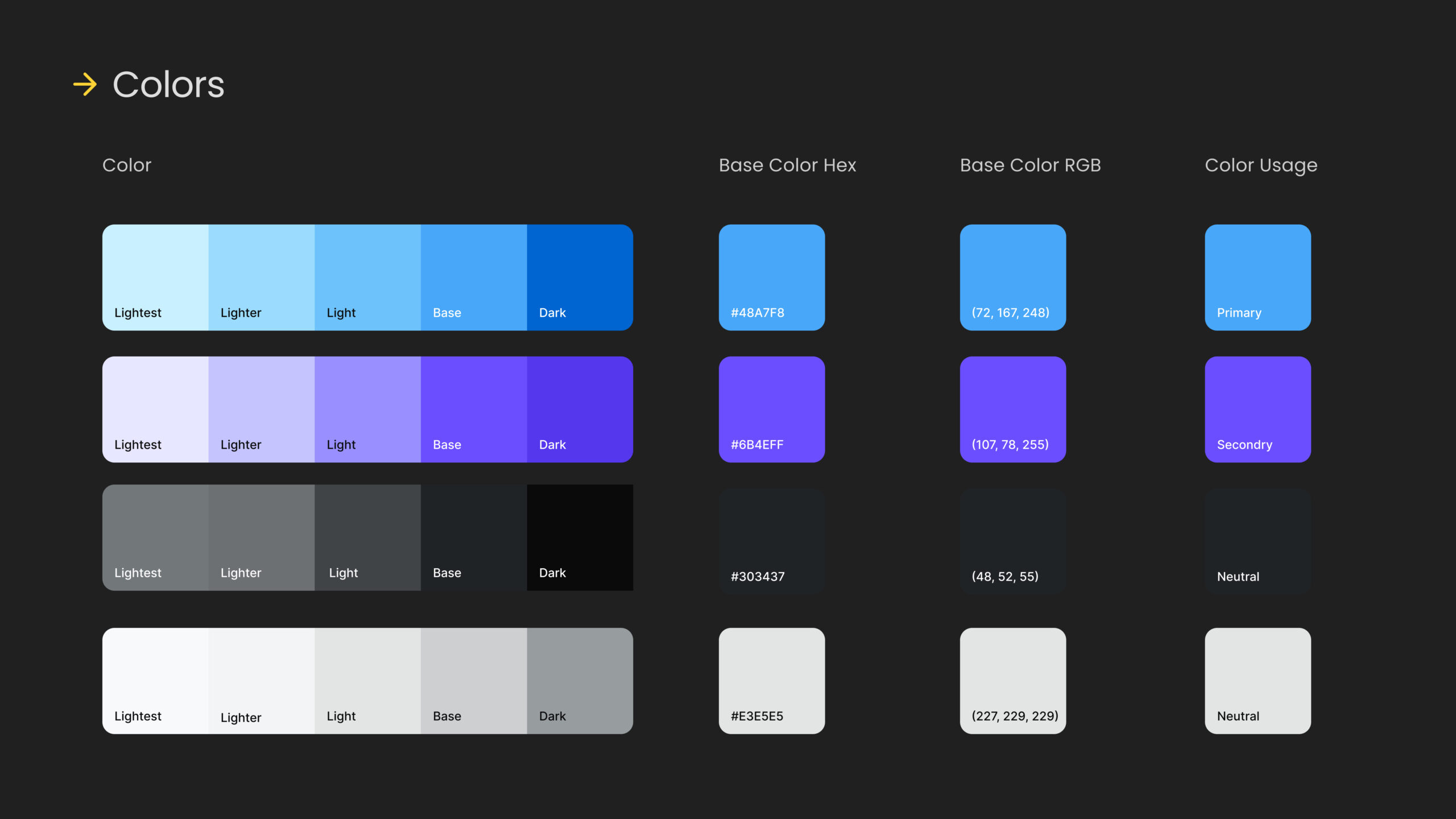
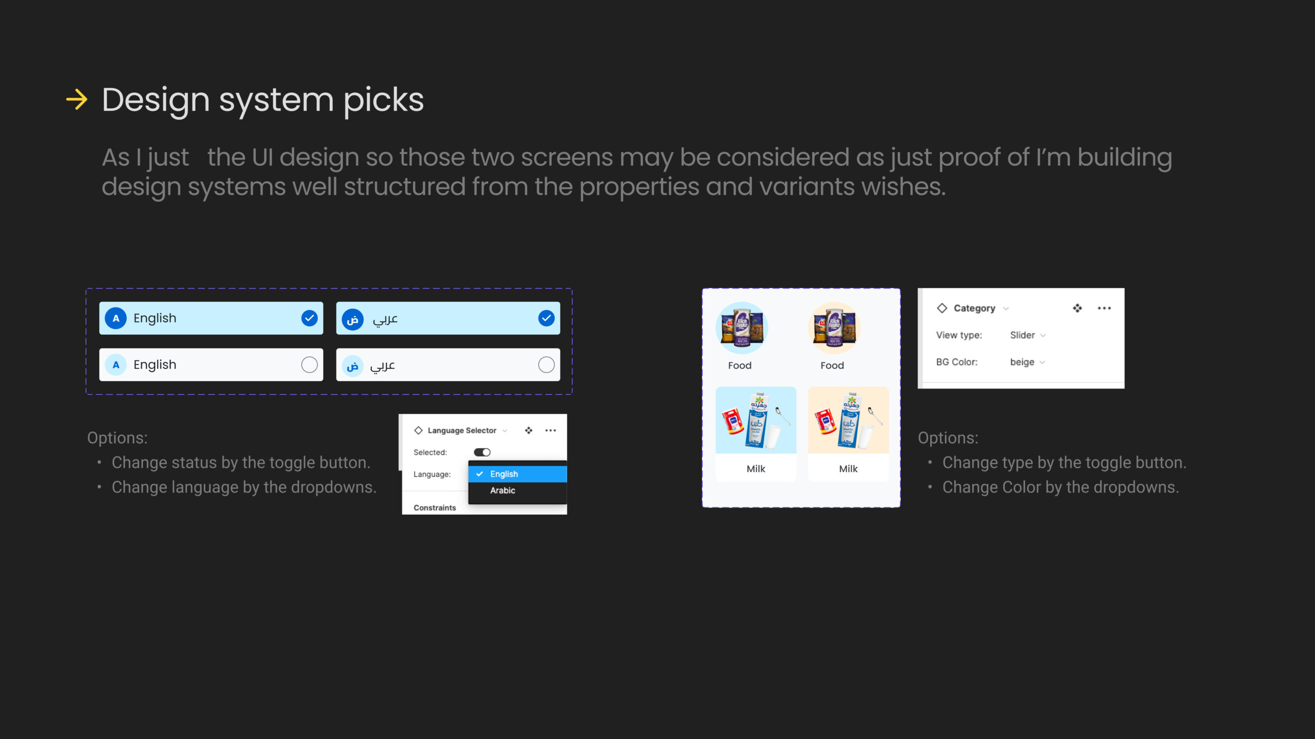
- Build sketches and design system based on the flow.
- Build in App animations and Prototype.
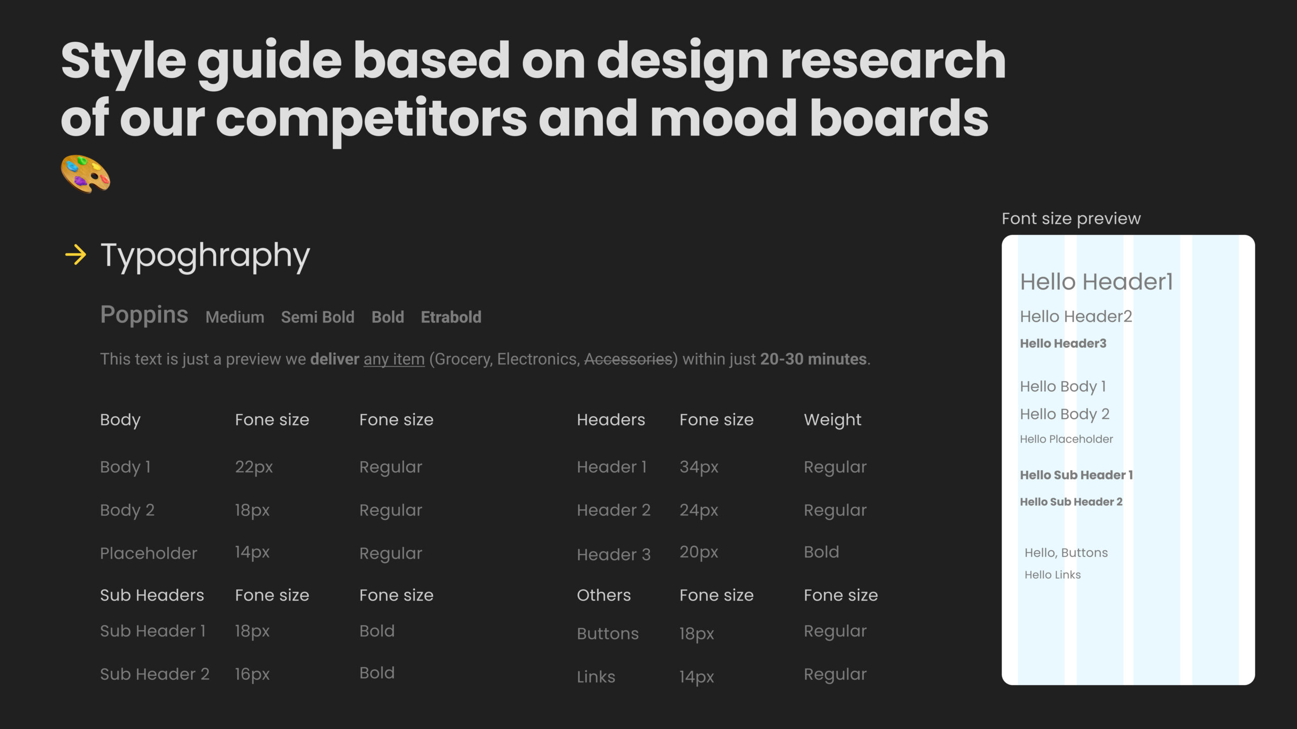
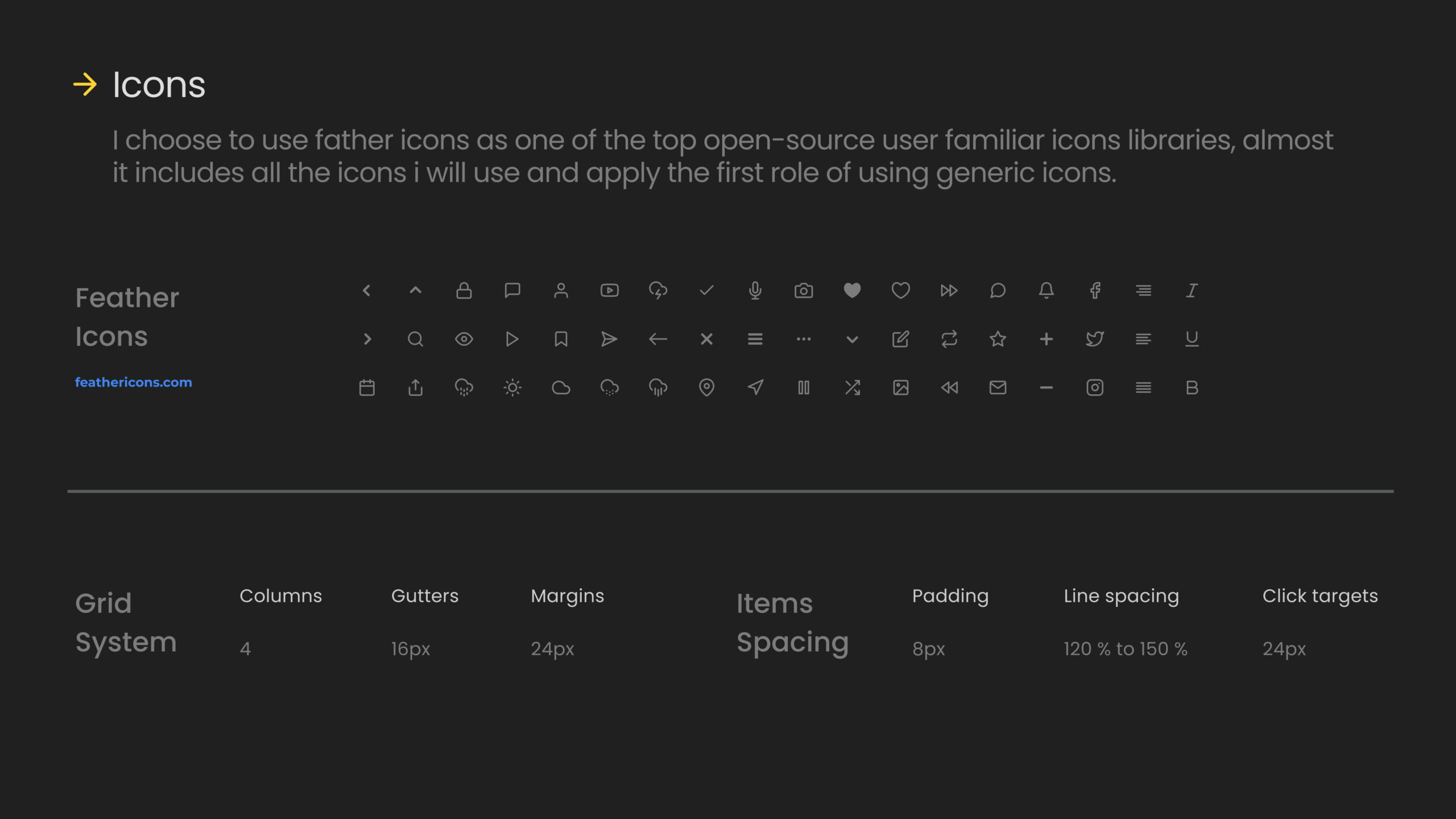
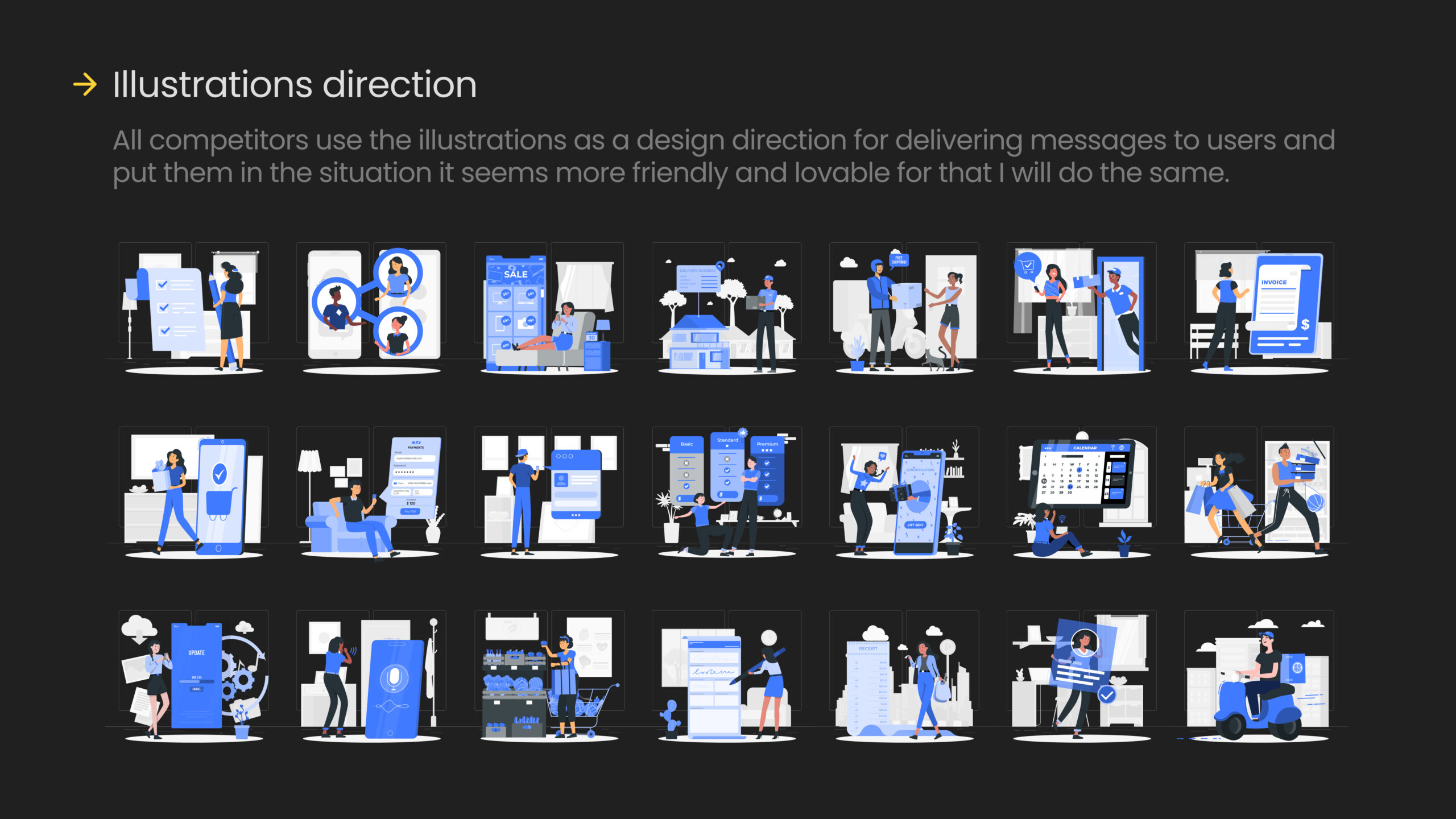
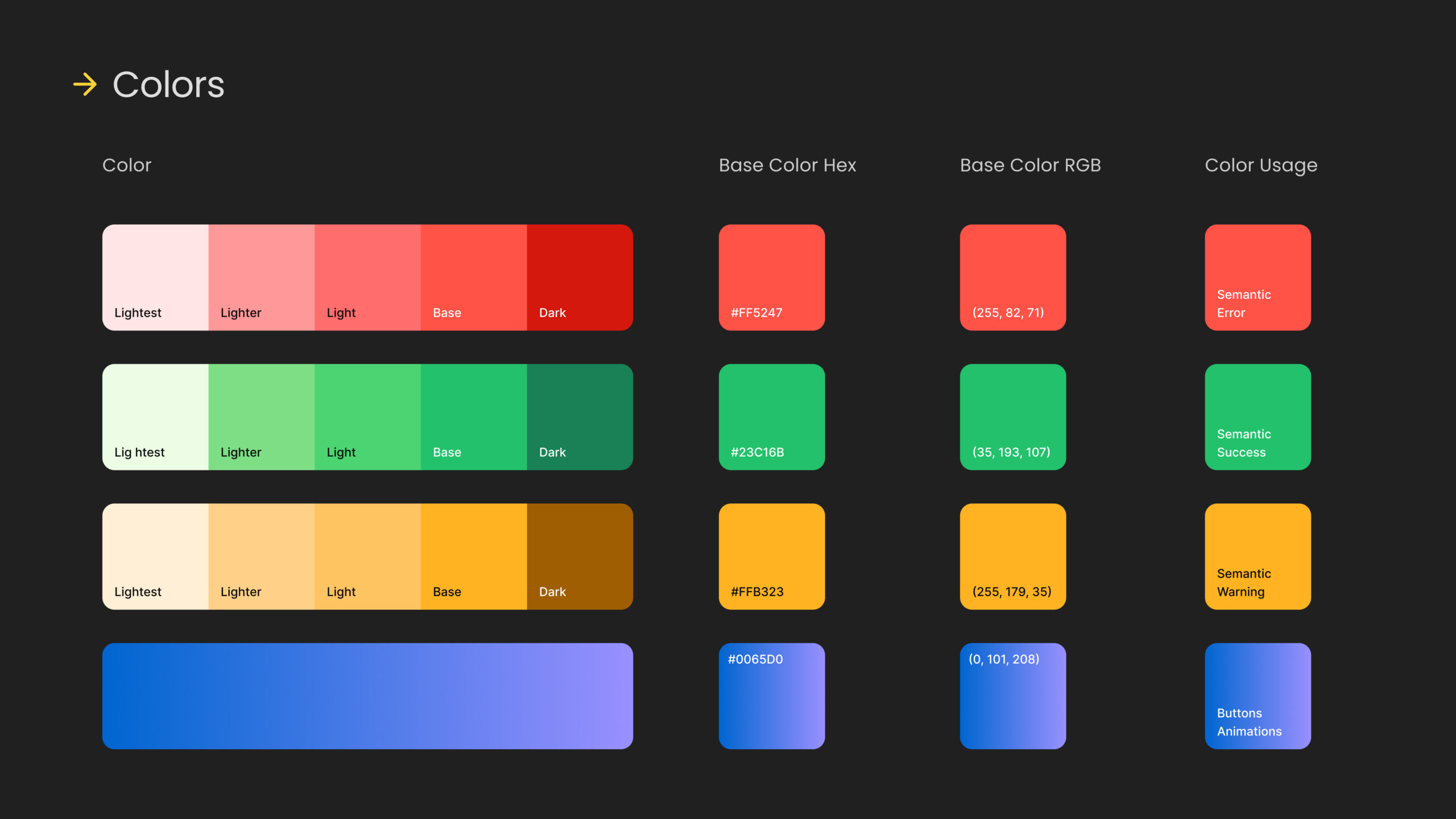
For the design phase I will pick some slides from the bechance presentation afterwards will list the UI Mobile screens
Final Screens
Below you’ll find the complete UI design screens for the grocery app flow, covering everything from creating an account to rating products, including purchasing, adding to cart, tracking orders, and reviewing orders.
Better Quality: Check the Full English UI version screens form here
Your turn
Hey there! I wanted to share with you what I have been working on in this design case study, and I would love to hear your thoughts and feedback on what we did well and what we could improve on for next time. What suggestions do you have?
