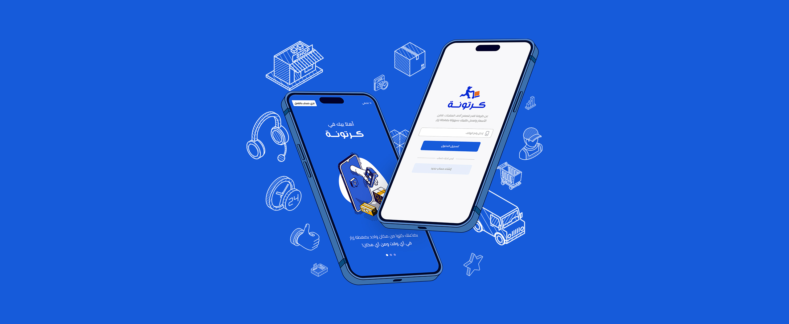
What we did
- Data Analysis
- Heurstic Evalution
- Competitive Analysis
- Rebranding
- Full UX Revamping
Launched in April 2022
The brief
The story began when our Squad Product Manager, Eman Abdoun, got mentioned by the Head Of Marketing, Nour Sobih, about a massive drop in the number of downloads Vs.—the number of registrations for our mobile App.
So we started with a focus group between Product Team, Marketing Team, and data team to search and list the reasons that may lead to this. So the results of this discussion led us to two main points:
- Offline one ( Related to the marketing campaigns)
- Digital on App ( Related to the signup flow)
For the offline
- We started by checking the last campaign’s targeted areas and if it’s an area our app covers or not.
- We found that at the same time, there was a launched campaign on TV and social media all over Egypt; however, we were working on just four governorates at this time.
- It was a lead generation campaign across the marketing and sales team to check the next governorate we can launch based on the number of potential customers who will register on the app.
Is this the main reason?
BIG NO! To clarify, users can register for the app even if we are launching a campaign and installing the app. During registration, the user can create a complete account. Upon logging in, we will notify the user if no retailers are available in their area, as we have yet to offer services in that region.
So let’s check the Digital path, I decided to user our resources on checking this:
- I instructed the customer support team to forward any complaints from users regarding account creation or registration on the Cartona App.
- A heuristic evaluation session was organized for all product designers, including those on my team and the Speakol team, as it is our sister company.
- We initiated data analytics work on our existing data tracking applications, such as Google Analytics, Redash, and Clevertap.
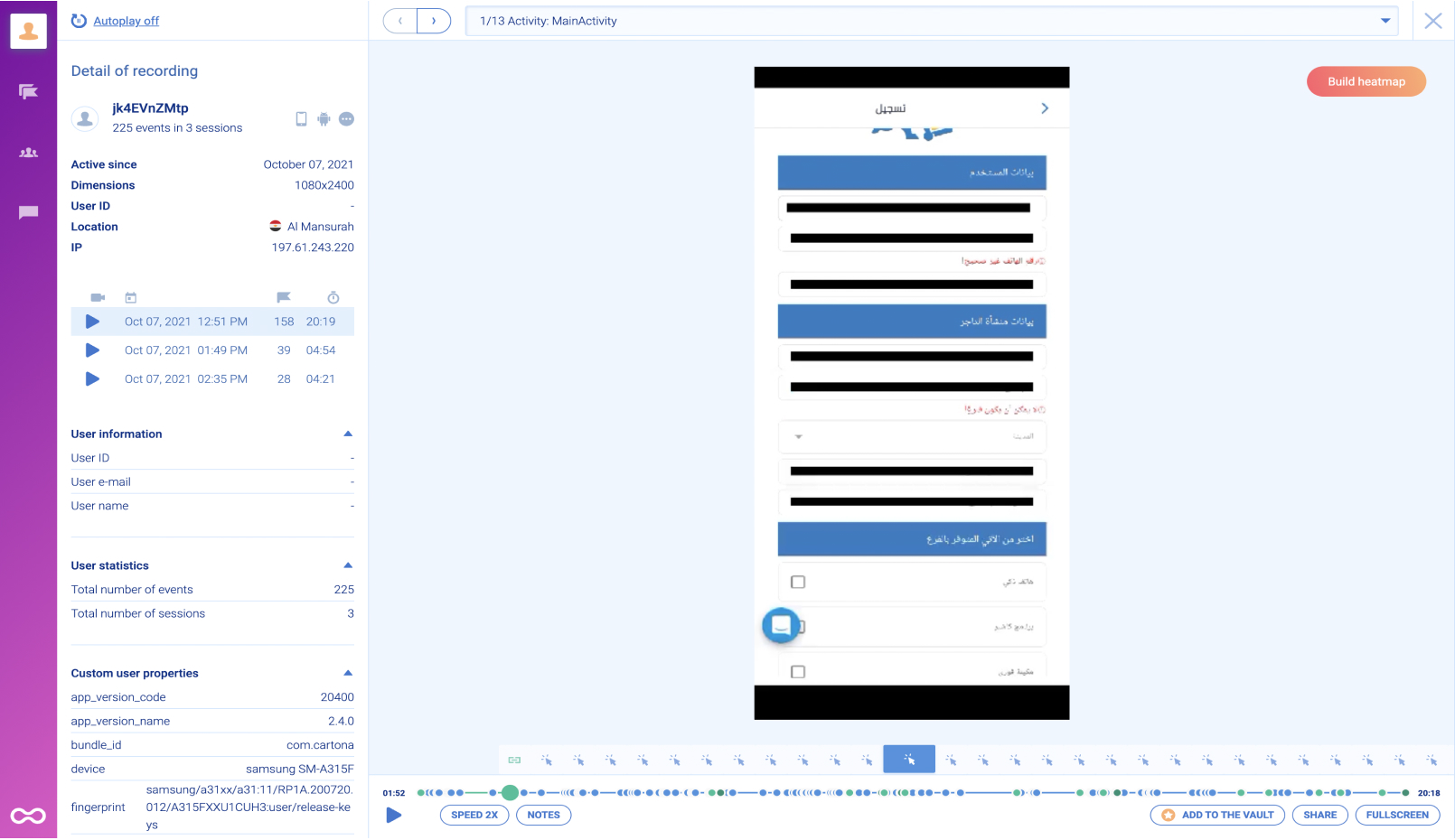
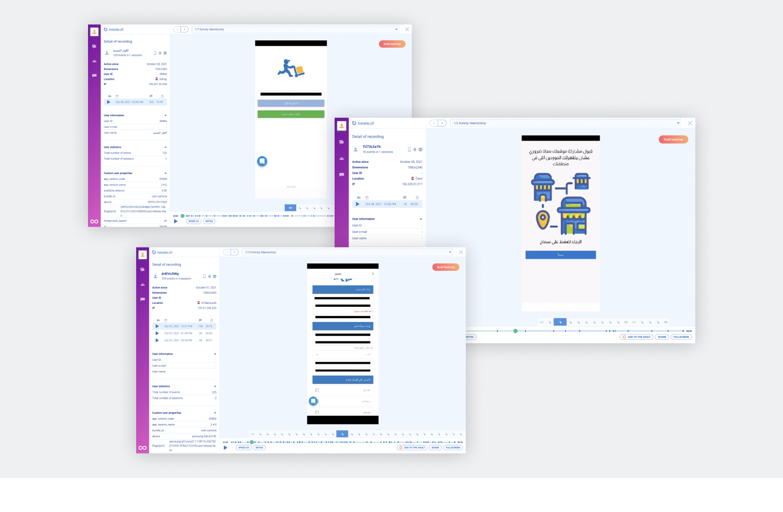
- Another analysis of user behavior in the app was undertaken using a different form of behavior tracking, this time utilizing our implemented session-recorded SmartLook technology.
Then the results of Those activities leaded us to understood that:
Our customers were facing several issues with the registration process, including users in covered areas and the sales team requesting a salesman onsite to register and deliver the app to the user.
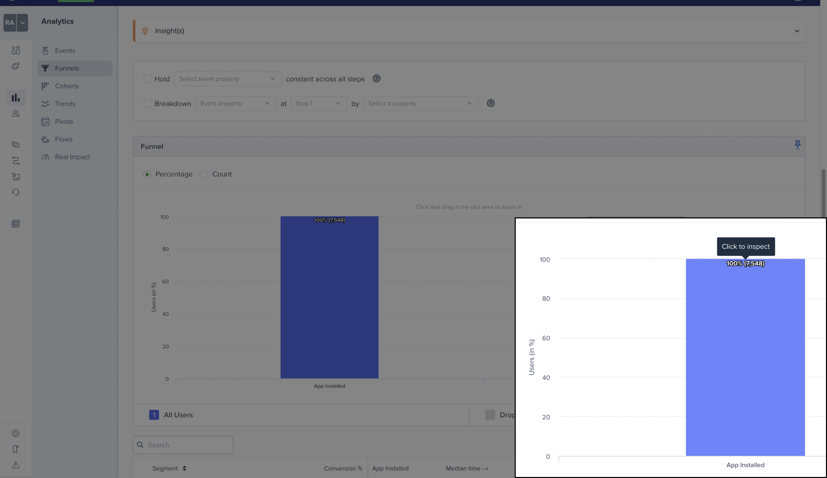
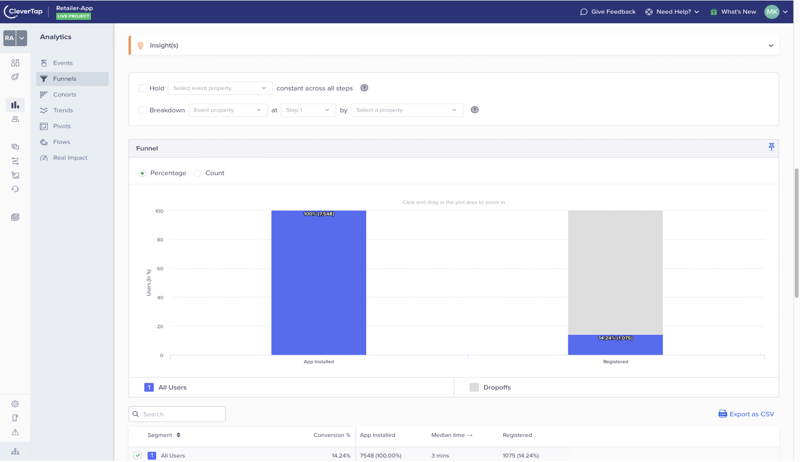
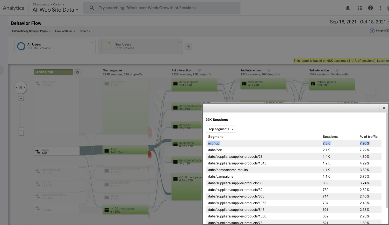
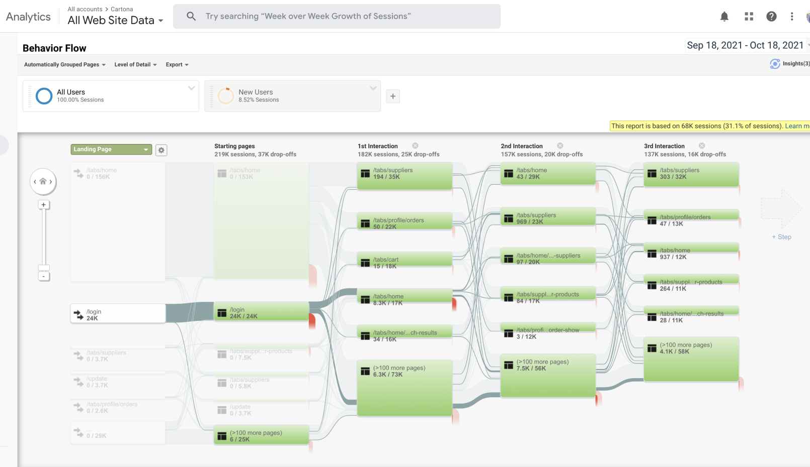
- After analyzing data from Clevertap, Google Analytics, and Redash between September 18, 2022, and October 18, 2022, we discovered the following:
- Only 14.24% of the total installs resulted in registrations.
- Users typically spent 02:30 min on the registration page without successfully registering.
- 7.96% of the traffic went to the sign-up page, and 99% of them dropped off without registering.
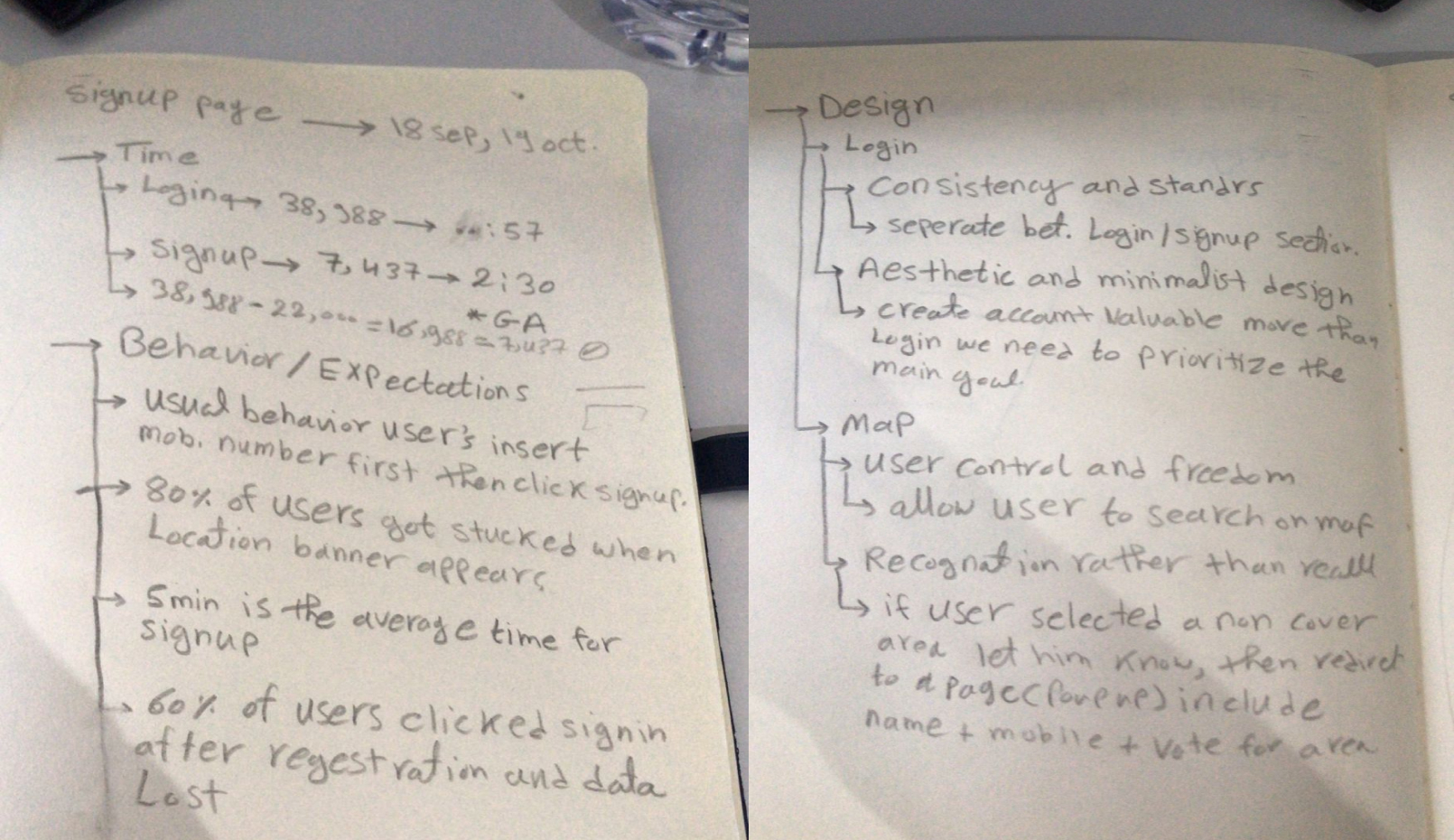
- Using Smartlook recorded session behavior tracking, we monitored user behavior to gain insight into the high drop-off rate. We found that:
- Users usually enter their mobile numbers first before clicking on the “Sign Up” button.
- 80% of users encountered difficulties when a location banner appeared.
- 40% of users clicked on “Sign In” after filling out the registration form instead of signing up.
- During the heuristic evaluation session, which involved our in-house designers, with help of Esraa Allam and Alaa Elsebaiy, we identified several major heuristic principles that were impacted, including:
- Consistency and standards
- Aesthetic and minimalist design
- Match between system and the real world
- User control and freedom
- Recognition rather than recalling definitions
- Help users recognize, diagnose, and recover from errors.
The full flow heuristic evaluation in details
According to the results, we are currently only meeting 4 out of the 10 Usability Heuristics for User Interface Design and need to follow the rest. However, this is acceptable, given that developers initially built the app as an MVP and had not undergone any product work or design.
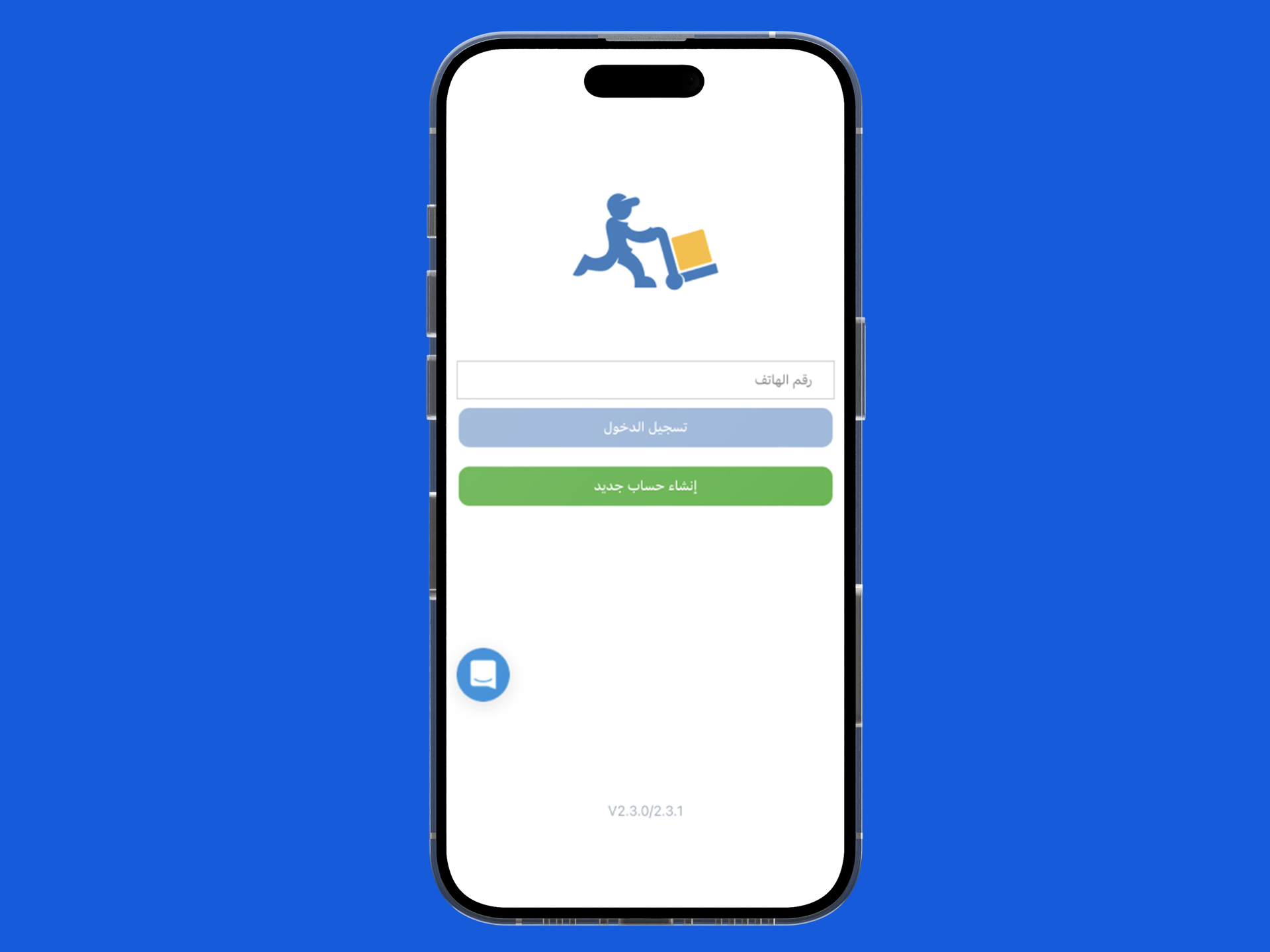
Login Page Heuristic evaluation
Principles affected
- Consistency and standards
- Aesthetic and minimalist design
Issues
It seems like sign in and sign up is the same function also most user click sign up automotacilty after adding number the
Recommendation
- Separate sign up button.
- Change colors of the sign in to be more attractive over the sing up
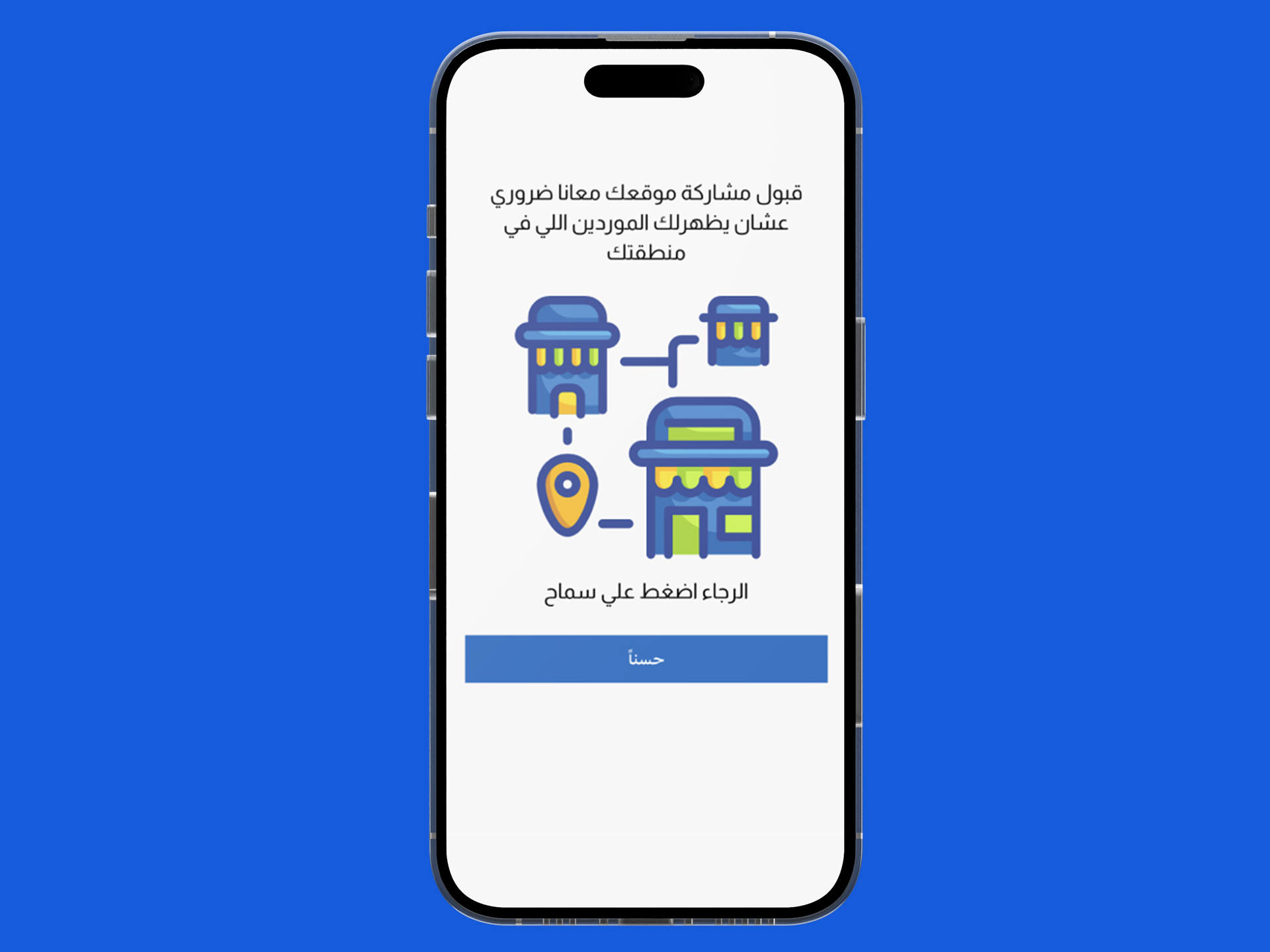
Location Permission Heuristic evaluation
Principles affected
Match between system and the real world
Issues
Terminology isn’t clear enough, we ask users to click on a word that doesn’t exist.
Recommendation
Ensure users can understand the meaning without having to go look up a word’s definition.
Location Locator Heuristic evaluation
Principles affected
- User control and freedom
- Recognition rather than recalling definations
Issues
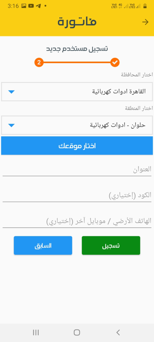
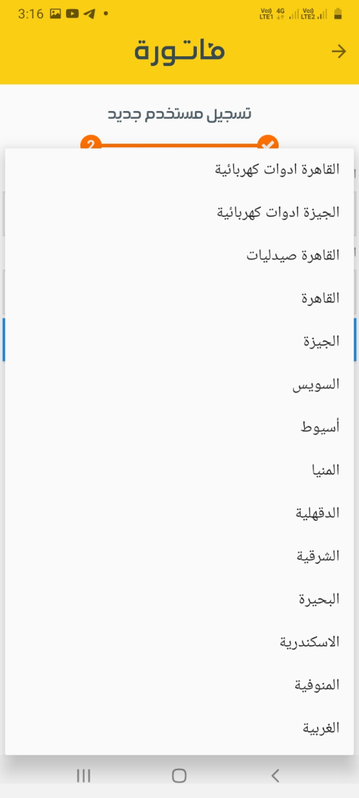
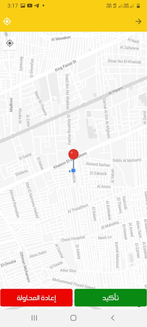
- User have to select location manually.
- There’s no validation for area covarge from the beginning.
Recommendation
- Add search to map.
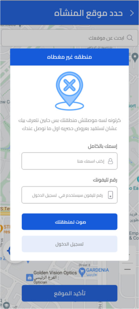
- Inform user if the area isn’t covered and allow them to vote for it.

Registration form Heuristic evaluation
Principles affected
Aesthetic and minimalist design
Issues
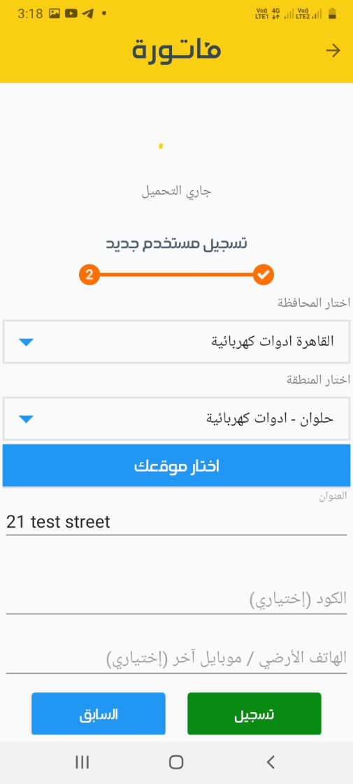
Much more information requested in one screen.
Recommendation
- Prioritize the content and features to support primary goals.
- Involve the user in the reason behind the data.

Error Detection Message Heuristic evaluation
Principles affected
Help users recognize, diagnose, and recover from errors
Issues
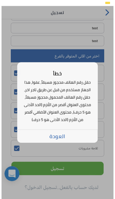
- 4 Errors appear in the same dialog.
- User don’t know how to link between them and the components.
Recommendation
- Tell users what went wrong in language they will understand — avoid technical jargon.
- Use traditional error message visuals, like bold, red text.

After that let’s Identifying and Addressing Key User Interface Issues for Better User Experience
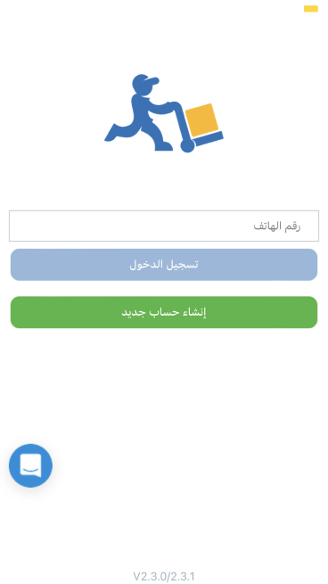
- Users have difficulty differentiating between “sign in” and “sign up.”
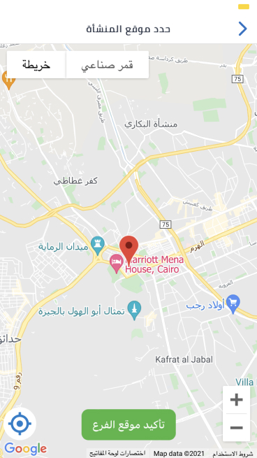
- Users encounter difficulties in defining their locations since the map is not searchable and, therefore, location accuracy is questionable.
- The sign-up form lacks user explanation about the required information and data input.
- Users are unable to pinpoint precisely where errors occur.
At this point, we have a general understanding of the primary problem and can begin to address it. However, I conducted a competitor analysis to confirm our approach and gather insights into what other companies are doing. I installed and examined various applications on the market, such as MaxAB, Fatura, Sary, and Capiter, taking screenshots and illustrating their respective user flows. The purpose of this step is to:
- Compare our approach with that of others.
- Obtain ideas and inspiration from existing market applications.
- Verify the ideas we intend to employ to rectify the problem, such as incorporating onboarding screens.
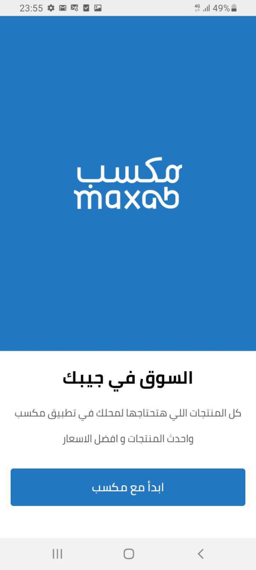
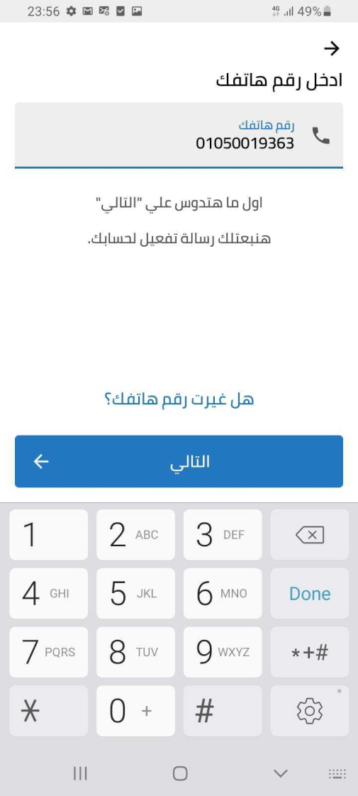
Maxab App - Registration Flow
Actually what’s great about maxab app signup/sign flow the simplicity of registration just 3 steps:
- User mobile number
- User store name
- Location auto detection
In my experience in retail, this type of registration process, despite being simple and requiring only a mobile number, store name, and auto-detected location, can lead to a high number of fraudulent accounts. Even with user validation after login, it can still be a backdoor for spam and fake account creations, which can be challenging to clear from the data team’s side and the technical side of database storage.
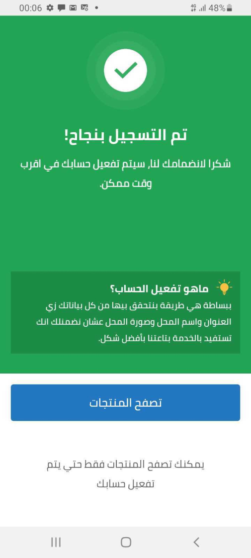
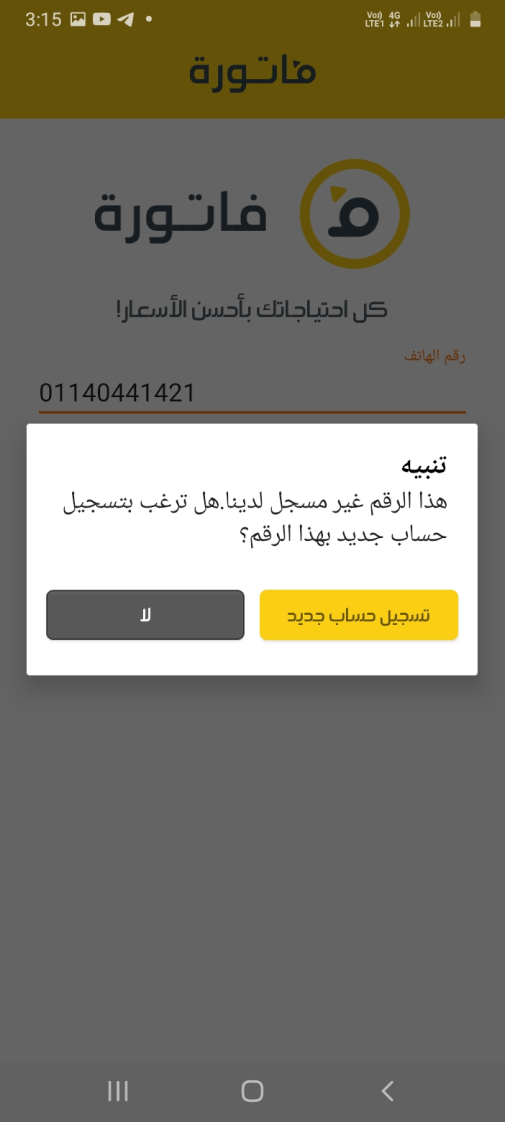
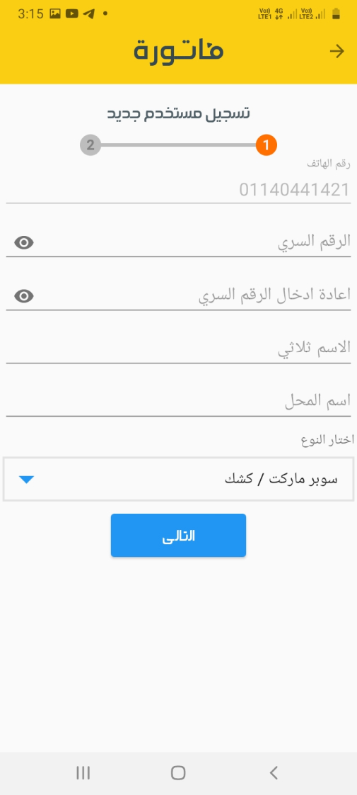
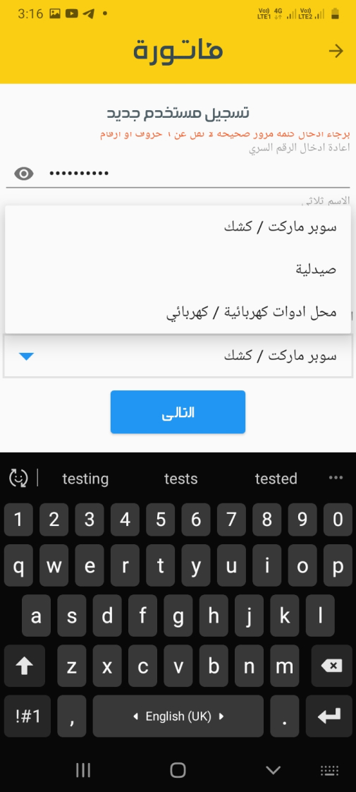
Fatura App - Registration Flow
Fatura also great when it comes to the number of steps however the play it smarter in two points
1- reducing huge number of data in just 2 steps
2- Inform the user by the number of the steps using progress bar pullets with number
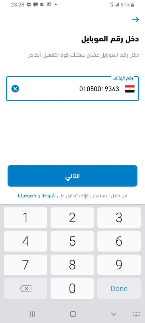
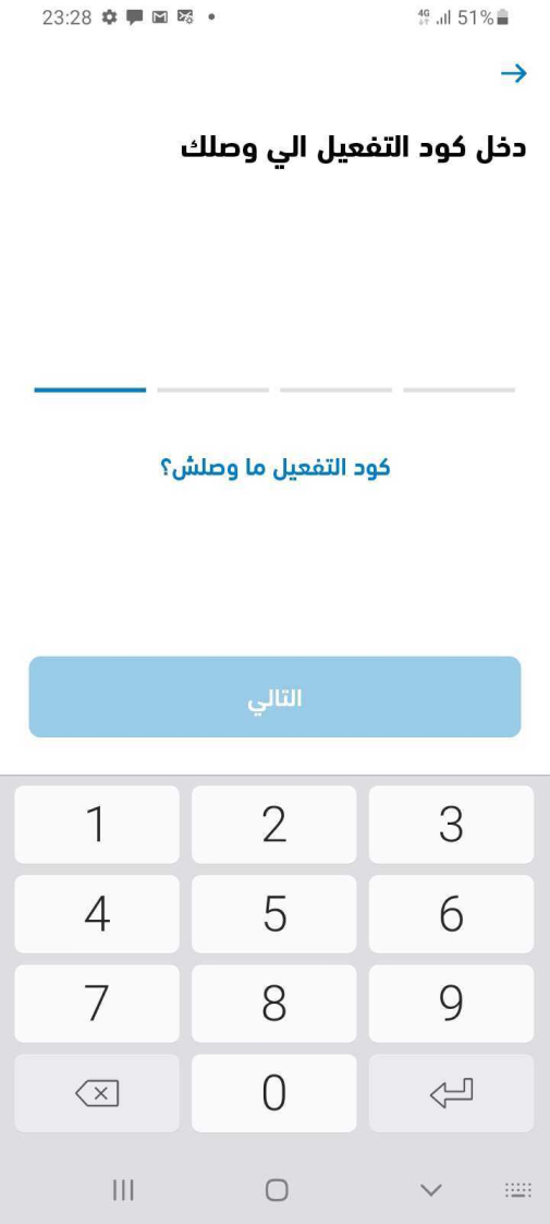
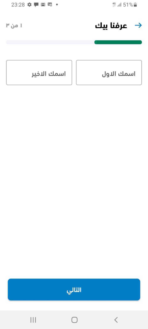
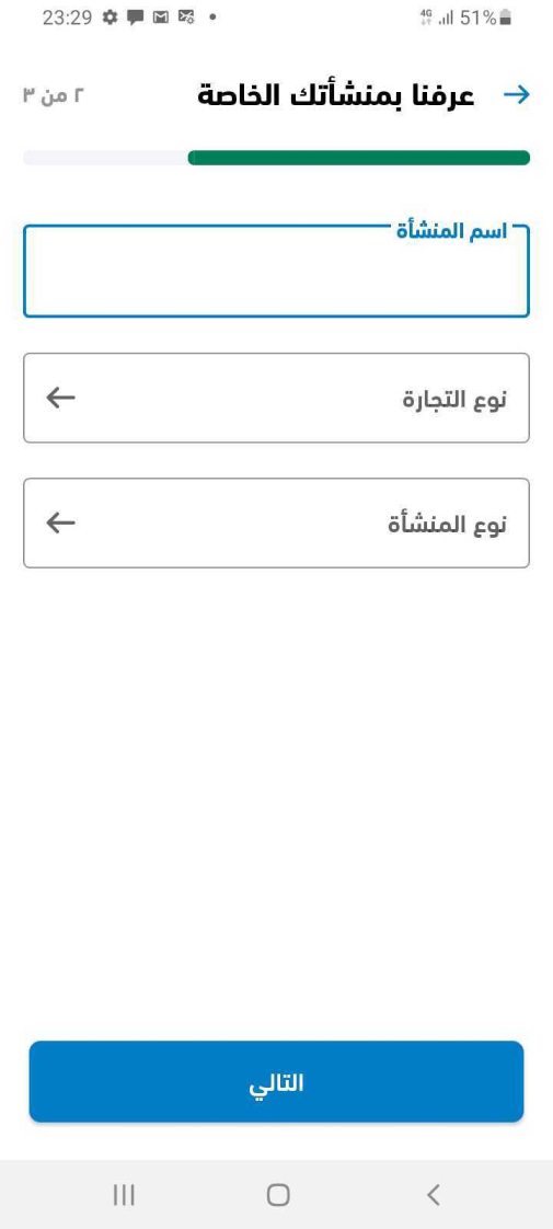
Capiter App - Registration Flow
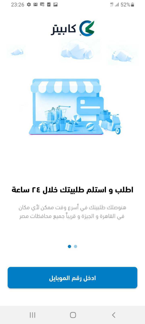
Capiter signup flow 1st step
Capiter signup flow 2nd step
Capiter signup flow 3rd step
Capiter signup flow 4th step
Capiter signup flow 5th step
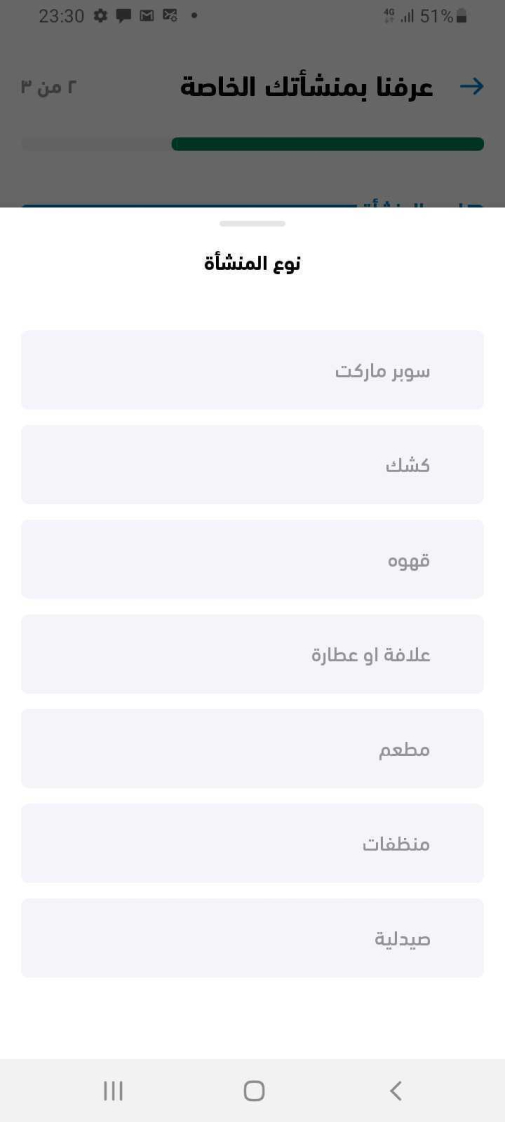
Capiter signup flow 6th step
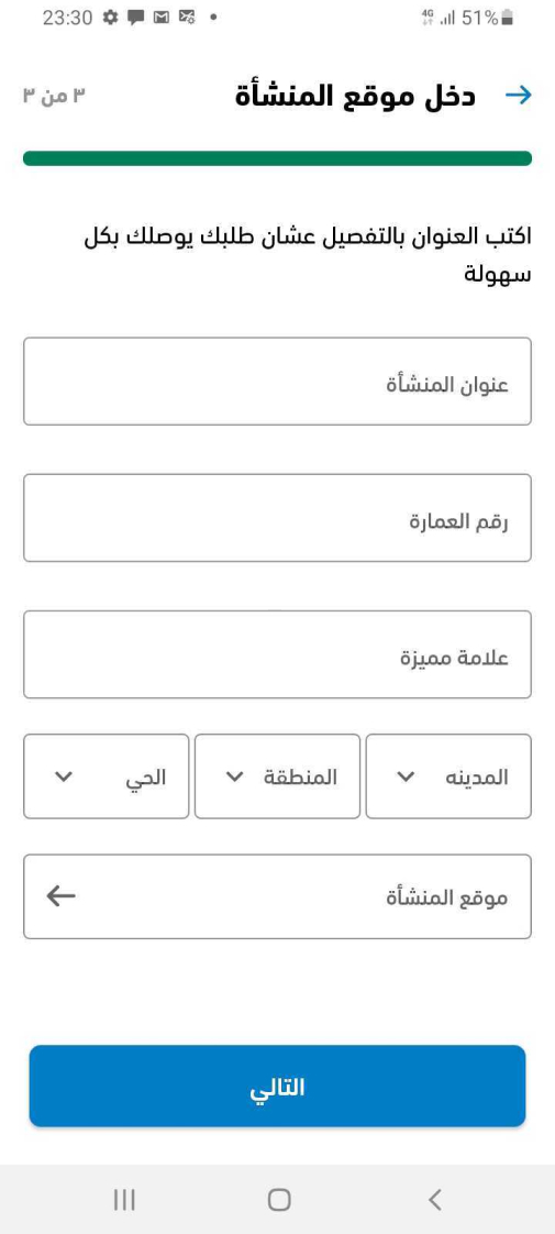
Capiter signup flow 7th step
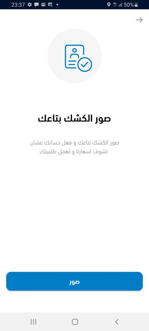
Capiter signup flow 8th step
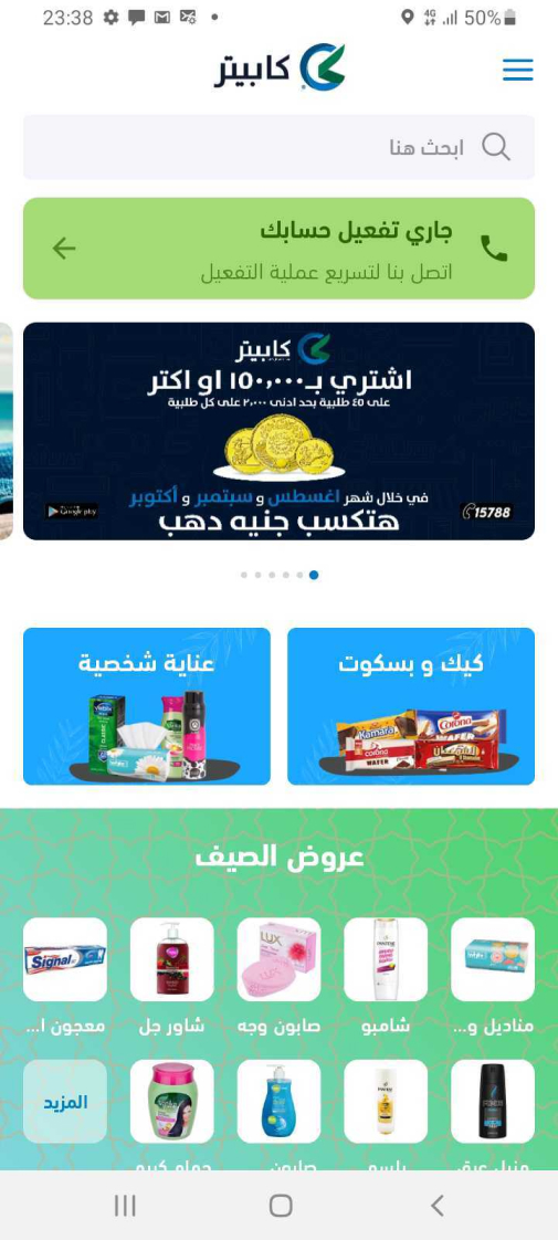
Capiter signup flow 9th step
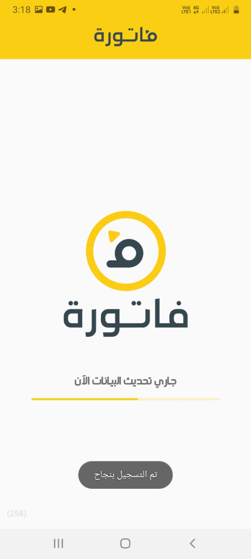
Fatura signup flow 10th step
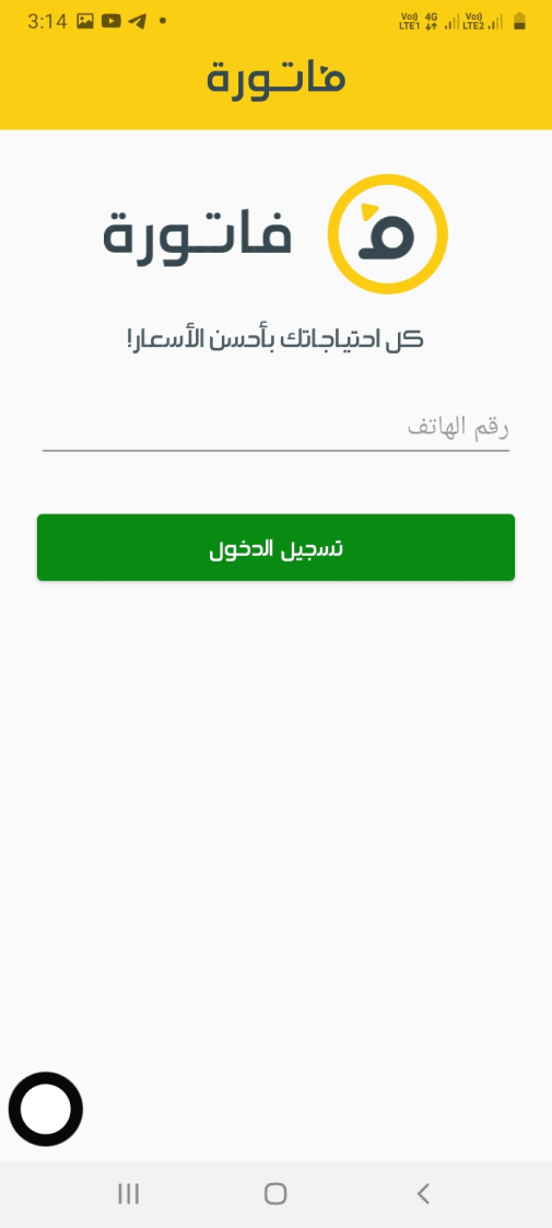
Fatura signup flow 2nd step
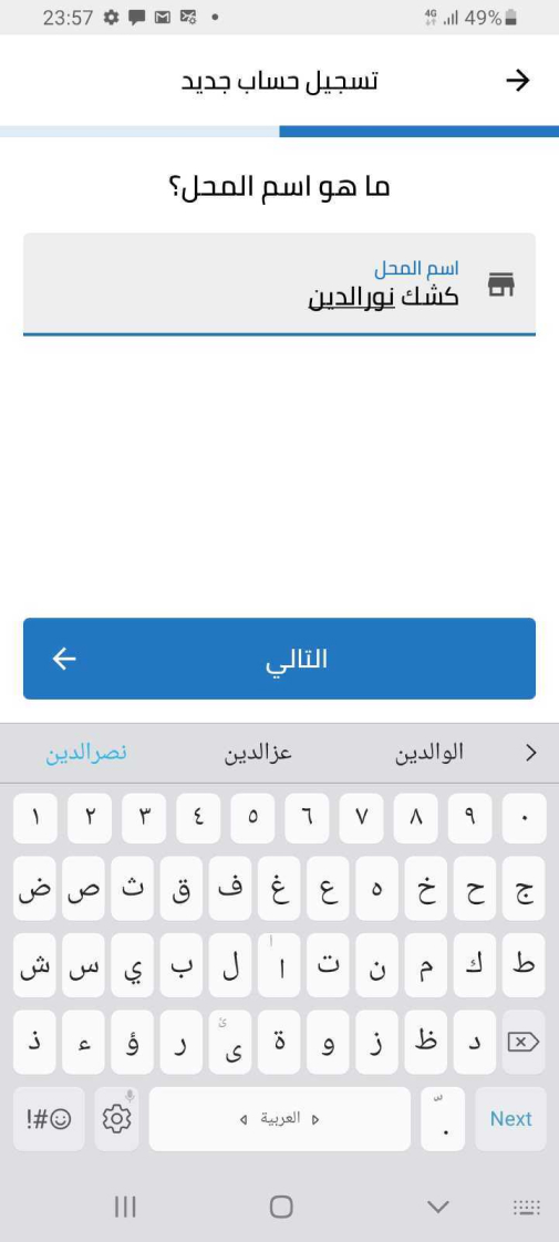
MaxAB signup flow 3rd step
The best user friendly onboarding and signup flow when it comes to the tone and voice of talking with the users:
- Firstly the terms in Egyptian colloquial.
- They added a step of OTP mobile verification
- Using the same concept of gathering all the date on the onboarding
Although the last step of taking a picture for user validation in this flow is crucial, I don’t particularly appreciate that it’s mandatory during registration. A better approach would be to provide a “Skip for now” option and suspend the user account until they upload the required picture after login. Otherwise, users may get blocked from continuing the registration process, especially if they are not physically present at their store. In such cases, collecting minimal user data and listing them as potential users would be more suitable.
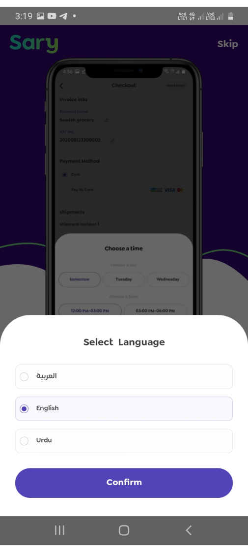
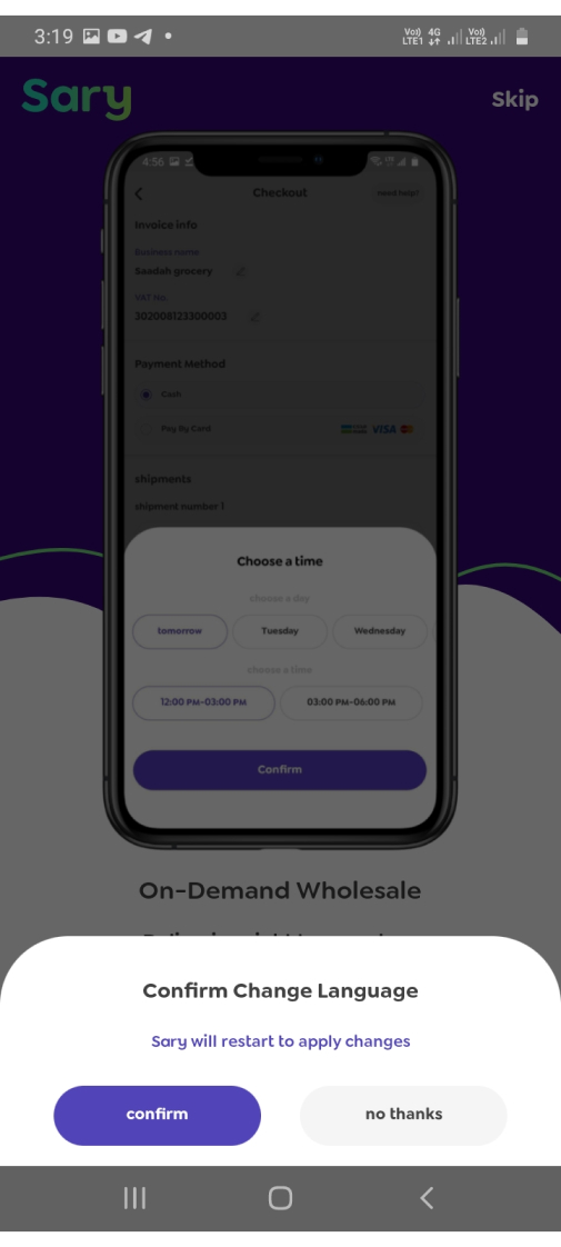
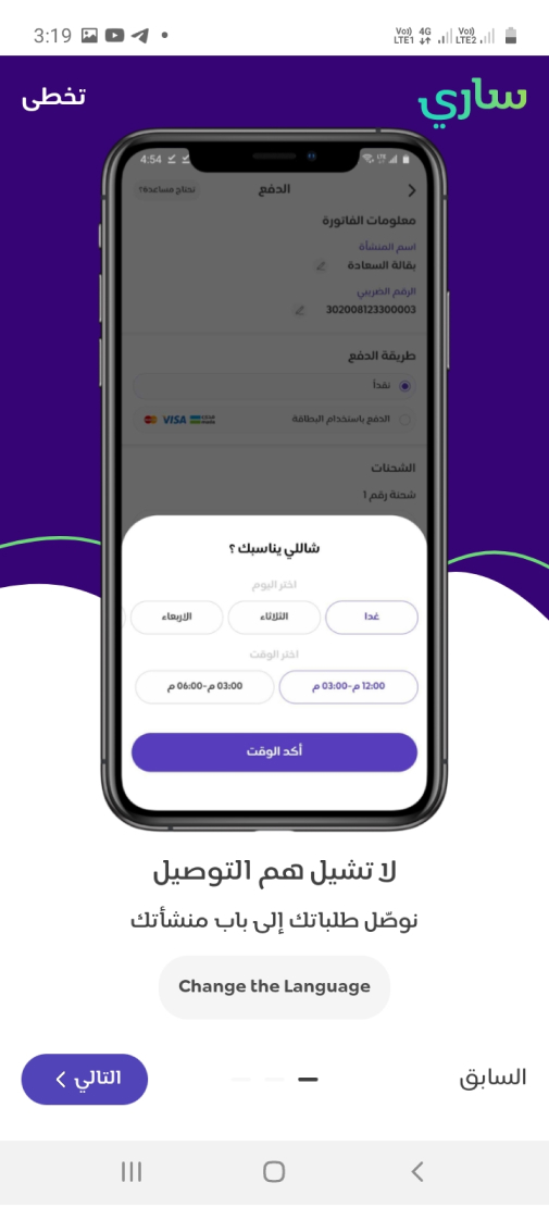
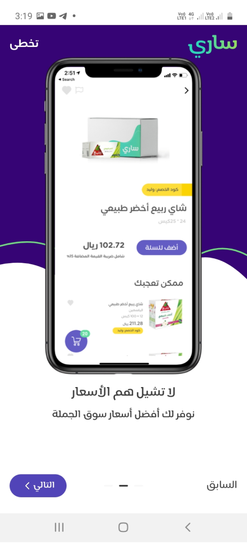
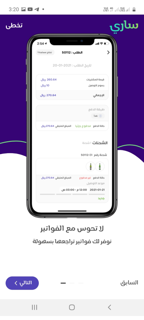
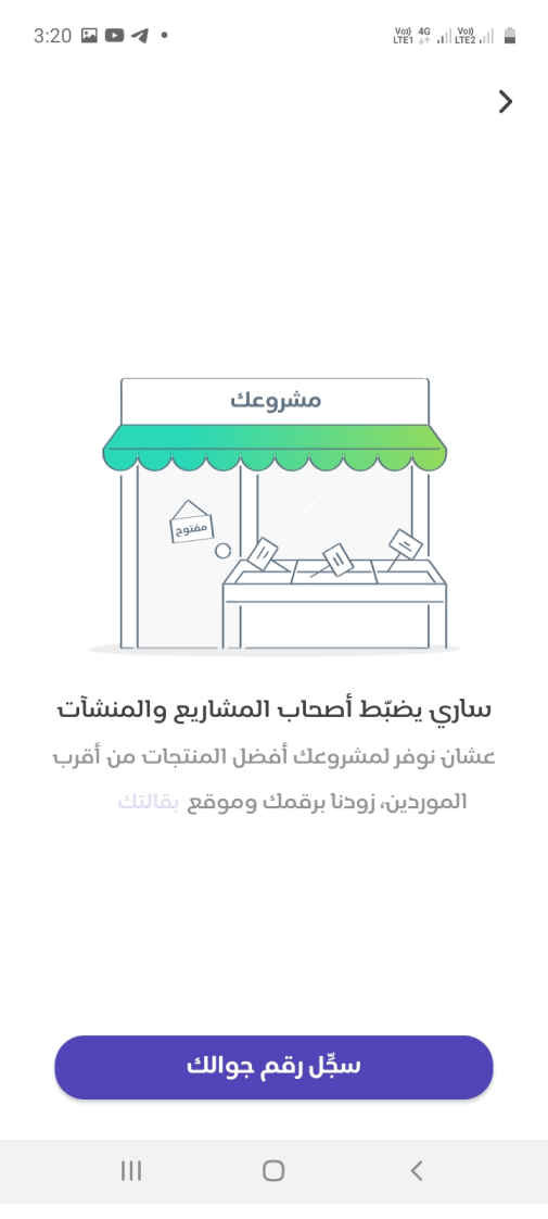
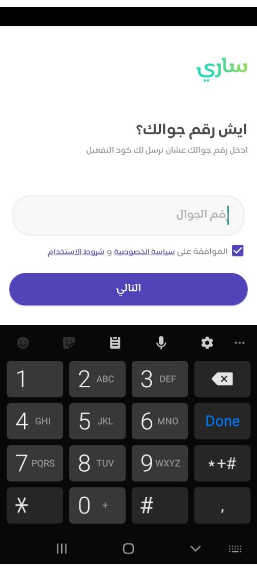
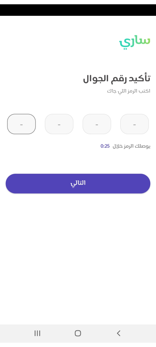
Sary App - Registration Flow
From October 18th to September 18th, 2022, the Sary app was unavailable in Egypt, but they did have an office there. However, I asked a friend in Saudi Arabia to share their mobile number so I could create an account from Egypt and follow the steps. Why did I do this? Because I wanted to understand the mindset of Saudi consumers, as their approach to B2B retail is similar whether it’s done onsite or digitally. I found the combination of onboarding screens and data gathering particularly effective.
Competitors Discovery Conclusion
What I learned from this, our registration flow need to be simplified and we have to keep an eye out for:
- Adding helpful friendly onboarding
- Divided the flow
- Put the user in the situation
And this will be enhanced by transferring this flow
Cartona App registration - Old user Flow
Cartona App registration - New user Flow
And here are the designed screens for this new flow
I know it’s weird to simplify by increasing the steps and number of screens but let’s check the screens.

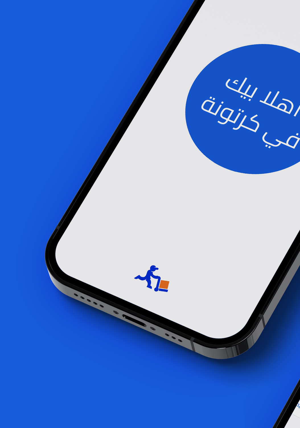
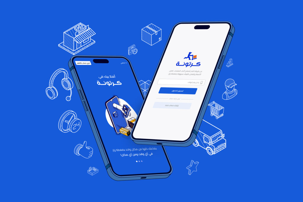
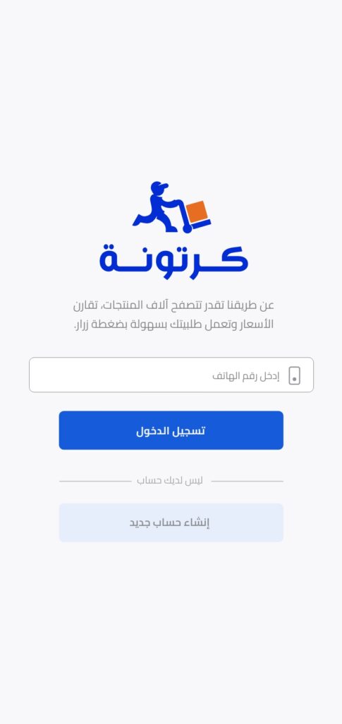
Cartona Signup Flow - Login

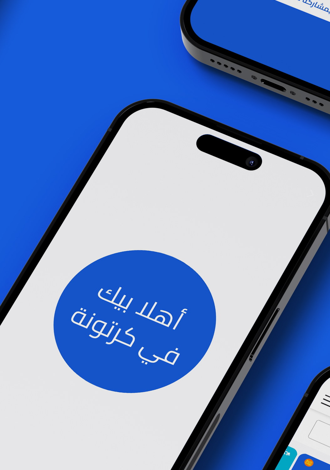
Cartona Signup flow - Onboarding 1

Cartona Signup flow - Onboarding 2

Cartona Signup flow - Onboarding 3

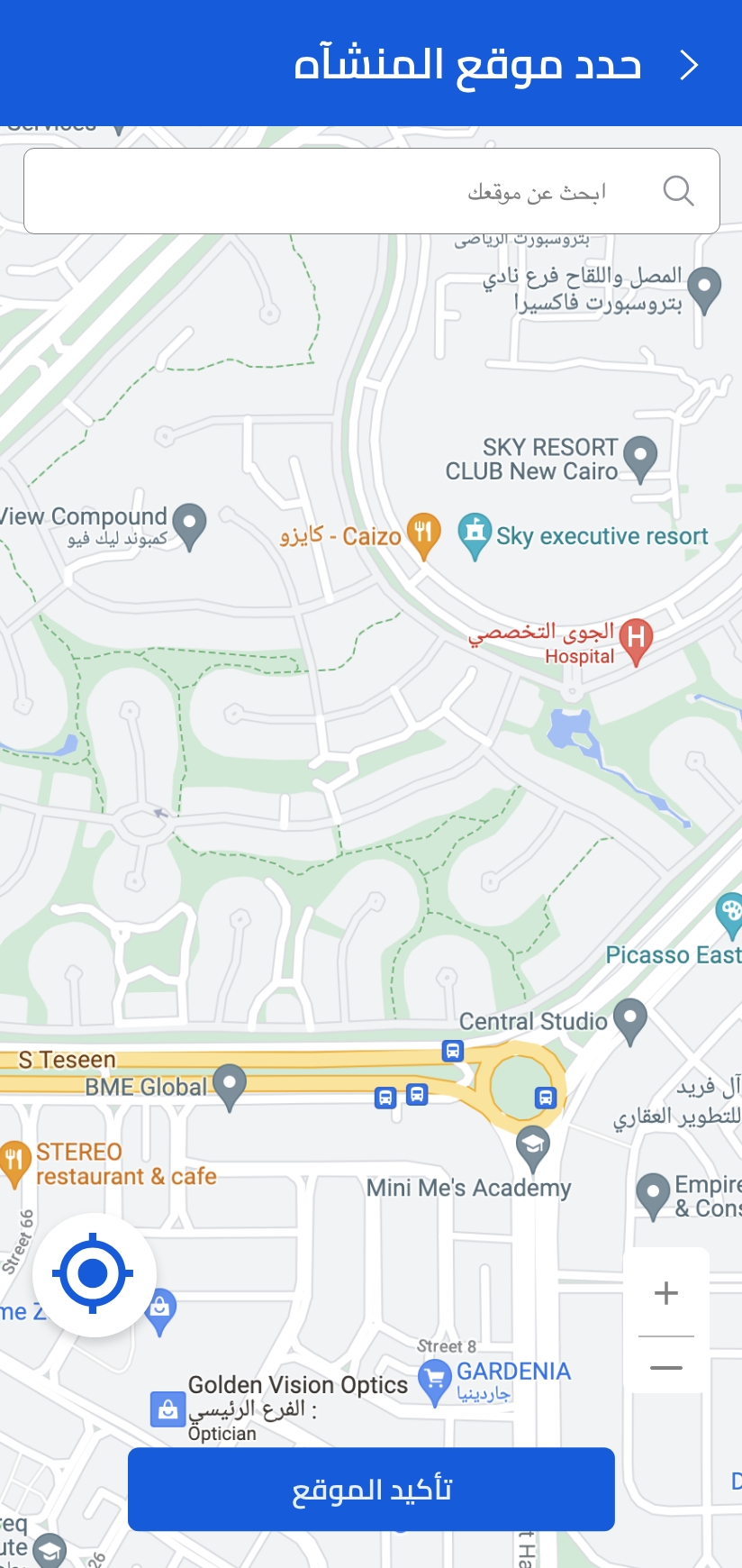
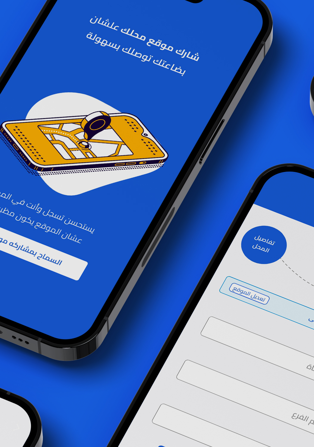
Cartona App Set location on map screen
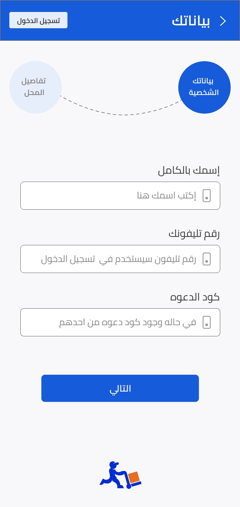
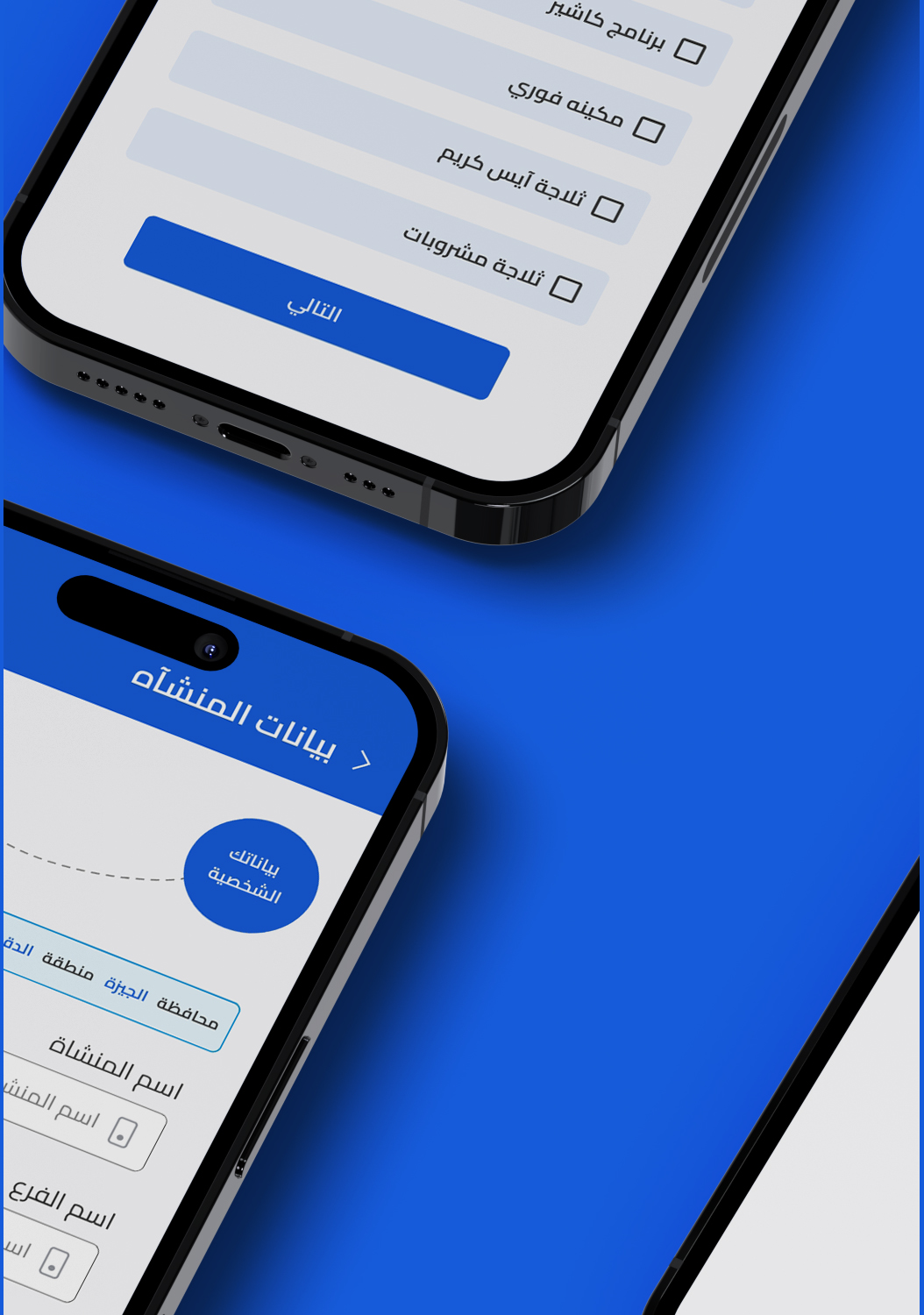
Cartona Signup flow - Personal Data
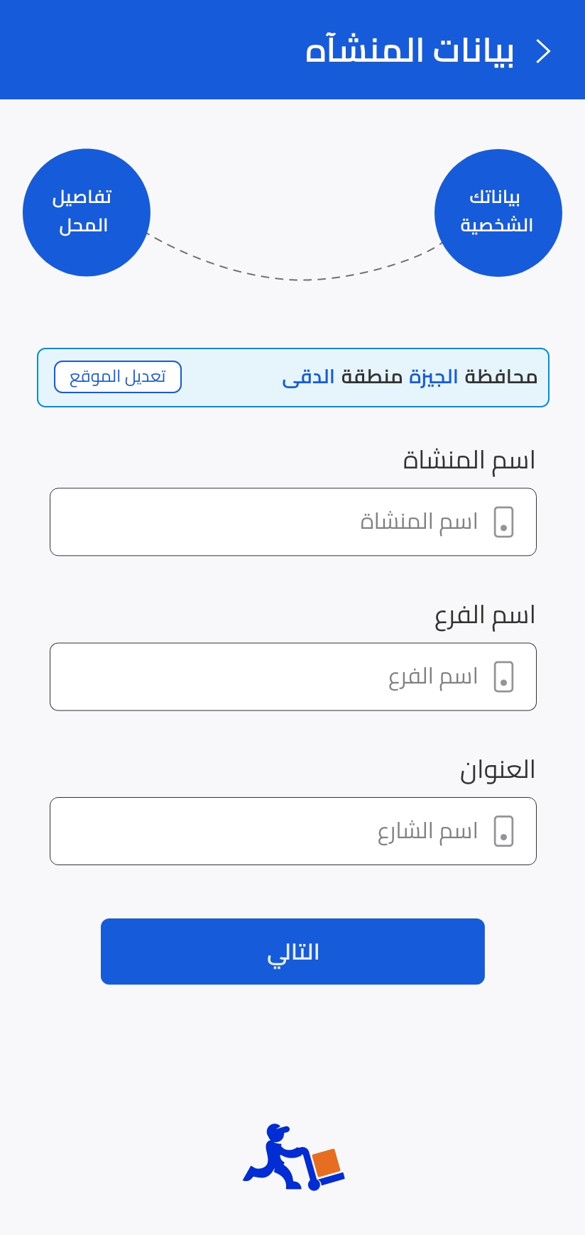
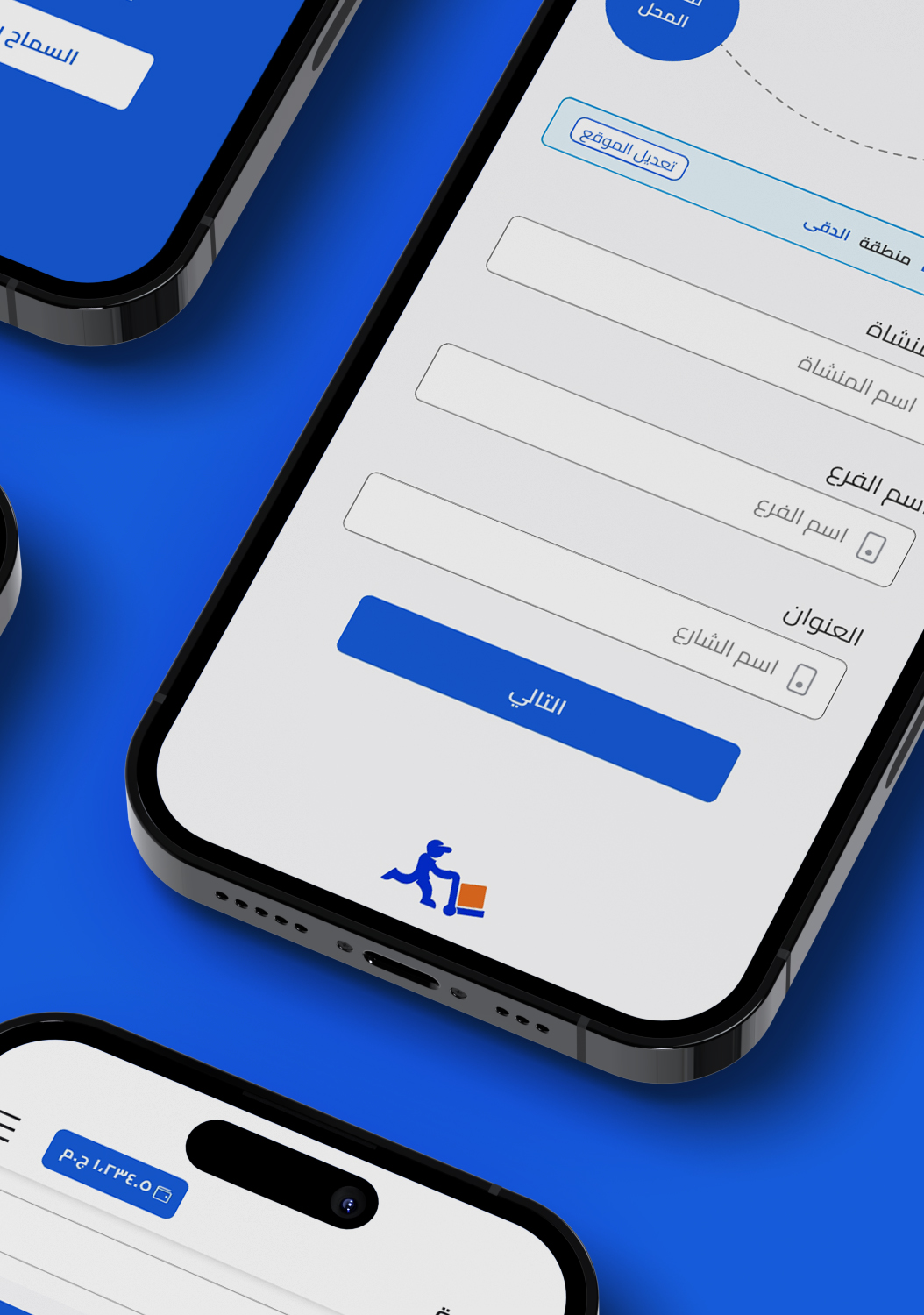
Cartona signup flow - Business data

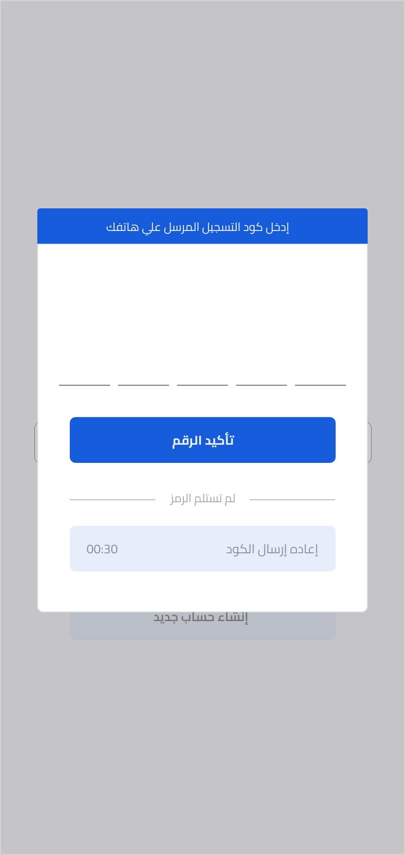
Cartona Signup flow - OTP
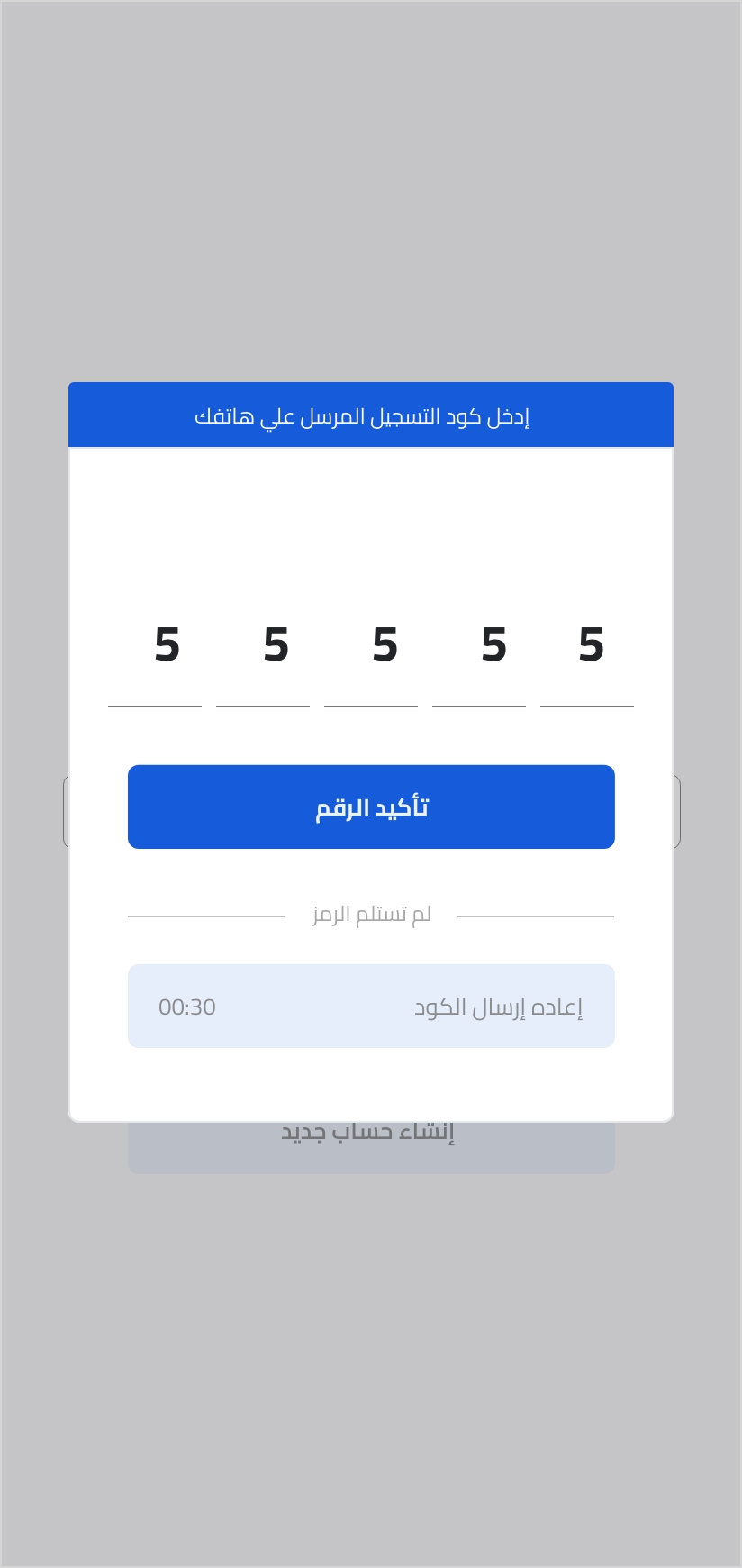
Cartona Signup flow - OTP Confirmation


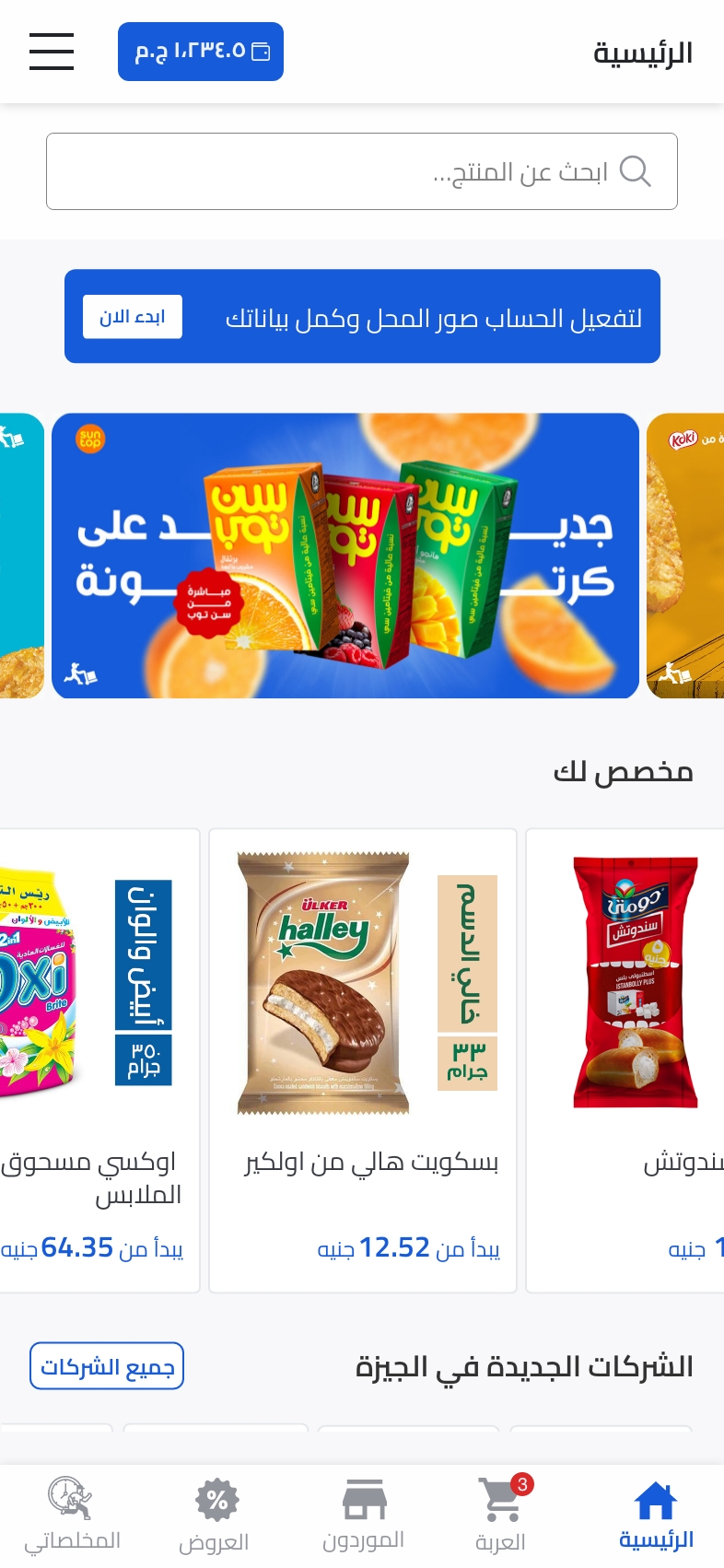
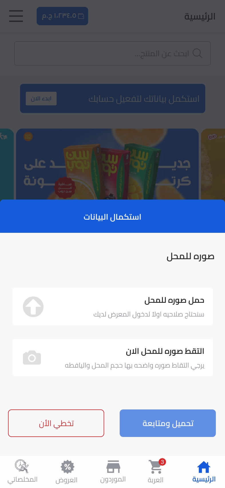
Cartona Signup Flow - Store Verification
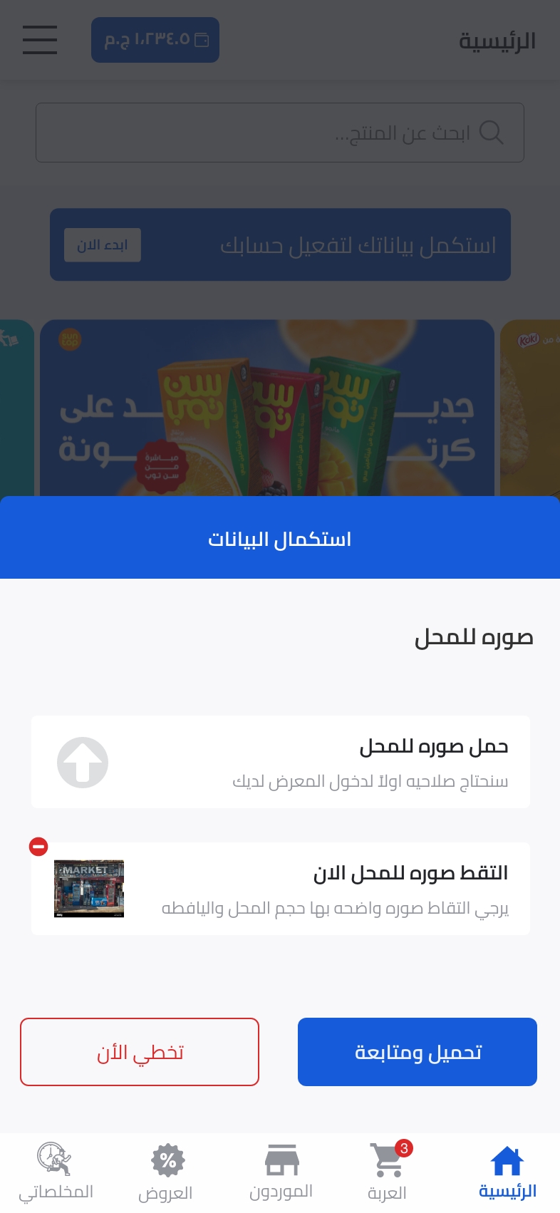
Cartona Signup Flow - Store Verification
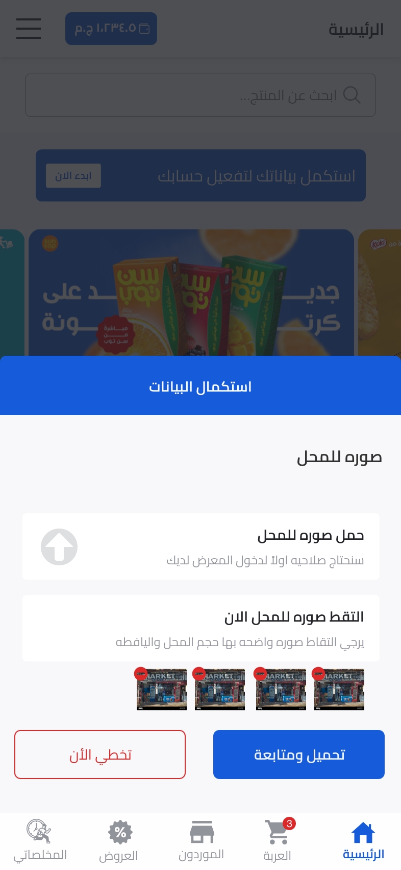
Cartona Signup Flow - Store Verification
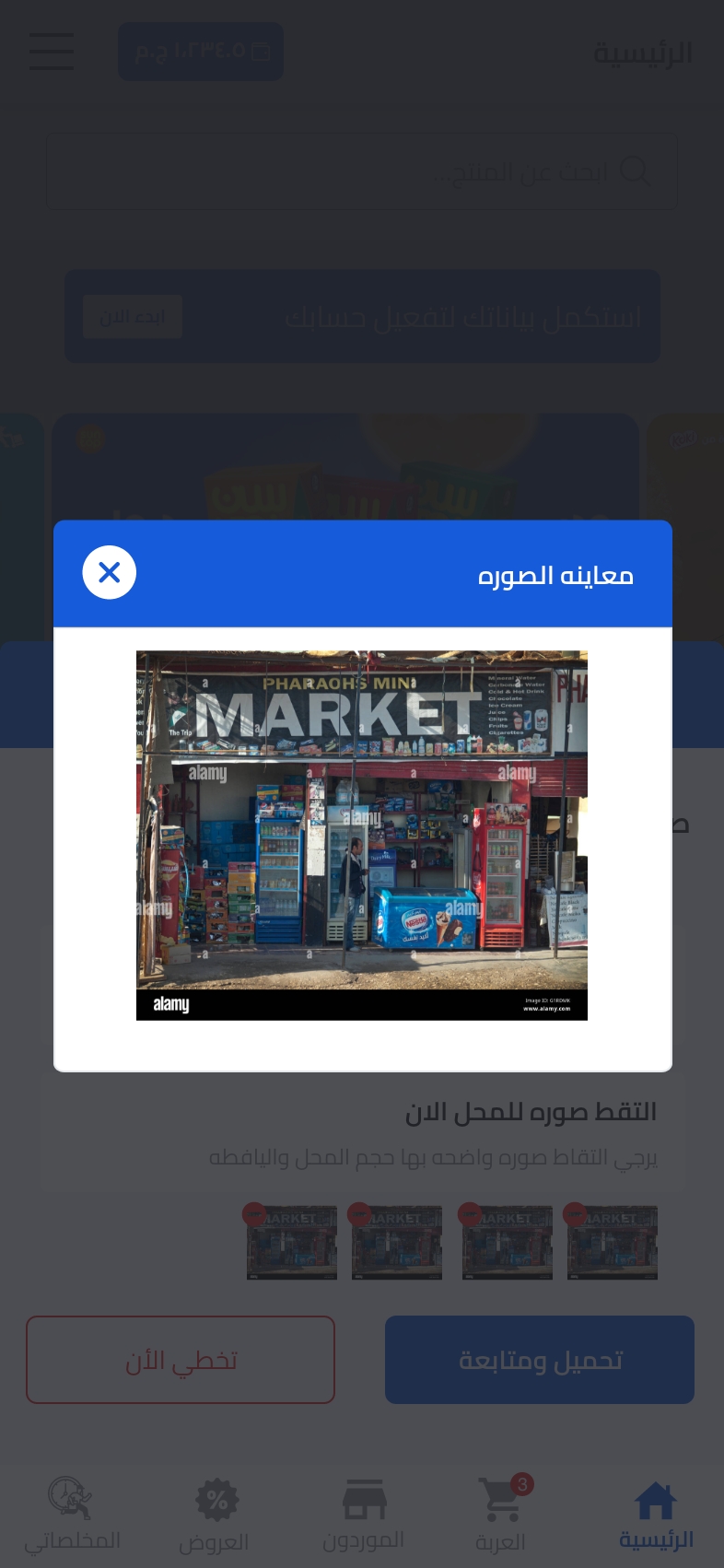
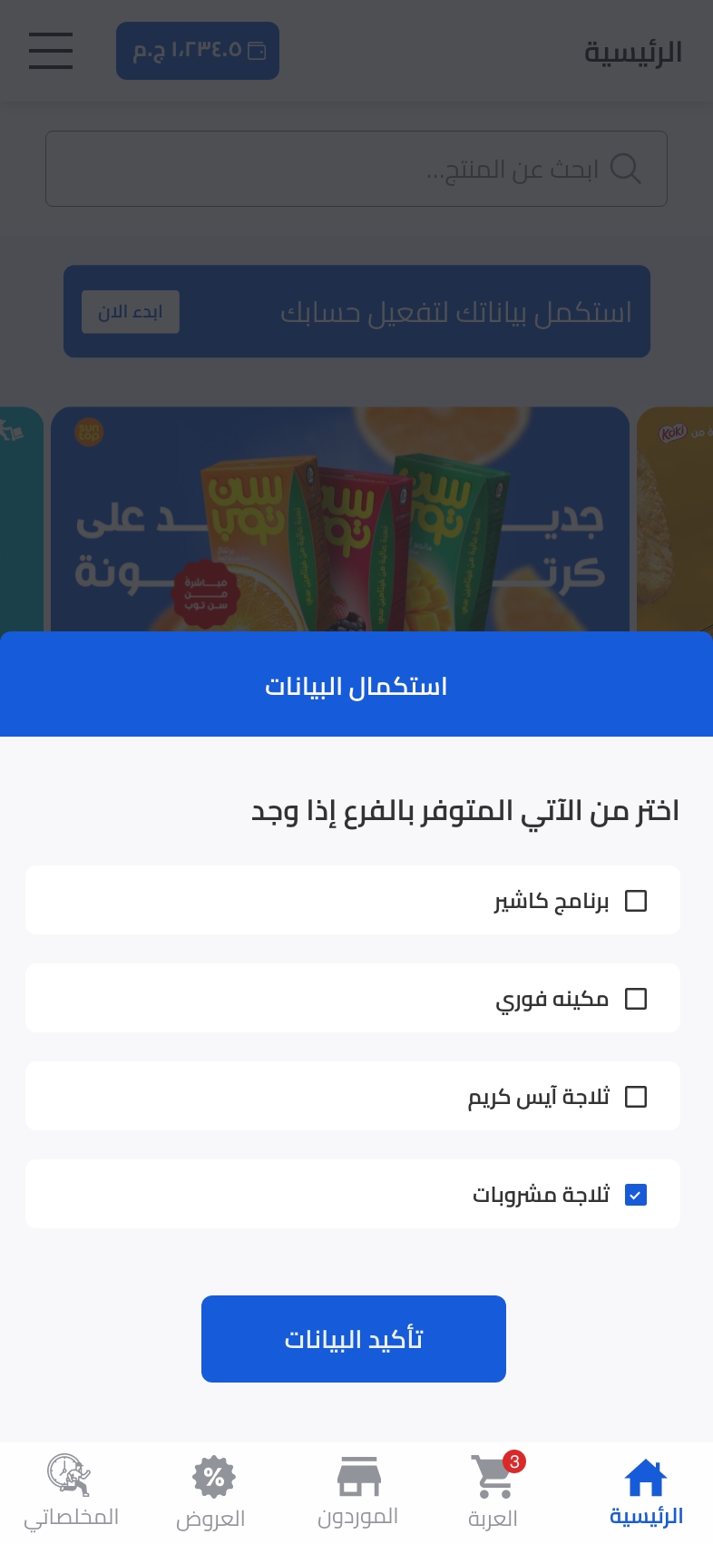
Cartona Signup Flow - Store details
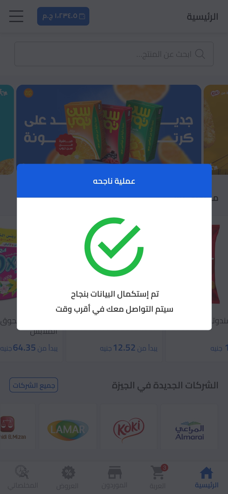
Cartona Signup Flow - Account Verified
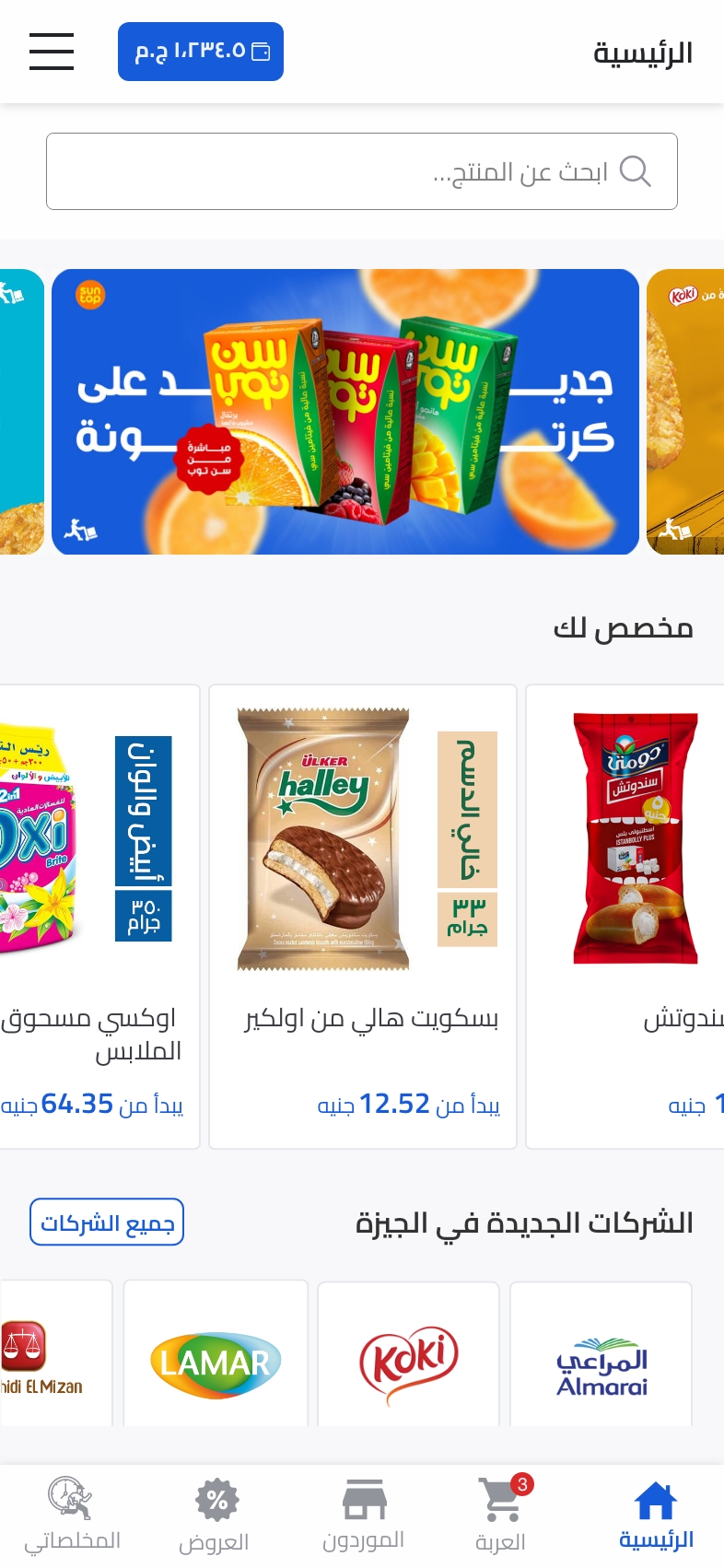
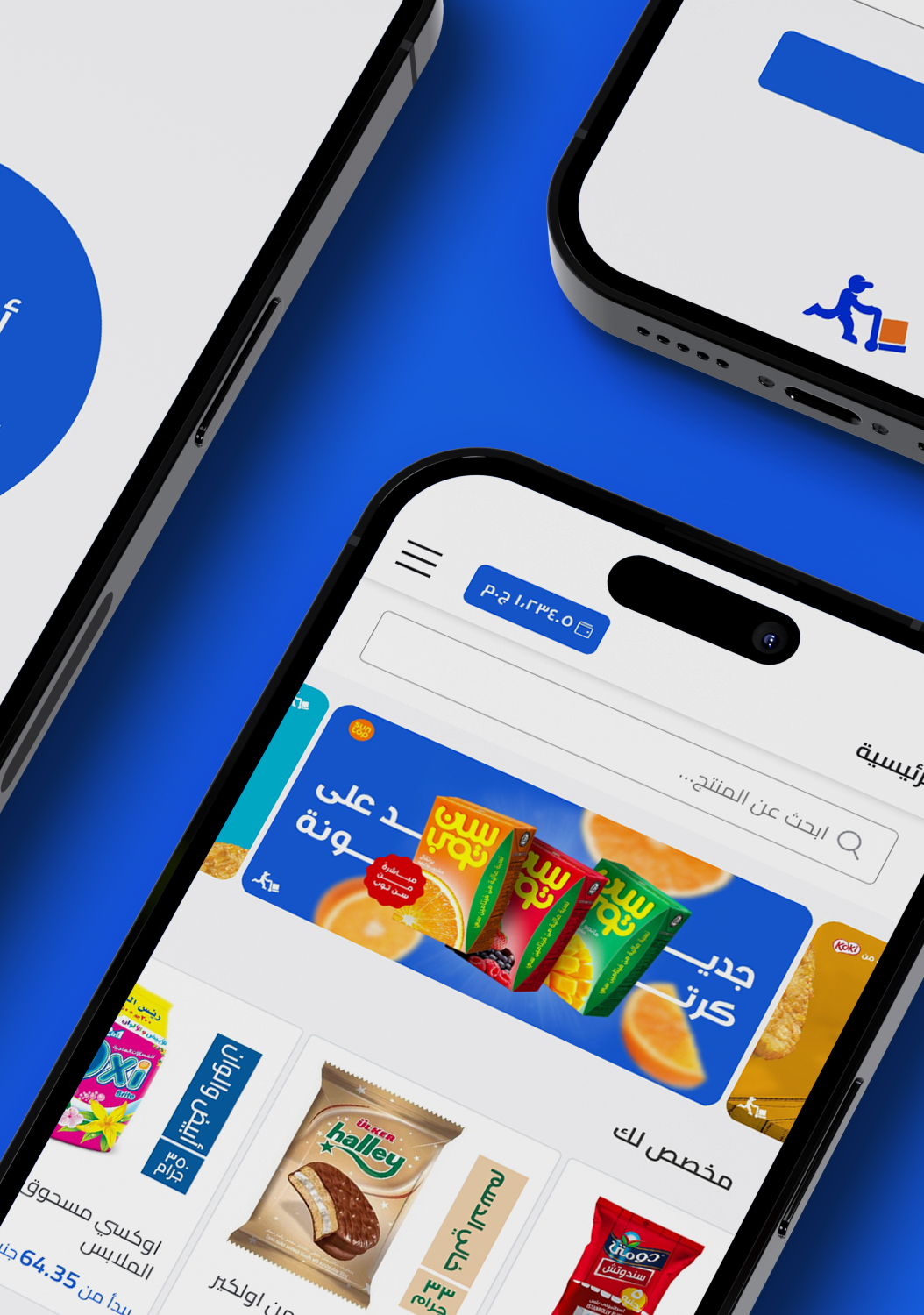
Cartona Home page
You may have noticed that the design style and design pattern used in the new app are entirely different from the old one. However, I just remembered that our talented Branding Lead, Bassel Hesham, was working on rebranding the app, including changing the colors, logo, and entire identity. I will discuss this project in more detail in my upcoming articles on the blog. As part of revamping the app, we decided to incorporate the new styles and enhance the UX of the signup flow by using the unique app style and branding.
Deeper Look to each screen
here’s what I did exactly on each screen as a improvements in a comparison view between old signup flow screens and the new designed one
Login Screen
- Updating the logo and colors with
our news branding and style guide. - Separating between the signing/sing up sections, and help user to know the different between them.
Location Access permission screen
- Matching new branding.
- work more in clear terminologies’ with help users to create their tasks.
- Add back to singing option for more flexibility as users was closing the app and reopen it to get back.


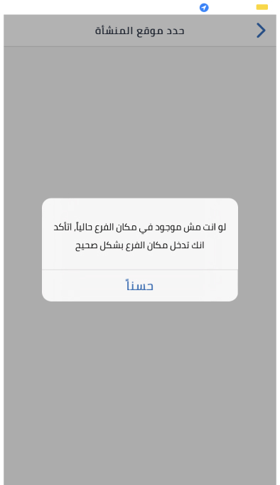
Set Location on map screen
- Adding search to help users find their location faster.
- Applying the style guide for the screen components

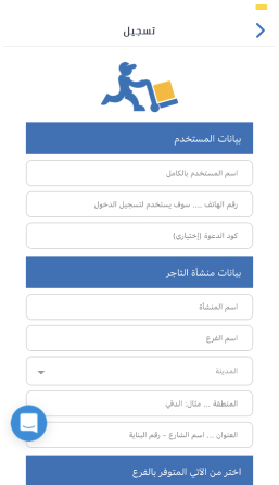
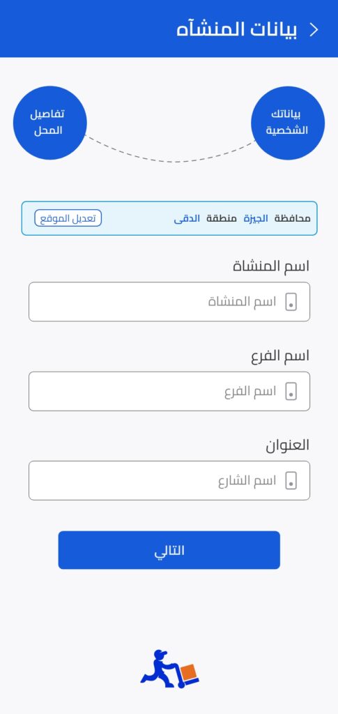
Regesteration Form
- Dividing the steps into 3 separated screens
- Applying style guide.
- More fixed clear text field titles.
- Reducing some data with management across data team.
- Start using icons to help users recognize

Your area is not covered Message
This message was appearing on the begging after installing the app so I think about use it as a lead generation for collecting data
- Dividing the steps into 3 separated screens
- Applying style guide.
- More fixed clear text field titles.
- Reducing some data with management across data team.
- Start using icons to help users recognize
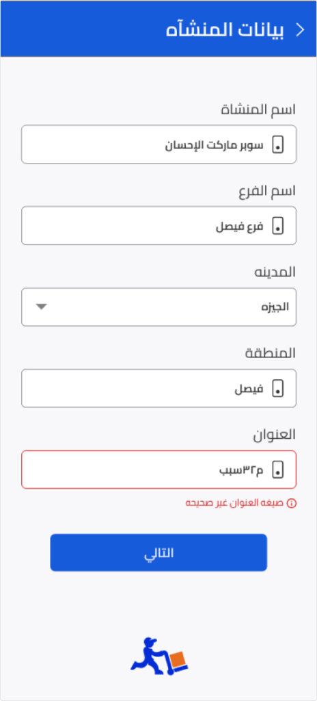
Form Error Messages screen
It’s very clear and common across all apps but as our app was outdate i just matched it by:
- Changing the error previewing concept to labels instead of popup.
- Applying style guide.
Conclusion and results
- 90% of users find it easier.
- Reduced user learning effort to be onboarded.
- Location finding became faster.
- User now know if the action is sign in or sign up in a clear way.
- Data gathering became more clear.
- Converting Area not covered error messages to lead generation got a great appreciation from the sales team.
Your turn
Hey there! I wanted to share with you what I’ve been working on with my team, and I would love to hear your thoughts and feedback on what we did well and what we could improve on for next time. What suggestions do you have?
