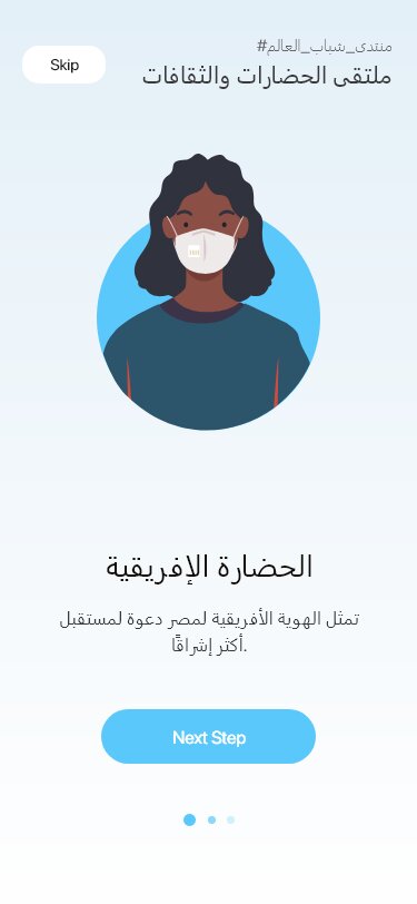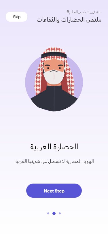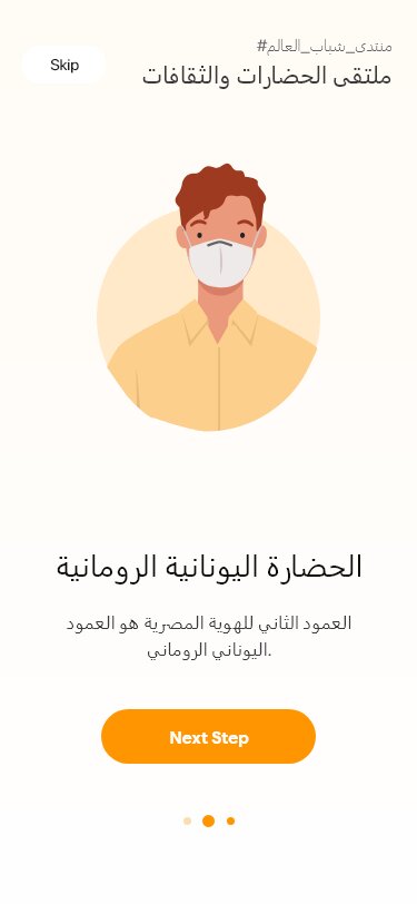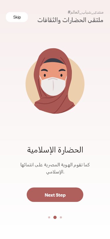
My Role
- Research & User Flows
- Information Architecture
- Sketching & Wire-framing
- UI Design
- Prototyping
Launched in August 2020
The brief
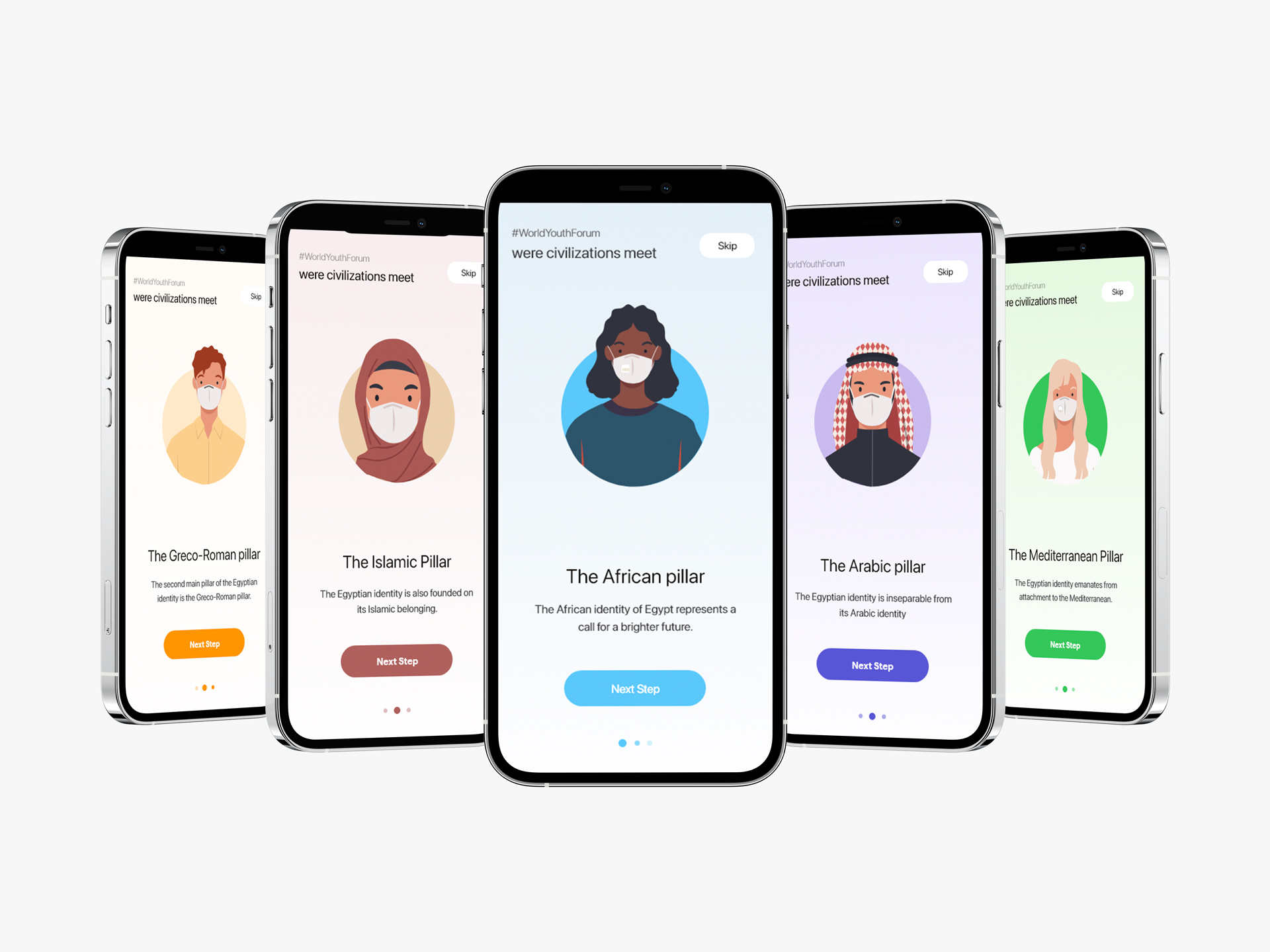
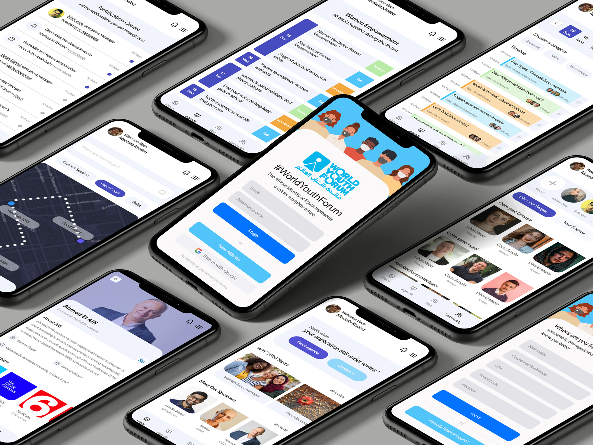
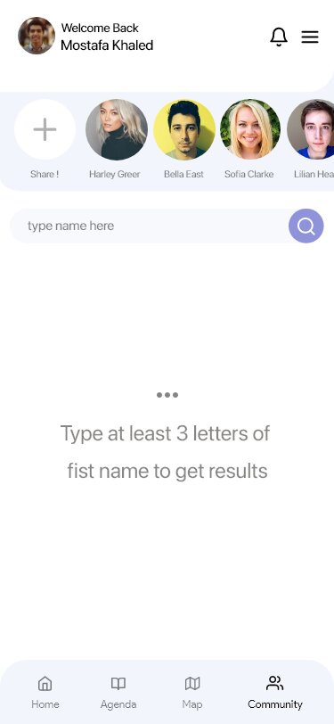
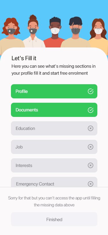
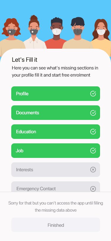
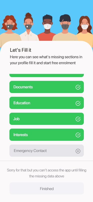
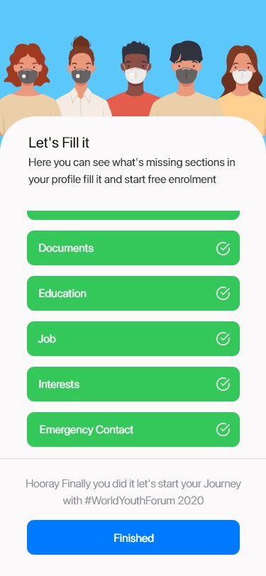
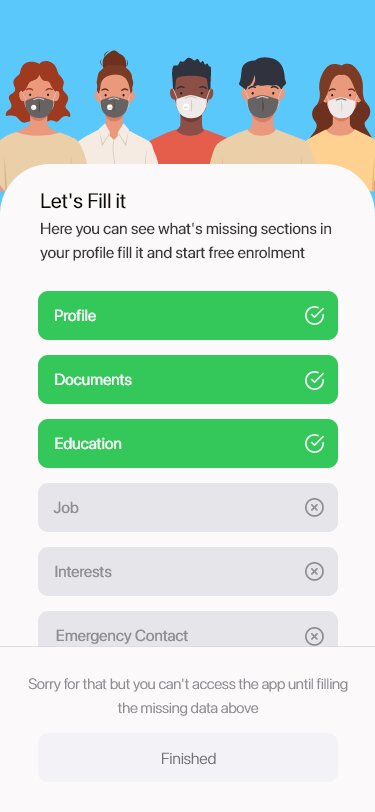
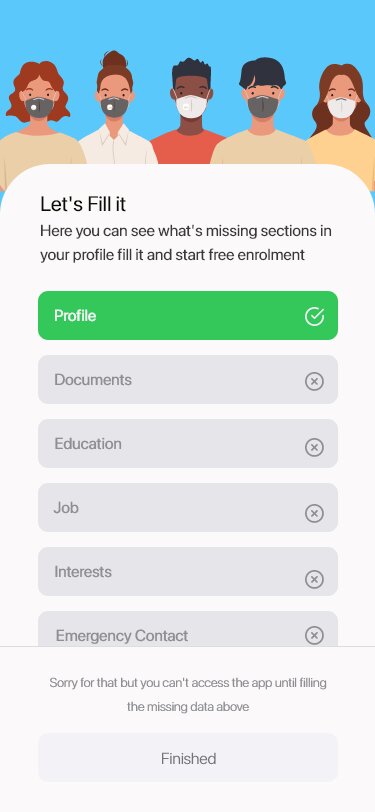
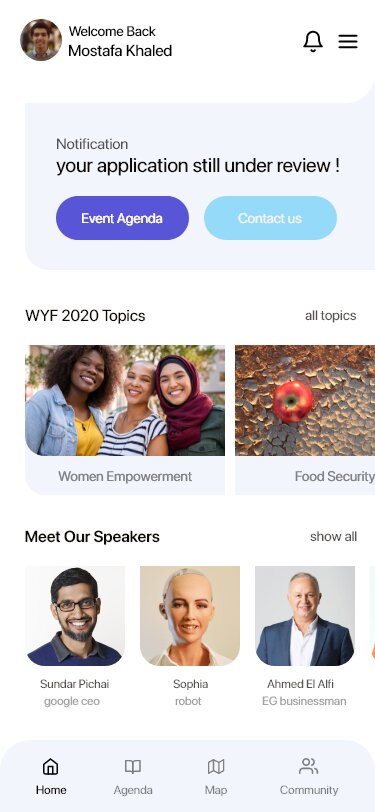
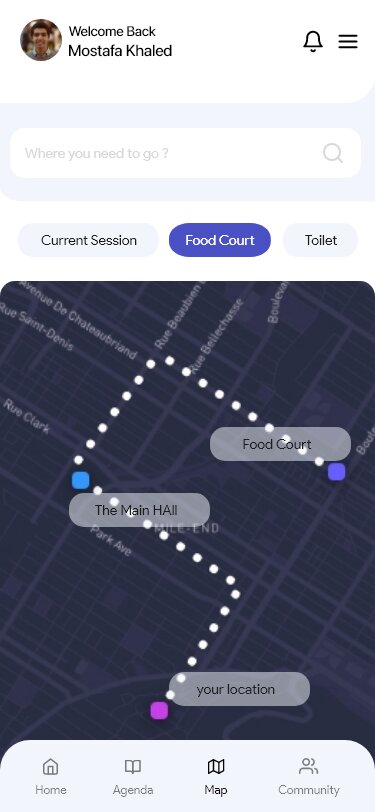
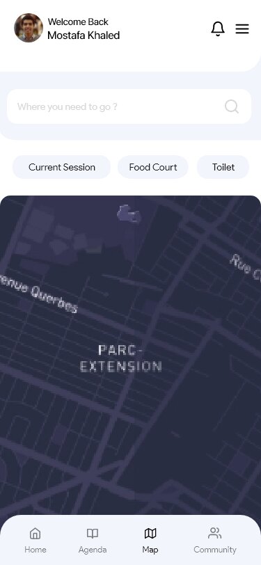
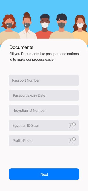
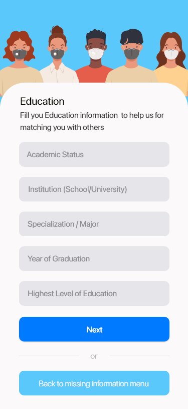
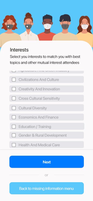
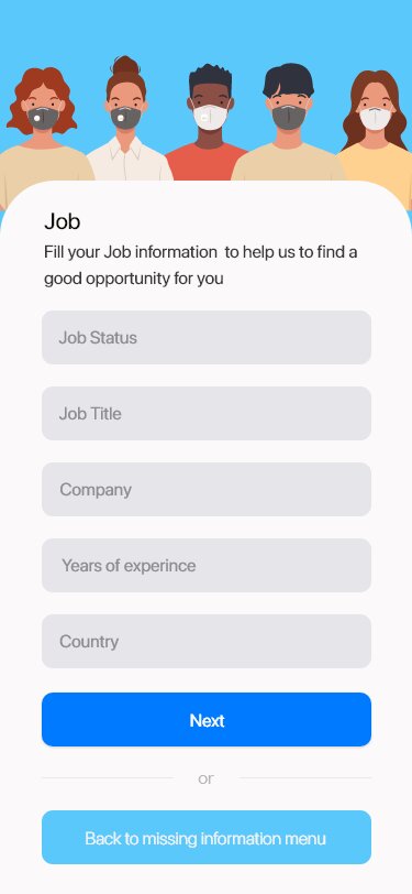
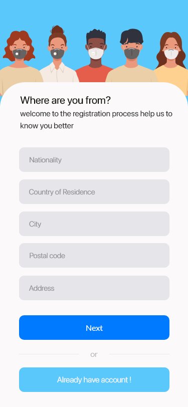
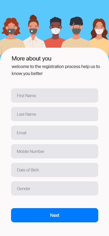
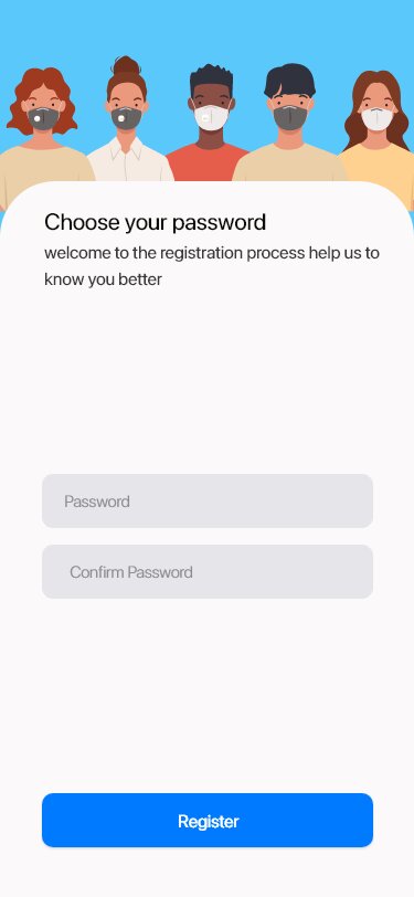
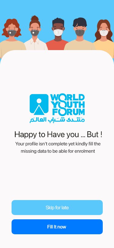
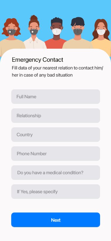
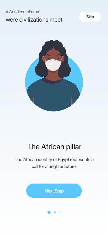
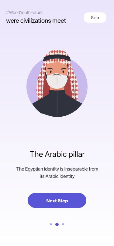
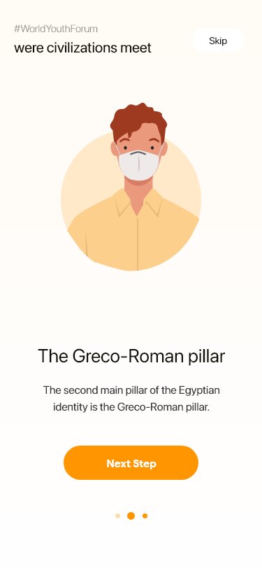
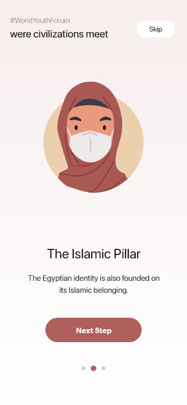
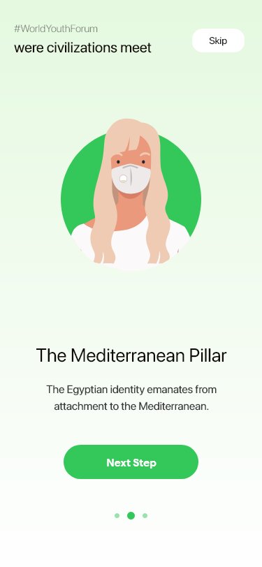
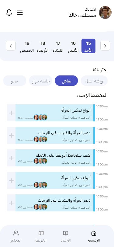
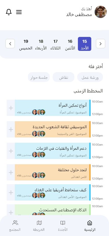
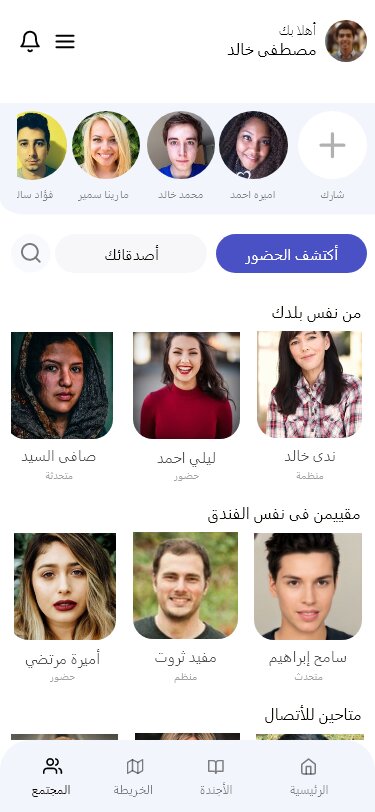
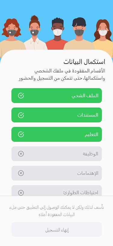
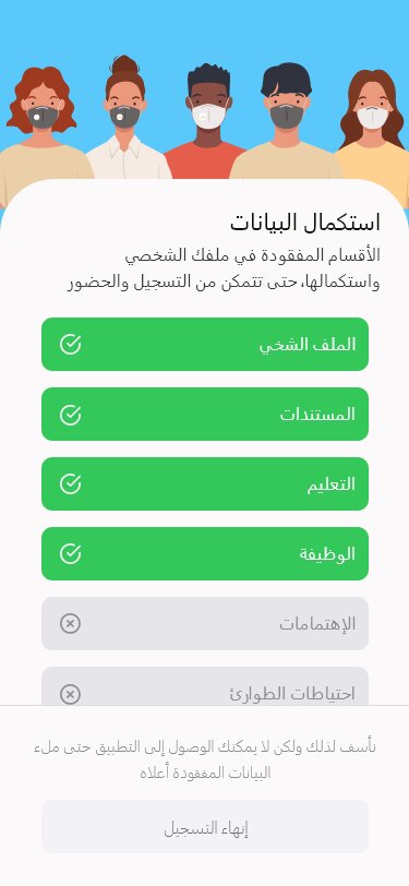
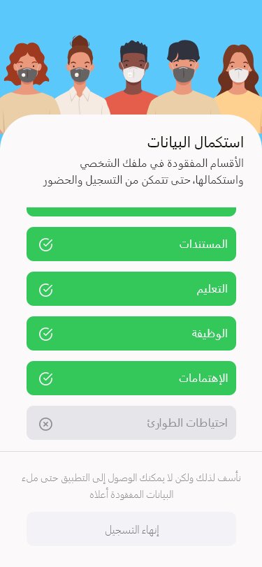
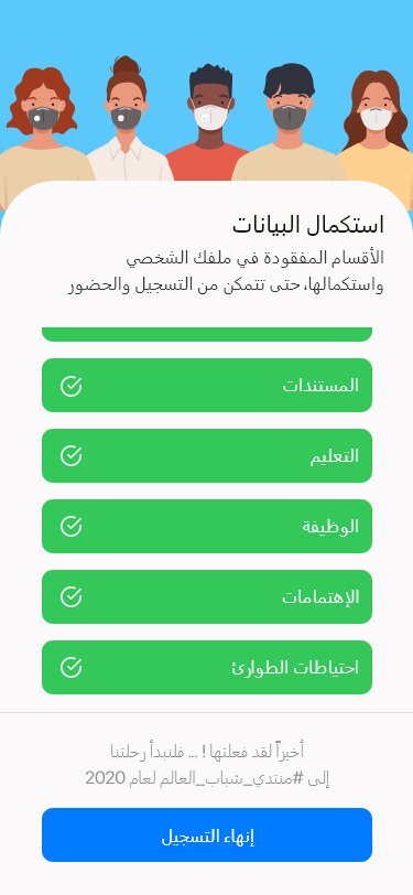
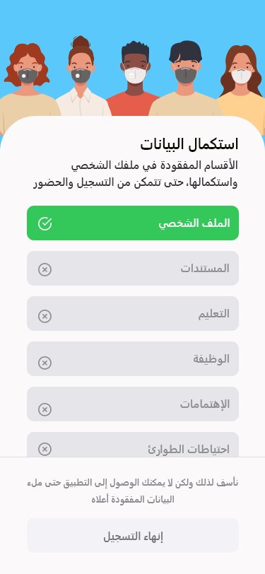
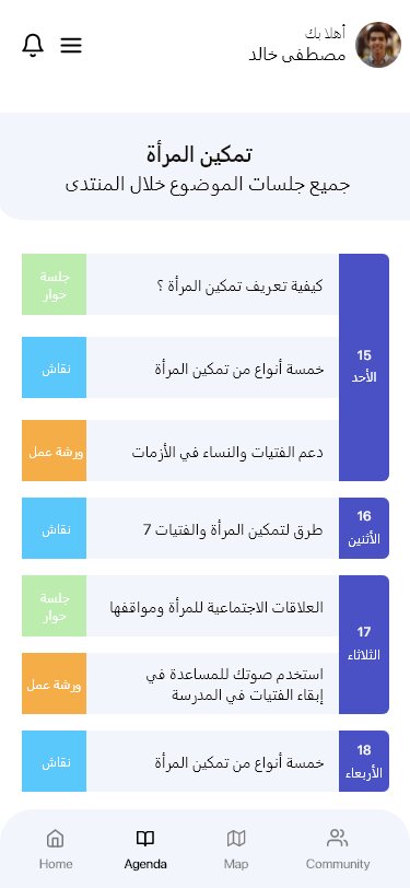
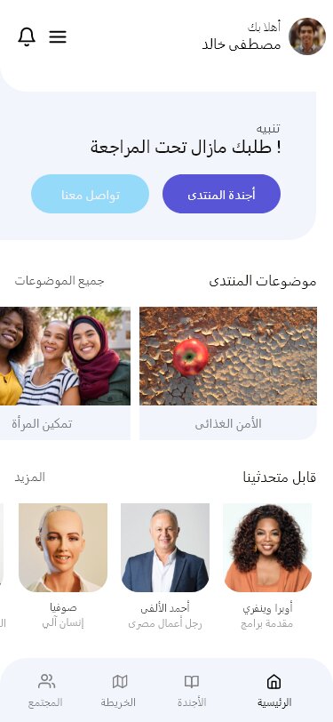
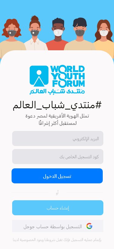
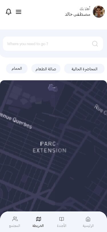
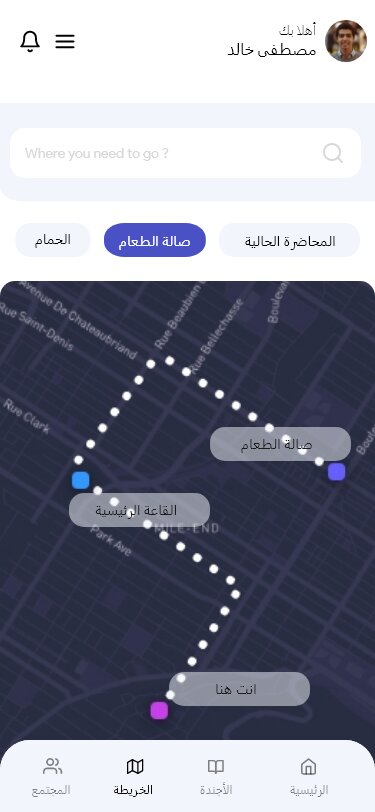
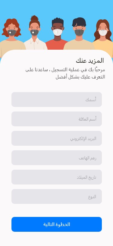
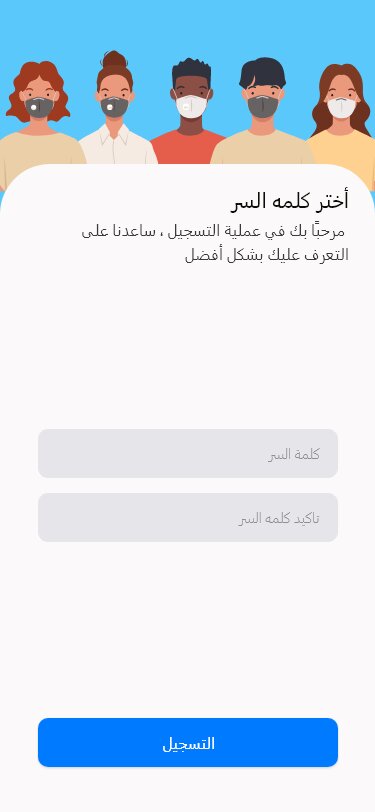
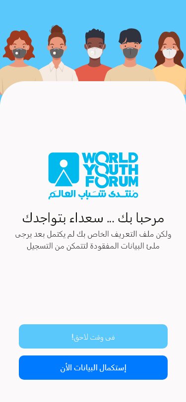
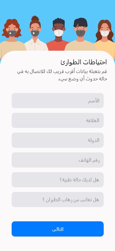
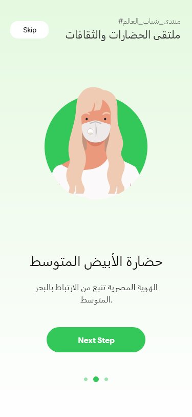
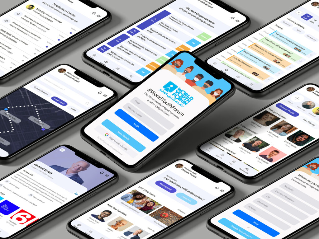
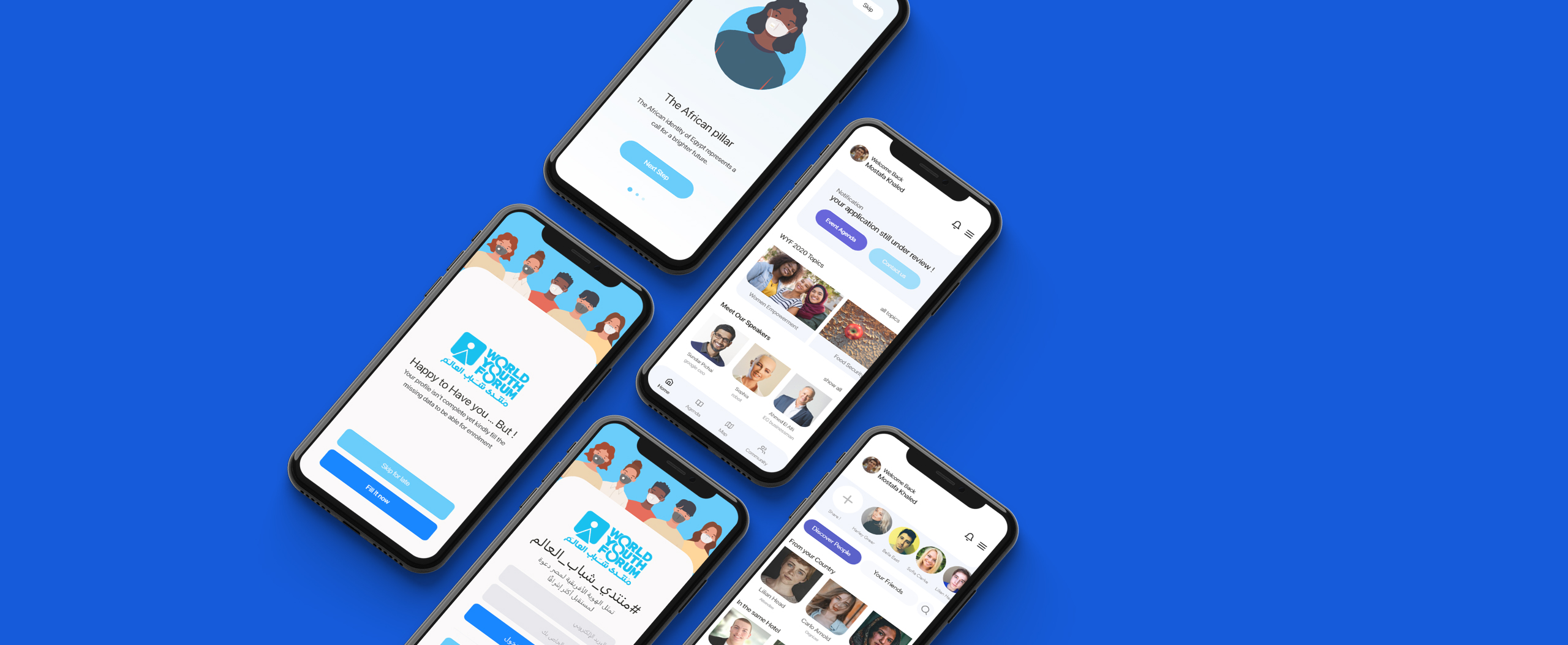
We have developed an iOS app for managing World Youth Forum attendees. The app facilitates the entire process, from registration and accommodation booking to flight details and session attendance. It also enables attendees to connect with others and provide feedback.
The Challenge
We aim to create an event management app that streamlines the attendee experience. With a few simple clicks, attendees can easily register, attend, learn, network, and engage. Our app delivers a modern user experience that is both intuitive and efficient.
What's WYF Mobile App
WYF is an IOS mobile app built to help both forum attendees and organizers to manage the whole experience, whereas;
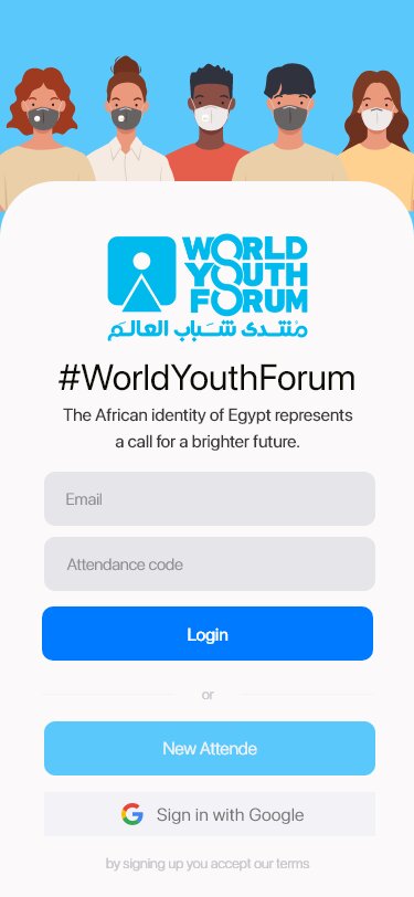
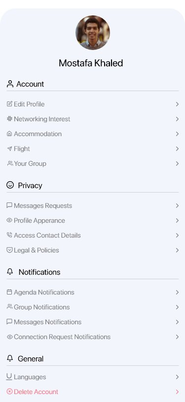
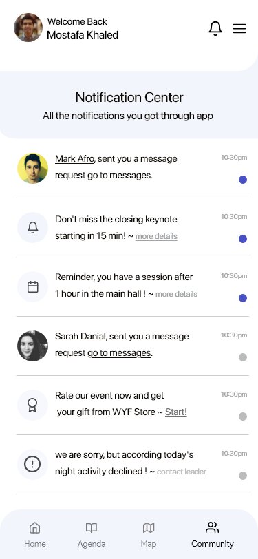
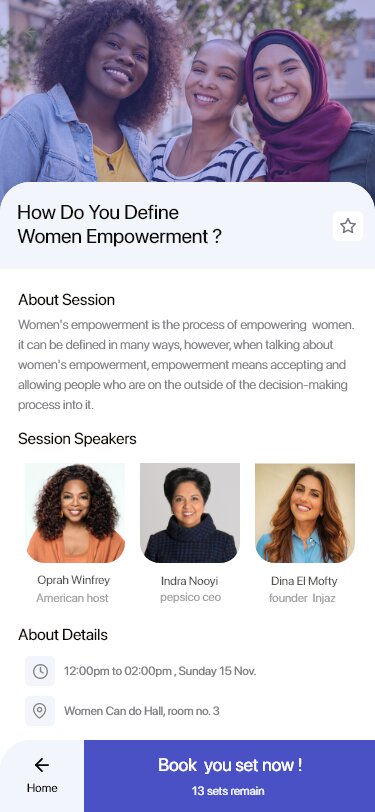
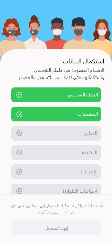
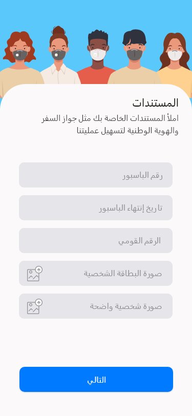
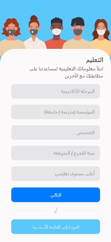
- Attendees will use it starting from the registration flow, passing by accommodation detail, activity management, session booking, connecting with others attending during the forum until going back to their countries and submitting their feedback.
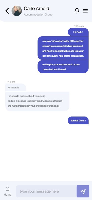
- The organizer will track attendees’ activities, send them reminders, and receive their problems through the chat feature.
This product targets youth and influencers from 124 countries — So the main challenge is to design for the world!
WYF Mobile App Project High-level Goals
Create a simple and user-friendly iOS app for World Youth Forum attendees. The app should enable easy registration, provide information and status updates, and allow users to browse event agendas, sessions, and topics, access speaker profiles, and connect with other attendees. Ensure that the app follows the event’s branding and design guidelines and focus on enhancing user satisfaction.
- Design an iOS app that allows users to register, receive information, and track their status.
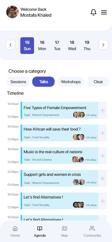
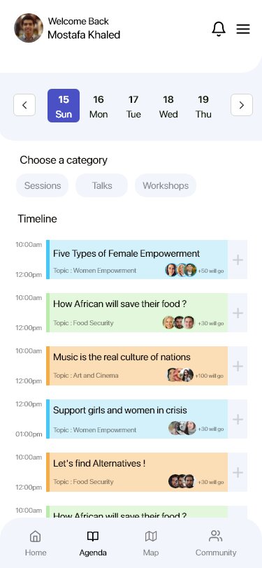
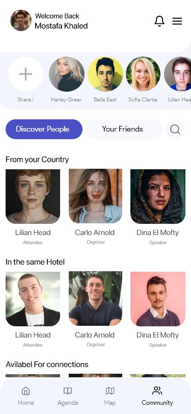
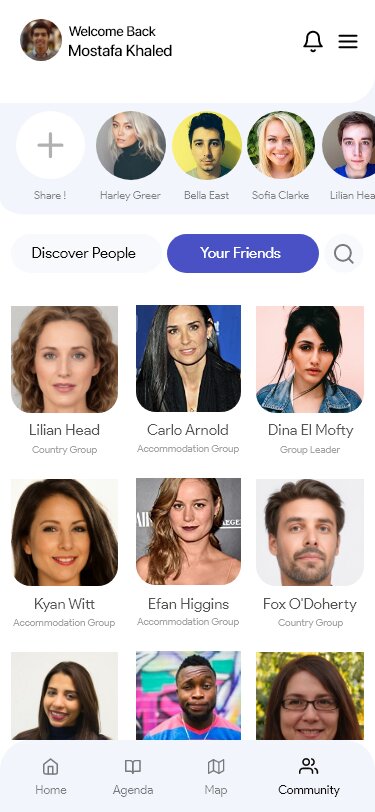
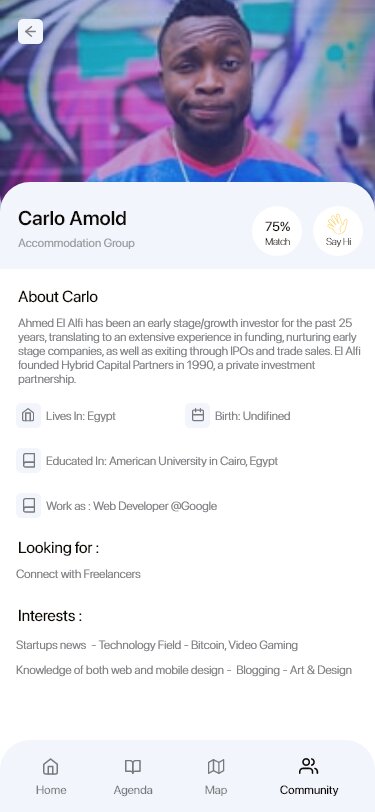
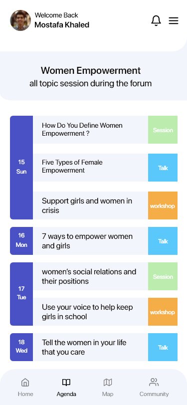
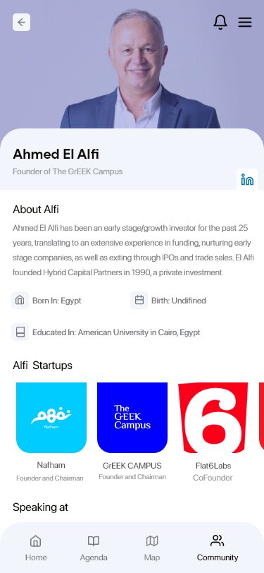
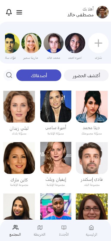
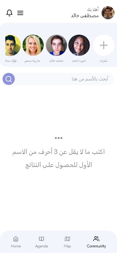
- Design an iOS app that allows users to browse event agendas, brows sessions & topics details, access speakers’ profiles, discover other’s people and connect with them.
- Design it most simply, especially the registration phases, as there are a lot of steps and information needs.
- Follow the event branding identity in color.
- Enhancing user satisfaction with a product until getting good feedback.
My Process
I am interested in understanding attendee behavior at events and conferences, such as their decision-making process for attending, session booking methods, and post-event engagement with media.
However, I recognize that personal experience alone is not sufficient for research. Although I have extensive experience in event management and have attended numerous physical and virtual events, it is essential to consider the perspectives and needs of all potential app users.

Discovery Phase
I utilized phone and in-person interviews and a survey that received responses from 10 TIEC event organizers, some of whom lead teams for IEEE and RiseUp.
The survey provided quick insights from a representative sample. In contrast, the interviews provided a more in-depth understanding of attendee behaviors. Based on these methods, the following insights were gained:
- People Love the experience of mobile apps in which they have all the event data in their hands, with no need for many questions. Also, otherwise, organizers’ jobs were reduced to 50%. They exist during the events to guide and keep the flow in.
- People love to discover others’ information, so a flow of matching people and giving them the ability to connect must also provide them with the freedom to choose what people can know about them.
- People categorize things by speakers and knowledge benefits when planning to attend a session.
Survey Results
The survey helped me quickly gather information from a subset of my intended audience, while the interviews provided me with a more comprehensive understanding of participants’ behavior.
What People Need
- The convenience of having all event information at their fingertips through a mobile app was highly appreciated by users, resulting in reduced need for assistance from event organizers during the actual event. As a result, the workload for organizers was reduced by 50%, as they were only needed for simple guidance and to maintain the flow of the event.
- Allowing users to discover and connect with others is crucial as people enjoy learning about each other. A matching flow that grants users control over their displayed information is also necessary.
- When planning to attend a session, people tend to categorize things by speakers and the knowledge benefits they expect to gain from attending.
What we try to offer
Design a seamless and engaging experience for attendees, regardless of location. Develop a private event community that offers various engagement options, including sharing photos, exchanging messages, liking and commenting on posts, and mentioning other attendees.
- Facilitate attendee networking and interaction through features such as 1:1 Video Chat and Messaging, Group Discussion tools, and Advanced Livestream Chat.
- Polls & Surveys, Q&A, and Gamification to drive session engagement and collect valuable feedback.
Note: This survey ran over phone calls. The segment is well selected based on my network and relations, who are active in events.
Define Phase
Once the requirements have been validated and ideas have been gathered, the next step is to consolidate everything and begin constructing a concrete vision for the development process.
Competitors Discovery - What others do
Next I worked on secondary research to discover what other apps are doing and try to learn from their experience, find more features that I can recommend, and add them in notion under a section of picked up features or feature I like.
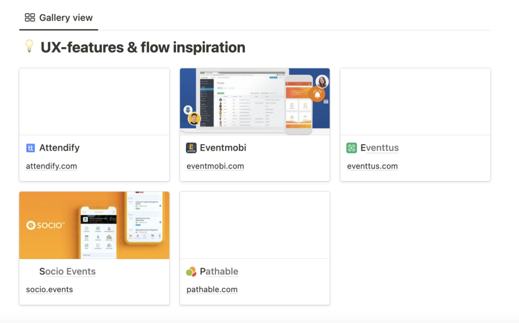
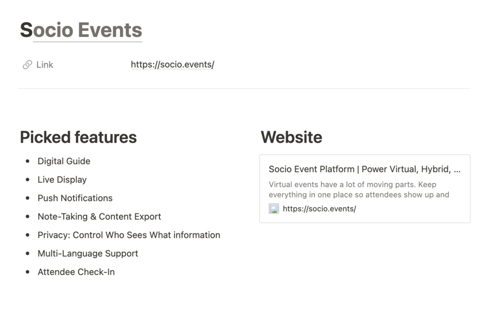
Check the whole UX Inspiration documentation on notion Click here
Let's Collect All together - Requirements Gathering and Backlog Creation
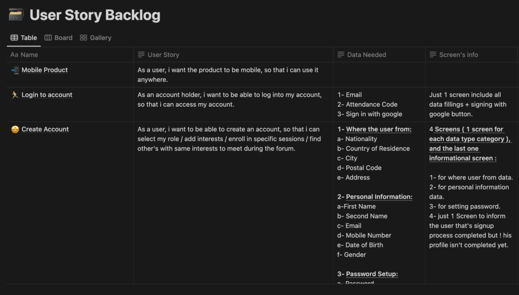
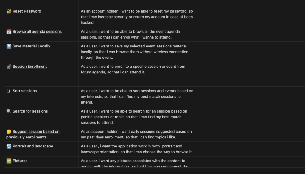
I utilized Notion to collect and define all the requirements and list the features as a user stories backlog in a table with the proper sequence.
Feature Name: Give a name for each feature to start recognizing it among the many features you will build.
User Story: The user story is the essential point to one what you are precisely building and for which need.
- Data needed for each screen: The easiest way to design based on what exactly will be located on this page without any assumptions.
- Screen info: This approach usually helps me to imagine how many pages I may need per phase.
Check the whole backlog on notion Click here
Tranfaring Features into user flows
After preparing the backlog and feature listing, it’s time to illustrate how each feature will work separately and start connecting them together.


Check the whole user flow on Miro Click here
Ideation Phase
This phase is where i illustrate all the research and flows into wireframes and design and as we already have the branding of World youth forum so I will go through the wire-framing and ui screens designs directly by:
- UI Inspiration:
To kick off my design process, I delve into the designs and case studies of popular apps. Next, I explore Behance and Dribbble projects for inspiration. I find these platforms to be more effective in sparking creativity than spending hours coming up with ideas on my own. Just an hour spent browsing can be more valuable than ten hours of trying to create something from scratch.
- Sketching: Sketching marks the starting point of the design process, as it allows us to translate our clear vision and inspired mindset into concrete ideas that can lead to the creation of something great.
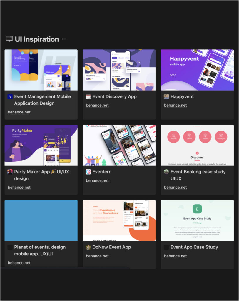
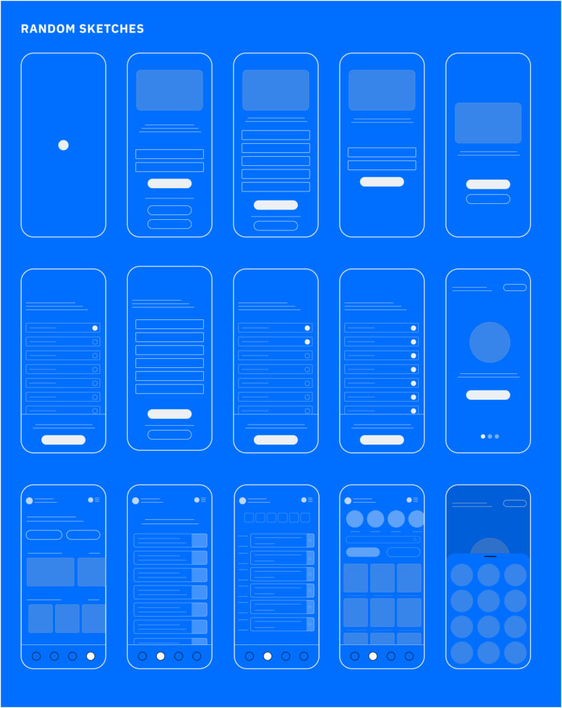
Check the whole UI Inspiration documentation on notion Click here
Designing Phase
Following the sketching and wireframing stage, we incorporated feedback and conducted usability test with random users to make enhancements and changes. Eventually, we reached the final concept that our users required, and began building the screens using the main design rules of the World Youth Forum branding and the mobile development library.
Design Rules
Design rules or principles provide essential guidance on how to create designs that are user-friendly and enjoyable to use. These rules help us choose, create, and organize elements and features in our designs. They encompass design philosophy and commonly recognized approaches to design.
Design rules include specific patterns and practices, such as size recommendations, writing conventions, and maximum text line width.
For this project, since it was designed for iOS, we followed Apple’s guidelines meticulously to ensure every aspect of the design adhered to their standards.
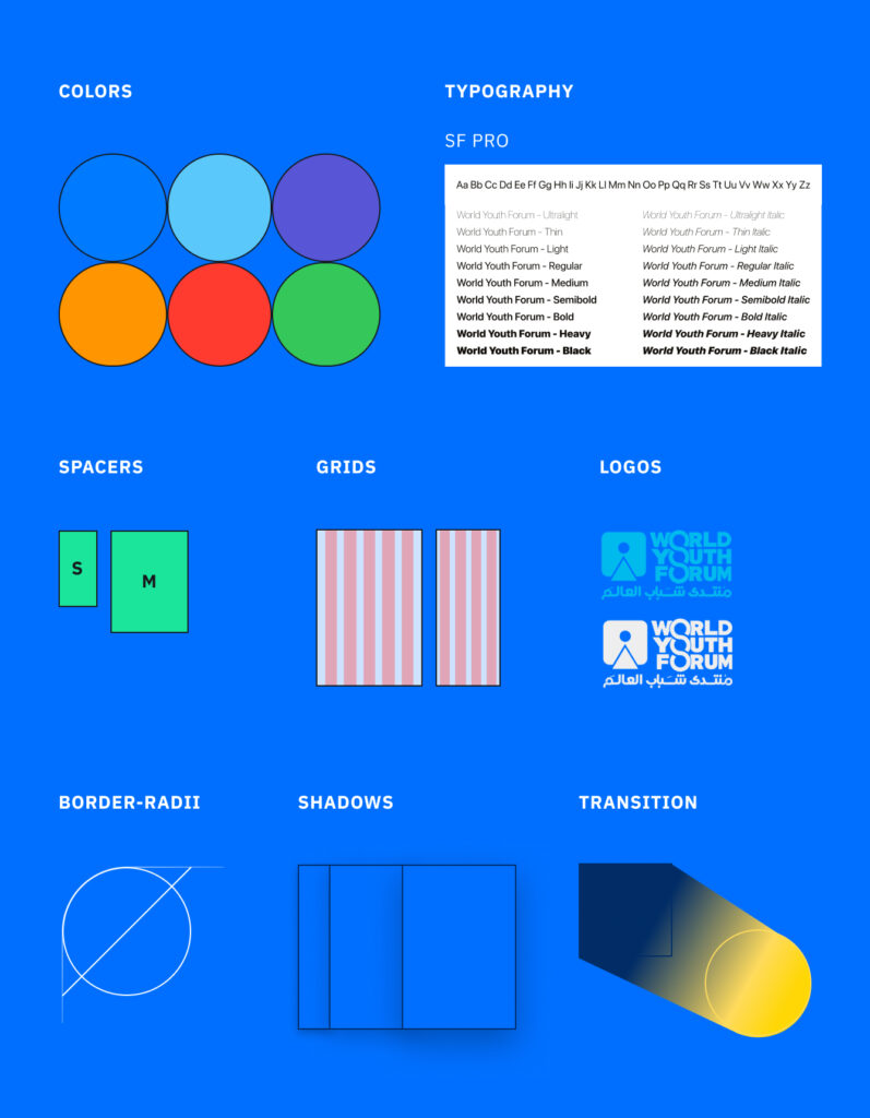
UI Style Guide & Components
All the UI Components, Style Guide and Design system listed and documented on notion where you can find it here seperated as:
- Colors
- Typography
- Spacers
- Grids
- Logos
- Border-radii
- shadows
- Transition
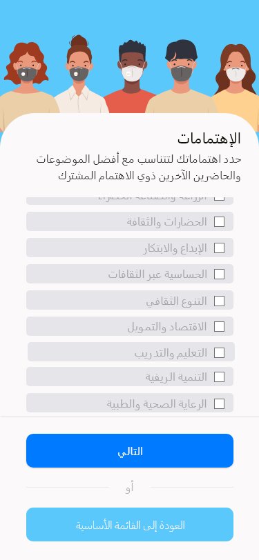
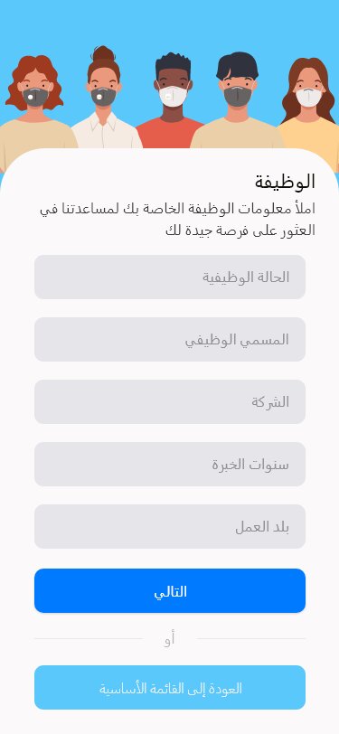
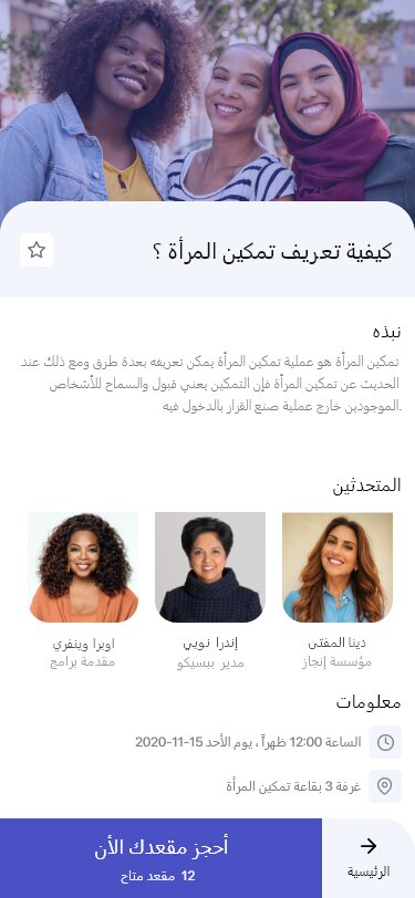
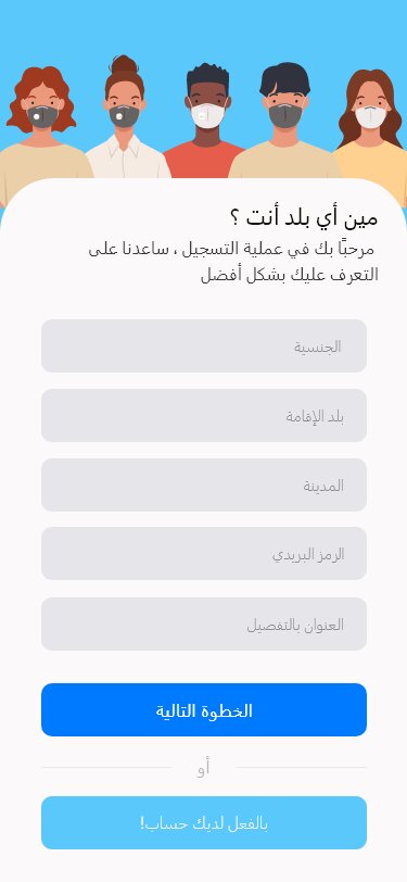
English UI Screens
The survey helped me quickly gather information from a subset of my intended audience, while the interviews provided me with a more comprehensive understanding of participants’ behavior.
Better Quality: Check the Full English UI version screens form here
Arabic UI Screens
The survey helped me quickly gather information from a subset of my intended audience, while the interviews provided me with a more comprehensive understanding of participants’ behavior.
Better Quality: Check the Full English UI version screens form here
Your turn
Hey there! I wanted to share with you what I’ve been working on with my team, and I would love to hear your thoughts and feedback on what we did well and what we could improve on for next time. What suggestions do you have?
